Modern Grotesque Body

Bogent + Swaraga
Creates crisp high-hierarchy contrast beneath Bogent headlines across menus, websites and labels.
Inspect Swaraga specimenDisclosure: MakerFileHub may earn a commission from qualifying purchases via paid links on this page. How our links work.
Heavy mixed case with inward curls and a low ball-ended g
Bogent is a heavy mixed-case serif in which the sides curve thick, the bowls stay compact, the B and o turn inward into curls and the g finishes in a long low curve with a rounded ball, so a word reads as a confident editorial mark.
Paid link
Get this fontProject & layout blueprintsAt-a-glance maker compatibility
Sturdy stroke walls and open counters weed cleanly on adhesive vinyl, HTV apparel film, and cut cardstock.
Visual anatomy & craft review
The B curls its upper bowl inward, the o turns its counter into an inward hook, the g drops a long low curve to a ball terminal and the stems keep an even heavy weight with compact counters. The inward curl is the character: it gives the letterform a closed, private quality, which is why the sample sets one word over a dark scene. Because the curls sit inside the letter, the face wants 30 pt before they stay distinct, and the ball terminal needs 14 mm of clearance beneath. The stars around the word are artwork; the lettering is the face.
Heavy · Inward curls · Ball terminal
Two-font hierarchy recipes
Tested contrast partners — pairing Bogent with grounded secondary typography.
Bogent + Swaraga
Creates crisp high-hierarchy contrast beneath Bogent headlines across menus, websites and labels.
Inspect Swaraga specimen
Bogent + Silken Luxe
Adds a warm human signature touch for 1-to-3-word callouts without competing against structured serif capitals.
Inspect Silken Luxe specimenPractical applications
Concrete hierarchy, scale and production guidance tailored to Bogent’s stroke geometry.
The heavy inward curls give a bottle presence, and the ball terminal stays solid at 20 pt on a 55 mm label in one ink. One ink keeps the ball from filling into the bowl.
Hierarchy & layout recipe
Print a 55 by 40 mm label: set the brand at 20 pt, keep 7 mm beneath for the ball terminal, and set the volume in a 6 pt caps at the foot with 4 mm of clear ground. Keep the label panel square rather than round.
Pre-production check
An inward curl printed at 16 pt closes into a solid bowl; check the plate proof and keep the brand at 18 pt or above.
The heavy serif gives a card punch, and the compact bowls keep a two-word greeting readable at 32 pt on an A6 sheet. The inward curls keep the tone from turning cute.
Hierarchy & layout recipe
Print an A6 card: set the greeting at 32 pt, keep 16 mm beneath for the low g curve, and set the name at 14 pt in a neutral sans below with 10 mm of clear ground. Keep the name on one row.
Pre-production check
A ball terminal printed under 2 mm looks like a smudge; check the proof and keep the greeting at 28 pt or above.
The inward curls soften a heavy face for a valentine, and the even weight keeps a short phrase clear at 30 pt. The ball terminal ends the line softly rather than cutting it.
Hierarchy & layout recipe
Print an A6 card: set the phrase at 30 pt, keep 18 mm of clear card on both sides, and leave the lower third blank for a handwritten line with 12 mm of clear ground. Keep the card flat for writing.
Pre-production check
A heavy word printed at 20 pt on a small card crowds the edges; check the card and keep 14 mm of margin. Test the wording on one card first.
Technical & licence verification
Confirm included OTF/TTF/WOFF formats, full glyph tables and licence coverage on the live store page before batch production.
Closest visual alternatives
Matched across letterform anatomy, stroke behaviour and craft applications.
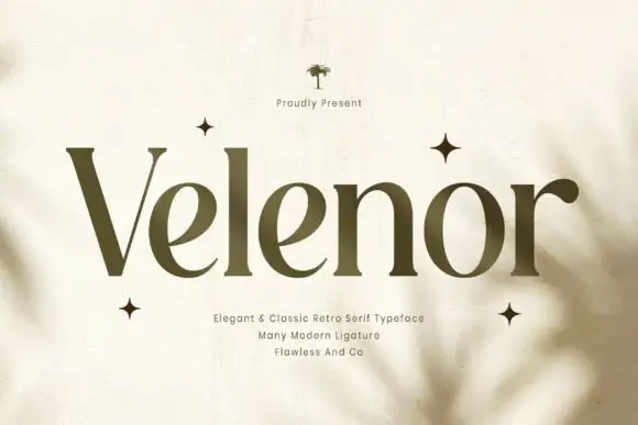
Elegant retro serif with tall ascenders
Velenor is an elegant retro serif in olive on cream: tall ascenders, wide bowls, high contrast and long flat serifs, set among four-point stars on a page with soft leaf shadows falling across it.
Ideas for this font

Fine serif title with large upper and lower loops
Amilea shows pale yellow high-contrast letters with fine tapered serifs and broad rounded lowercase over a dark portrait, where a thin loop curves below the capital A and a tall upper flourish crosses the central ascender before sweeping right.
Broad serif with enclosing loops
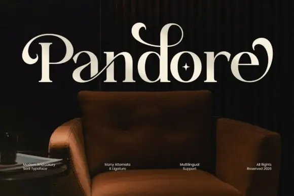
Pandore is a broad serif in cream on a dark interior photograph: heavy stems with fine serifs, and curled strokes that leave the P and the final e and loop back over the word, with a star set inside the o and a row of small tracked notes along the foot.
Vintage serif with floral frame
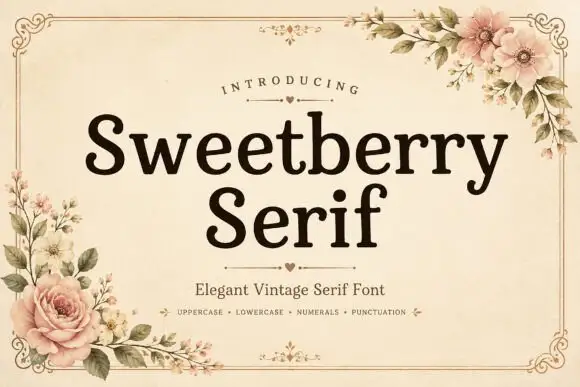
Sweetberry Serif is a vintage serif in deep brown on cream: moderate contrast, bracketed serifs, a large x-height and generous spacing, set in two lines inside a fine ornamental frame with roses and blossom at the corners and a small heart rule beneath the title.
Ideas for this font
Same independent foundry
Allow optional Google Analytics to measure visits and catalogue actions. Your search words and notes are not included. Privacy & storage