Editorial Serif Anchor

Baking + Stanza
Anchors Baking's fluid strokes with crisp Roman proportions on wedding suites, headers and packaging.
Inspect Stanza specimenDisclosure: MakerFileHub may earn a commission from qualifying purchases via paid links on this page. How our links work.
Upright looped handwriting with a doubled capital B
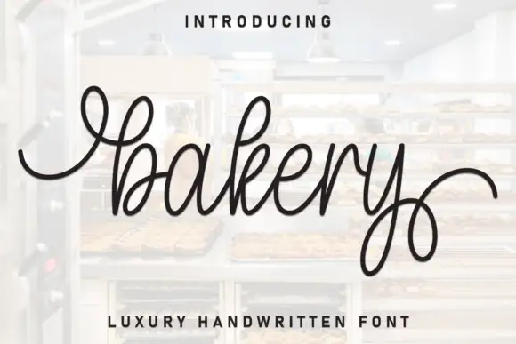
Baking is upright looped handwriting in one medium stroke, with a capital B that stands twice as tall as the x-height and a g whose open descender loop swings back under the word.
Paid link
Get this fontProject & layout blueprintsAt-a-glance maker compatibility
Weld or Unite overlapping script joins into one continuous vector path before sending to the blade.
Visual anatomy & craft review
The first letter is the whole character of the face: the capital B is drawn as a tall upright stem with an extra loop standing beside it, so it reads as two verticals before it reads as a letter. The k keeps a small curled shoulder instead of a straight arm, the i is dotted with a full loop, and the g drops a wide oval descender that returns close to the baseline, which is what gives the word its bounce at the end. Strokes stay even from capital to exit, turns are round with no flats, and joins pass at a consistent height so the letters look written in one pass. The baseline is level, though the ascenders and the descender loop break the rectangle above and below. The whisk, the stack of plates and the two tracked sans lines are presentation; the typeface is the word.
Upright · Looped · Playful
Two-font hierarchy recipes
Tested contrast partners — pairing Baking with grounded secondary typography.
Baking + Stanza
Anchors Baking's fluid strokes with crisp Roman proportions on wedding suites, headers and packaging.
Inspect Stanza specimen
Baking + Inkora
Keeps small-scale dates, URLs, nutrition facts and care instructions crisp and legible below script titles.
Inspect Inkora specimenPractical applications
Concrete hierarchy, scale and production guidance tailored to Baking’s stroke geometry.
Upright looped lettering reads from the queue at the counter and keeps a warm hand-made tone without the slant that makes scripts hard to read at an angle, and the doubled capital gives a short shop name enough presence to fill the board.
Hierarchy & layout recipe
Set the shop name at 30 cm on a 900 mm board above the counter, keep the opening hours in a plain sans at 4 cm beneath, and leave 10 cm clear either side so the g loop does not run under the hours line.
Pre-production check
Painted signage on timber wicks along the grain and closes the i loop; proof the design on a primed offcut and open the loop if it floods before the sign painter starts.
A single-word name in a looped upright hand fills a small tag without needing a picture, and the even stroke stays legible when the tag is punched, threaded and handled by guests at a party.
Hierarchy & layout recipe
Set the name at 16 pt on a 40 by 80 mm tag, punch a 4 mm hole 8 mm from the top, and keep the date in a small sans at 5 pt at the foot below the g descender.
Pre-production check
A 4 mm punch close to a descender loop will tear the loop; check the loop clearance on the printed tag rather than on screen before the whole batch is punched.
Looping, upright lettering signals a book for young readers without the cartoon weight that makes recipes feel unserious, and the tall capital sets a title line that a small hand can copy from.
Hierarchy & layout recipe
Set the title at 44 pt on a 210 by 210 mm cover, put the author line in a rounded sans at 11 pt at the foot, and keep a 25 mm band of clear space above so the B loop has room against the top edge.
Pre-production check
Laminated covers reflect light and a medium stroke can grey out; check the proof under a lamp and go one weight heavier if the title loses its edge on the shelf.
Technical & licence verification
Confirm included OTF/TTF/WOFF formats, full glyph tables and licence coverage on the live store page before batch production.
Closest visual alternatives
Matched across letterform anatomy, stroke behaviour and craft applications.
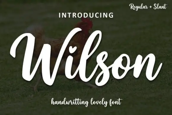
Heavy slanted open-loop lettering
Wilson is a heavy slanted handwriting in white over a photograph: fat even strokes, wide open loops on the W and the l, a heart set into the counter of the i, and a companion slant cut for the same design.

Fine lowercase script with a heart worked into the central connector
Hello Honey is fine lowercase script in which the two words are joined by a heart drawn into the connector, with long flat tails on both sides and a small even x-height.
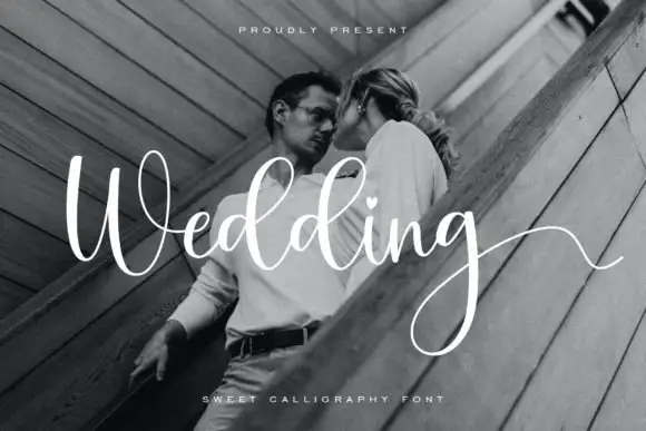
Light looping wedding script
Wedding is a light looping script in white over a black-and-white photograph: high thin loops, a wide W, a heart set into the d, and a g whose tail sweeps across the frame.
Ideas for this font
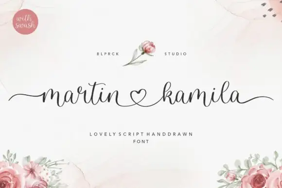
Low fine script with heart connector
Martin Kamila Script is a low fine script in charcoal on cream: small loops, a level baseline, and a heart drawn between the two names with long entry and exit strokes that run to both margins.
Ideas for this font
Same independent foundry
Allow optional Google Analytics to measure visits and catalogue actions. Your search words and notes are not included. Privacy & storage