Editorial Serif Anchor

Baby Giovani Script + Brenco
Anchors Baby Giovani Script's fluid strokes with crisp Roman proportions on wedding suites, headers and packaging.
Inspect Brenco specimenDisclosure: MakerFileHub may earn a commission from qualifying purchases via paid links on this page. How our links work.
Modern calligraphy with wide capital swashes and tight lowercase
Baby Giovani is modern calligraphy in which the capitals carry wide opening swashes while the lowercase body stays tight and small, so a two-line name reads as two contrasting registers of the same hand.
Paid link
Get this fontProject & layout blueprintsAt-a-glance maker compatibility
Weld or Unite overlapping script joins into one continuous vector path before sending to the blade.
Visual anatomy & craft review
The capital B on the first line is built as a tall loop that opens with a thin entry from below, thickens through the stem and finishes with a bowl that closes above the baseline, and the following lowercase letters are short, narrow and closely spaced, which makes the capital feel oversized by design. The second line repeats the pattern with a capital G whose swash sweeps under the whole word and ends in a small ball terminal, and its descender drops in a wide arc. Contrast is high: shaded downstrokes are three times the weight of the joins, and the joins sit low. The rule under the second line is printed presentation, as are the pastel clouds; the calligraphy is the two words.
Swashy · Contrasted · Modern
Two-font hierarchy recipes
Tested contrast partners — pairing Baby Giovani Script with grounded secondary typography.
Baby Giovani Script + Brenco
Anchors Baby Giovani Script's fluid strokes with crisp Roman proportions on wedding suites, headers and packaging.
Inspect Brenco specimen
Baby Giovani Script + Bargain Condensed
Keeps small-scale dates, URLs, nutrition facts and care instructions crisp and legible below script titles.
Inspect Bargain Condensed specimenPractical applications
Concrete hierarchy, scale and production guidance tailored to Baby Giovani Script’s stroke geometry.
The oversized capitals give a two-word name a visible hierarchy, and the wide swash under the second line works as a printed base for the design, which saves adding a ribbon or a rule under the lettering.
Hierarchy & layout recipe
Set the first word at 70 mm and the second at 90 mm on a 1.2 m banner, keep the swash 30 mm above the bottom hem, and set the date in a narrow sans at 25 mm in the corner.
Pre-production check
Printed banners are finished with a hem that shifts the artwork; check the proof against the finished size and keep the swash clear of the sewn edge by 30 mm.
High-contrast calligraphy with a wide capital swash gives an invitation formality at small size, and the small lowercase body keeps two names inside a narrow card without stacking three lines.
Hierarchy & layout recipe
Set the first name at 26 pt and the second at 30 pt on a 120 by 180 mm card, keep the details block in a small caps serif at 8 pt, and leave 15 mm between the swash and the details so the two do not touch.
Pre-production check
The thin joins in a high-contrast script can break on an uncoated card; print a proof on the actual stock and hold the second line at 30 pt rather than pushing it larger.
The swash capitals bring a playful formality that suits a children's label aimed at parents, and the tight lowercase keeps a two-word brand name compact enough for a woven tag.
Hierarchy & layout recipe
Set the brand at 16 pt on a 35 by 50 mm tag, keep the size and care marks in a 4 pt sans, and leave 5 mm between the swash and the tag edge so the stitch line does not cross the lettering.
Pre-production check
A wide swash on a small woven tag loses its thin entry; ask the mill for the minimum stroke it can weave and drop the swash if it cannot hold under 0.4 mm.
Technical & licence verification
Confirm included OTF/TTF/WOFF formats, full glyph tables and licence coverage on the live store page before batch production.
Closest visual alternatives
Matched across letterform anatomy, stroke behaviour and craft applications.
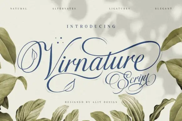
Calligraphic script with leaf ornaments
Virnature is a wide, low-contrast calligraphy script with a deep blue ink and leaf ornaments drawn into the letters themselves, shown between branches of real foliage.
Ideas for this font
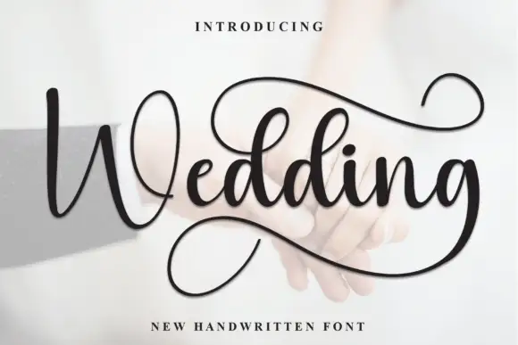
Looped script with a deep returning tail
Wedding is a looped script in black over a pale photograph: wide bowls, tall capitals with full loops, and a tail from the final letter that drops into a deep loop beneath the word before lifting.
Ideas for this font
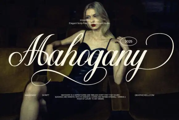
Elegant wide-swash script
Mahogany is an elegant script in white over a dark photograph: heavy shaded downstrokes, hairline joins, a capital M drawn as one wide travelling swash and a y whose tail sweeps out to the edge of the frame.
Ideas for this font

Loose script with a looped capital and low tails across the baseline
Easy Handwriting is a loose script in which the capital loops high, the body stays low and the tails run flat along the baseline, so a phrase reads as something written quickly on a card rather than as calligraphy.
Ideas for this font
Same independent foundry
Allow optional Google Analytics to measure visits and catalogue actions. Your search words and notes are not included. Privacy & storage