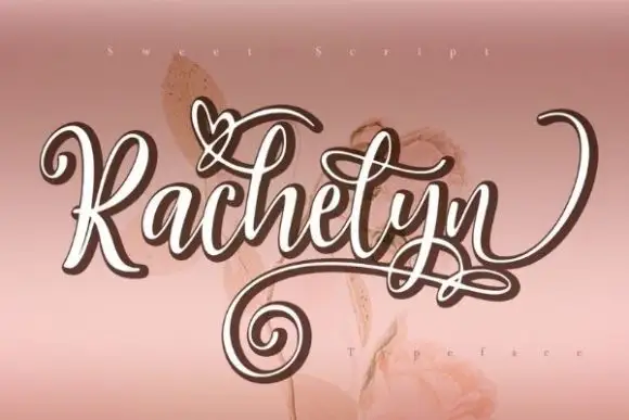
Editorial Serif Anchor

Angelia Script + Stanza
Anchors Angelia Script's fluid strokes with crisp Roman proportions on wedding suites, headers and packaging.
Inspect Stanza specimenDisclosure: MakerFileHub may earn a commission from qualifying purchases via paid links on this page. How our links work.
Fine high-contrast script with broad swashes and a looped descender
Angelia Script is a fine high-contrast script with a narrow x-height, broad swashes leaving both ends of the word, and a long looped descender that returns beneath the line.
Paid link
Get this fontProject & layout blueprintsAt-a-glance maker compatibility
Weld or Unite overlapping script joins into one continuous vector path before sending to the blade.
Visual anatomy & craft review
The capital A opens with a thin entry that swells into a shaded stem before closing a narrow bowl, and the lowercase that follows is small and fine: the n keeps a light shoulder, the g drops into a long loop that comes back under the word, the e and the l close tightly and the i carries a high dot. Contrast is high, with shaded downstrokes and hairline joins, which is what gives the word its elegance at 30 pt and above. The word exits into a broad swash that lifts and curls to the right, and that swash balances the long descender loop on the other side. Ends taper to points. The watercolour flowers at the edges, the pink ground of the sample and the tracked caption are presentation; the script is the word.
Fine · Swashed · Elegant
Two-font hierarchy recipes
Tested contrast partners — pairing Angelia Script with grounded secondary typography.
Angelia Script + Stanza
Anchors Angelia Script's fluid strokes with crisp Roman proportions on wedding suites, headers and packaging.
Inspect Stanza specimen
Angelia Script + Base Edge
Keeps small-scale dates, URLs, nutrition facts and care instructions crisp and legible below script titles.
Inspect Base Edge specimenPractical applications
Concrete hierarchy, scale and production guidance tailored to Angelia Script’s stroke geometry.
The fine contrast and the broad swashes give a formal invitation its elegance, and the long descender loop keeps a single-line name from looking stranded on a tall card.
Hierarchy & layout recipe
Set both names at 28 pt on a 120 by 180 mm card, set the details in a small caps serif at 8 pt, and hold 20 mm below the descender loop so the details have their own band.
Pre-production check
Hairline joins under 0.1 mm drop out of offset; ask for the printer's minimum line and thicken the joins rather than reducing the contrast.
The script thanks a client in a formal register, and the swashes give a small card a finished edge without printed borders.
Hierarchy & layout recipe
Set the message at 20 pt on a 148 by 105 mm card, keep the supplier name in a 7 pt caps serif, and leave 15 mm at each end so both swashes stay inside the trim.
Pre-production check
A broad swash crossing a printed rule looks like an error; check the proof and remove any rule the swash would overlap.
The fine contrast reads as engraved at label size, and the swashes let a short shop name fill a narrow tag without stretching.
Hierarchy & layout recipe
Set the boutique name at 13 pt on a 35 by 70 mm tag, keep the dress sizes in a 5 pt sans at the foot, and leave 7 mm at each end so the swashes finish inside the tag.
Pre-production check
Foil on hairlines bridges at the loops; check a foil dummy and open the tightest loop before the die is produced.
Technical & licence verification
Confirm included OTF/TTF/WOFF formats, full glyph tables and licence coverage on the live store page before batch production.
Closest visual alternatives
Matched across letterform anatomy, stroke behaviour and craft applications.
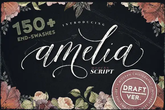
Fine textured swash calligraphy with more than 150 end swashes
Amelia Script is a fine calligraphic script with a dry textured stroke and a large set of end swashes, so a single word can be finished with a long curved flourish in whichever direction the layout needs.
Ideas for this font

Modern copperplate calligraphy with overhead swash loops and thick-thin contrast
Bunglon is a modern copperplate script in which the downstrokes carry weight, the hairlines stay fine and generous swashes arch above the x-height and below the baseline, so a single name reads as formal calligraphy.
Ideas for this font
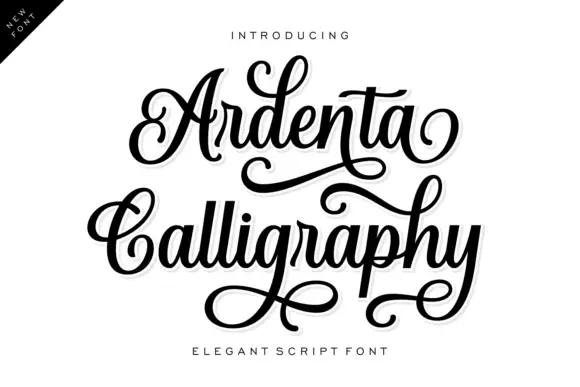
Heavy curled calligraphy with stacked lines
Ardenta Calligraphy sets a heavy even-weight script across two stacked, interlocking lines and lets the capital swashes curl far outside the width of the word.
Ideas for this font

Fine slanted calligraphy with a wide open S and long low descenders
Stylish is a fine slanted calligraphy in which the S opens very wide, the l and h lift tall loops, the connectors run thin and the y drops a long low stroke, so a short phrase reads as modern pointed-pen writing.
Ideas for this font
Same independent foundry
Allow optional Google Analytics to measure visits and catalogue actions. Your search words and notes are not included. Privacy & storage