Editorial Serif Anchor

Alesandra + Amor Hadena
Anchors Alesandra's fluid strokes with crisp Roman proportions on wedding suites, headers and packaging.
Inspect Amor Hadena specimenDisclosure: MakerFileHub may earn a commission from qualifying purchases via paid links on this page. How our links work.
Fine textured slanted brush script with a long exit loop
Alesandra is a fine slanted brush script drawn with a dry texture, where the letters lean forward together and the final letter exits in a wide loop that swings under the word.
Paid link
Get this fontProject & layout blueprintsAt-a-glance maker compatibility
Weld or Unite overlapping script joins into one continuous vector path before sending to the blade.
Visual anatomy & craft review
The capital A is written as a fine diagonal entry that rises from below the baseline, crosses its own stem and closes into a small counter, so the letter looks like a quick pen gesture rather than a constructed form. The following letters keep narrow bowls and thin joins, all leaning at the same angle, and the stems show the texture of a brush that skipped on the paper: edges are slightly irregular and some strokes are lighter at the top than at the bottom. The l and the d rise into tall straight ascenders with no loops, and the final a exits in a wide oval that travels left and up, ending in a fine point under the centre of the word. Nothing is heavy; the whole line is drawn at a light pressure. The cream ground, the painted highlight and the tracked captions are presentation; the script is the word.
Fine · Slanted · Textured
Two-font hierarchy recipes
Tested contrast partners — pairing Alesandra with grounded secondary typography.
Alesandra + Amor Hadena
Anchors Alesandra's fluid strokes with crisp Roman proportions on wedding suites, headers and packaging.
Inspect Amor Hadena specimen
Alesandra + Modern Heritage
Keeps small-scale dates, URLs, nutrition facts and care instructions crisp and legible below script titles.
Inspect Modern Heritage specimenPractical applications
Concrete hierarchy, scale and production guidance tailored to Alesandra’s stroke geometry.
A fine textured script reads as a personal signature on a salon window, and the light pressure keeps the mark from dominating the interior it is applied to.
Hierarchy & layout recipe
Set the salon name at 20 cm on the window, keep the services in a plain grotesque at 4 cm beneath, and hold 12 cm clear on the right so the exit loop finishes inside the glass.
Pre-production check
Window vinyl on a glazed door reflects light and a fine stroke can vanish; check the applied vinyl from outside at midday and go up one size if the joins disappear.
The fine slanted lettering and the exit loop give a small card movement, so a short date reads as a designed piece on a format too small for ornament.
Hierarchy & layout recipe
Set the date at 24 pt on a 148 by 105 mm card, keep the names in the same face at 14 pt, and leave 20 mm at the right so the exit loop is not clipped by the trim.
Pre-production check
A textured hairline under 0.15 mm drops out in digital print; print the card on the actual stock and hold the size at 26 pt if the ends of the loops disappear.
A light brushed script suggests the hand of the maker, which suits a studio selling thrown pots, and the even lean keeps a longer studio name on one line.
Hierarchy & layout recipe
Set the studio name at 12 pt on a 90 by 55 mm card, keep the address in a 5 pt sans, and leave 6 mm at the base so the exit loop does not sit against the card edge.
Pre-production check
Cards that go into a gift box get handled; print one and rub the surface before approving the run, and confirm the fine texture does not lift off.
Technical & licence verification
Confirm included OTF/TTF/WOFF formats, full glyph tables and licence coverage on the live store page before batch production.
Closest visual alternatives
Matched across letterform anatomy, stroke behaviour and craft applications.
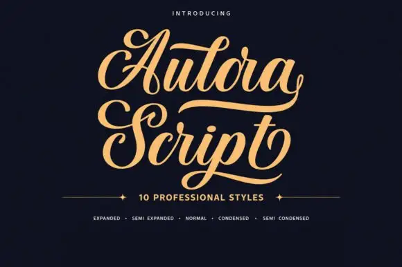
Bold curled script with heavy swash capitals and multiple widths
Aulora Script is a bold curled script whose capitals carry heavy swashes and whose letters are drawn in several widths, so a title can be set expanded or condensed without losing its character.
Ideas for this font
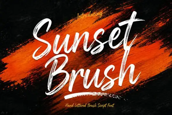
Rough brush script with a dry edge
Sunset Brush is a rough brush script in white over an orange paint smear: heavy strokes with dry, split ends, tall narrow loops and a forward slant that keeps a twelve-letter phrase moving.
Ideas for this font
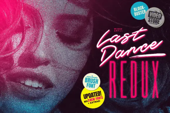
Slanted cinematic brush script
Last Dance Redux is a slanted brush script in white with a pink glow: fast narrow strokes with a dry edge, tight loops and underline swashes, presented as a video-store cover with neon type beneath.
Ideas for this font
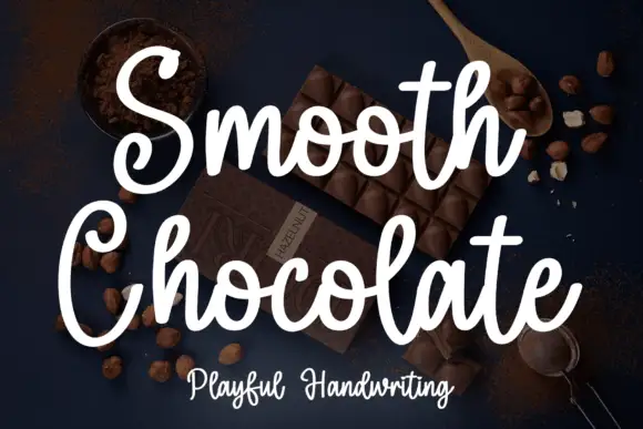
Rounded brush handwriting on a dark ground
Smooth Chocolate is a rounded brush handwriting in white over a dark photograph of chocolate: fat soft strokes with rounded ends, large open bowls, tall loops and a light bounce that keeps a long phrase moving.
Ideas for this font
Same independent foundry
Allow optional Google Analytics to measure visits and catalogue actions. Your search words and notes are not included. Privacy & storage