Modern Grotesque Body

Worid + Kohilo
Creates crisp high-hierarchy contrast beneath Worid headlines across menus, websites and labels.
Inspect Kohilo specimenDisclosure: MakerFileHub may earn a commission from qualifying purchases via paid links on this page. How our links work.
Elegant serif with theatrical descenders
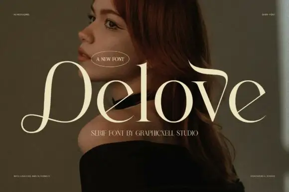
Worid is an elegant serif in warm cream on a dark portrait: very high contrast, tall narrow letters, and descenders that turn into long curved tails, so the word reads as a film title rather than as a text face.
Paid link
Get this fontProject & layout blueprintsAt-a-glance maker compatibility
Crisp hairline serifs shine on stationery, foil stamping, and packaging; add slight offset for small decals.
Visual anatomy & craft review
The word is set across the middle of the frame and the drawing is a display serif with a theatrical temperament: the stems are thin, the joins are heavier than the stems in places, and the R and the D finish in long tails that curl below the baseline and reach toward each other, which ties the word into a single shape. The O stays wide and round while the W and the R are narrow, so the rhythm alternates between broad and tight, and the tracking is close enough that the tails overlap the next letter's space. Because the strokes are fine, the face needs a mid-to-dark ground, which the portrait provides, and the cream type is placed on the shadowed side of the face. The two caption lines are set in small caps, and a small oval badge marks the release, so the page reads as a promotional specimen.
Elegant, theatrical, contrasted, editorial
Two-font hierarchy recipes
Tested contrast partners — pairing Worid with grounded secondary typography.
Worid + Kohilo
Creates crisp high-hierarchy contrast beneath Worid headlines across menus, websites and labels.
Inspect Kohilo specimen
Worid + Hailey
Adds a warm human signature touch for 1-to-3-word callouts without competing against structured serif capitals.
Inspect Hailey specimenPractical applications
Concrete hierarchy, scale and production guidance tailored to Worid’s stroke geometry.
A theatrical serif gives a festival cover the register of a title card, and the overlapping tails create a shape that reads at poster size where a straight serif would sit flat.
Hierarchy & layout recipe
Set the title at 120 pt across 200 mm, the dates in a 10 pt cap line beneath, and the programme details at 8 pt. Keep the tails inside the safe area and print cream on a dark image so the hairlines stay visible.
Pre-production check
Check the tails at full size, where they can collide with the following letter and turn the word into a ligature; adjust the tracking per pair. Confirm the 10 pt dates read at arm's length and that the hairlines hold on the chosen stock.
A theatrical serif gives a cinema a marque that looks like a title, and the fine drawing holds on a ticket and a poster where a script would be too slow to read.
Hierarchy & layout recipe
Set the mark at 30 pt on the poster, 14 pt on the ticket, and 70 mm wide for the canopy sign. Keep the mark one colour on the ticket and reversed white on the canopy, and keep the tails inside the trim.
Pre-production check
Check the 14 pt ticket version, where the tails can merge with the following line of text; set it on its own line. Confirm the canopy sign reads from 30 m and that the tails are not cut by the sign's frame.
A theatrical serif sets names for a formal evening with more character than a didone, and the tails give the card a drawn quality that a plain roman cannot.
Hierarchy & layout recipe
A5 portrait: the names at 30 pt, the details in a 9 pt serif, and a 0.4 pt rule beneath the names. Keep 22 mm margins and print in one ink on a heavy cream stock so the tails take the paper's texture.
Pre-production check
Check the tail of the final letter against the rule, where it can touch and read as a strike-through; increase the gap to 8 mm. Confirm the 9 pt details keep a 4.5:1 contrast and that the names stay on one line at the chosen measure.
Technical & licence verification
Confirm included OTF/TTF/WOFF formats, full glyph tables and licence coverage on the live store page before batch production.
Closest visual alternatives
Matched across letterform anatomy, stroke behaviour and craft applications.
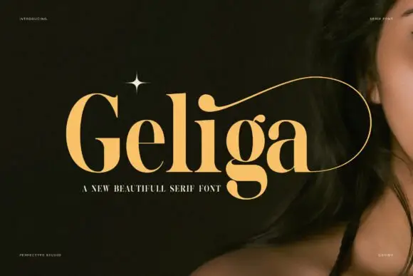
Heavy contrasting mixed case with an i-dot stroke enclosing the ending
Geliga shows gold mixed case on a dark portrait: thick curved sides meet fine joins, the g closes a low enclosed bowl and a long thin curve grows from the i-dot area to wrap around the right end of the word.
Ideas for this font

Elegant Roman capitals with wide spacing
Rosemode is an elegant Roman serif in deep green on off-white: wide capitals with moderate contrast, fine bracketed serifs and very generous spacing, with a small drawn rose above the word and a tracked capital line beneath.
Ideas for this font
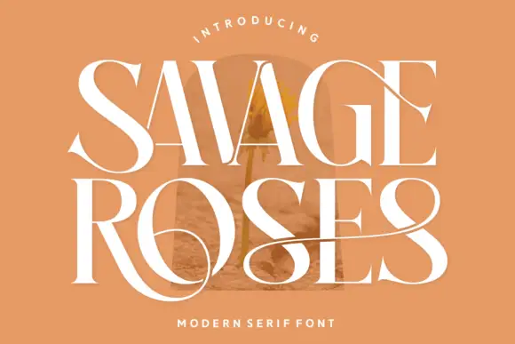
Tall contrasting serif with loops
Savage Roses is a tall contrasting serif in white on a warm tan ground: heavy stems with hairlines, wide serifs, and loops that leave the capitals and extend across the words in long horizontal sweeps, with a small tracked line above in a curved rule and a caption beneath.
Ideas for this font
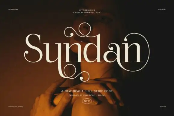
High-contrast serif with ornamental spirals
Sundan is a beautiful serif in cream over a warm photograph: high contrast, wide letters, and ornamental spirals that leave the S and the d, one rising above the word and one curling below it, with a small badge at the foot.
Ideas for this font
Same independent foundry
Allow optional Google Analytics to measure visits and catalogue actions. Your search words and notes are not included. Privacy & storage