Modern Grotesque Body

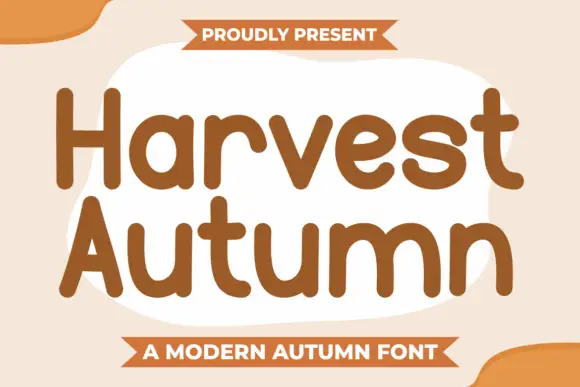
Vasion + Bargain Condensed
Creates crisp high-hierarchy contrast beneath Vasion headlines across menus, websites and labels.
Inspect Bargain Condensed specimenDisclosure: MakerFileHub may earn a commission from qualifying purchases via paid links on this page. How our links work.
High-contrast modern serif display
Vasion is a high-contrast modern serif in white over a black-and-white swan photograph: razor-thin hairline serifs, a wide V whose left stroke thins to nothing and an A that borrows the same geometry, set with tracked caps and four-point sparkles at the corners.
Paid link
Get this fontProject & layout blueprintsAt-a-glance maker compatibility
Crisp hairline serifs shine on stationery, foil stamping, and packaging; add slight offset for small decals.
Visual anatomy & craft review
The word runs at almost the full width of the frame, and the drawing is a display didone rather than a text face: the stems are thick, the hairlines approach a single point, and the serifs are flat unbracketed bars that catch the light. The V and the A are the expressive letters, with the V opening wide and its left stroke tapering to a hairline, while the S and the O keep a more conventional contrasted bowl. Tracking is close to zero so the letters nearly touch, which is how a display didone gains its tension, and the whole word sits over a swan reflected in dark water so the thin strokes read against a mid-value background rather than pure black. Above it, a light serif line and a pair of small sparkles; below, the style and the designer in spaced capitals, and two thin globe marks in the lower corners.
Elegant, contrasted, editorial, sharp
Two-font hierarchy recipes
Tested contrast partners — pairing Vasion with grounded secondary typography.
Vasion + Bargain Condensed
Creates crisp high-hierarchy contrast beneath Vasion headlines across menus, websites and labels.
Inspect Bargain Condensed specimen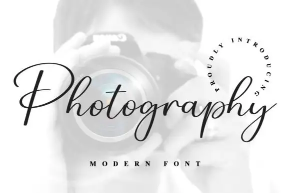
Vasion + Photography Font
Adds a warm human signature touch for 1-to-3-word callouts without competing against structured serif capitals.
Inspect Photography Font specimenPractical applications
Concrete hierarchy, scale and production guidance tailored to Vasion’s stroke geometry.
A contrasted didone gives a magazine cover its authority, and the hairlines read as luxury rather than decoration when they are printed at scale over a photograph.
Hierarchy & layout recipe
Set the masthead at 110 pt across 240 mm, tracking at minus 10 units, white over a black-and-white image, with the cover lines in a 9 pt italic serif and the barcode kept clear at the lower right. Leave 18 mm between the masthead baseline and the first cover line.
Pre-production check
Check the hairlines at 100 percent: anything under 0.25 pt will break on uncoated stock, so either print coated or thicken the thin strokes for that stock. Confirm the cover lines clear the masthead's serifs by 8 mm and read at newsstand distance.
Contrasting thick and thin strokes suggests refinement without ornament, which is exactly the register a jewellery mark needs when it appears next to metal and polished stone.
Hierarchy & layout recipe
Set the wordmark at 36 pt in caps, tracked minus 15 units, and lock it up with a 0.5 pt rule of the same width beneath at a 10 mm gap. Reproduce single-colour for packaging and reversed white for the site header.
Pre-production check
Check the reversed version on a dark plate at 1,200 px wide, where hairlines bloom outward, and confirm the mark still reads at 60 px in a browser tab. Test the single-colour version through a foil stamp on the box lid.
A high-contrast serif sets a formal tone with fewer elements than a script suite, and the wide capitals give a short word enough presence to carry the top of an invitation.
Hierarchy & layout recipe
A5 portrait: the word at 54 pt with linespacing pushed, the names in a 12 pt roman serif and the details in 9 pt italic, all centred on a 30 mm margin. Print letterpress in one ink so the hairlines take an impression rather than a flat tone.
Pre-production check
Check the letterpress die, where a hairline serif under 0.4 mm will not hold a deep impression, and confirm the paper's calliper suits the pressure. Read the proof to make sure the word does not float away from the lines beneath it.
Technical & licence verification
Confirm included OTF/TTF/WOFF formats, full glyph tables and licence coverage on the live store page before batch production.
Closest visual alternatives
Matched across letterform anatomy, stroke behaviour and craft applications.

Light high-contrast mixed case with wide open curves
Grandeur shows a light mixed-case serif with thin hairlines, broad round bowls and a wide open rhythm: the capital G trails a long fine lower spur and the d stem rises well above the lowercase line.
Ideas for this font
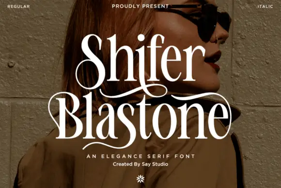
Elegance serif with swashes
Shifer Blastone is an elegance serif in cream over a portrait photograph: high contrast, fine stems, ball terminals and long swashes that leave the first letters and curve under the words, with a small italic beneath and a flower ornament at the foot.
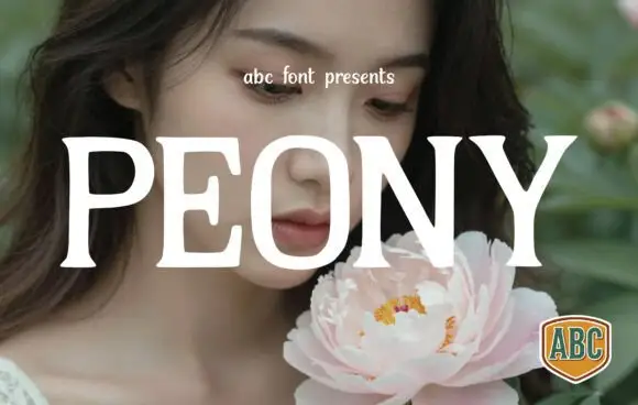
Broad high-contrast serif
Peony is a broad high-contrast serif in white over a portrait with a pale peony: wide capitals with hairline joins, gently curved serif ends and a wide O, set as one word across the plate with a small line at the top and a shield badge at the lower right.
Ideas for this font
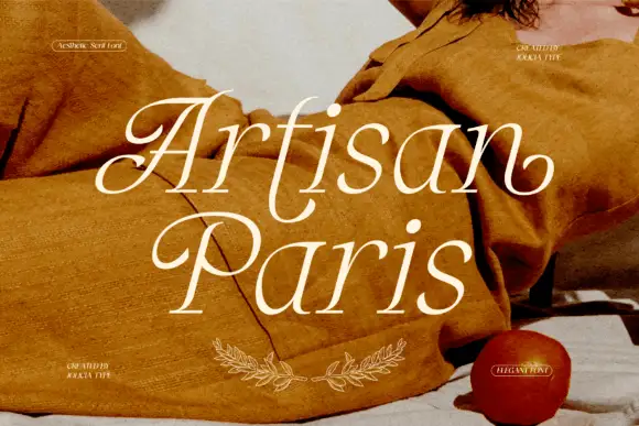
Wide fashion serif with tall ascenders and hairline serifs
Artisan Paris is a wide fashion serif in which the letters open generously, the serifs thin to hairlines and the ascenders stretch, so a two-word title reads as a printed lookbook cover.
Ideas for this font
Same independent foundry
Allow optional Google Analytics to measure visits and catalogue actions. Your search words and notes are not included. Privacy & storage