Neutral Sans Workhorse

Valentine Card Font + Cultivo
Lets Valentine Card Font own the focal silhouette while handling secondary copy, sizing and subheads cleanly.
Inspect Cultivo specimenDisclosure: MakerFileHub may earn a commission from qualifying purchases via paid links on this page. How our links work.
Heart-framed monogram with silhouettes
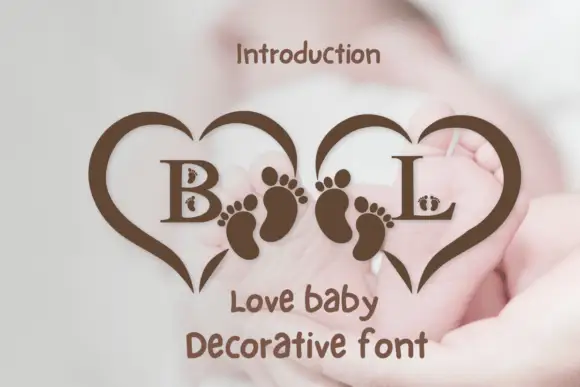
Valentine Card is a decorative display built around a framed monogram: two rectangular frames holding the initials, a chain of hearts along the base, silhouettes of a couple between them, and a script line beneath, all shown in brown over a soft bokeh ground.
Paid link
Get this fontProject & layout blueprintsAt-a-glance maker compatibility
Sturdy stroke walls and open counters weed cleanly on adhesive vinyl, HTV apparel film, and cut cardstock.
Visual anatomy & craft review
The specimen is really a cutting design as much as a typeface: the two initials sit inside open rectangular frames, hearts of different sizes climb the outer edges and run along the bottom, and the figures of a couple stand between the frames so the whole lockup reads as a paper cut for a card front. The lettering itself is a soft serif with rounded joins, drawn at a size where the counters stay open, and beneath it a script line spells out the occasion in a lighter weight. Everything is one colour, which is what a cutting file needs, and the brown against the blurred lights makes the silhouette read as the primary shape rather than as decoration on top of it. The caption beneath the lockup names the face as a decorative font, which is accurate: the value here is the ornament, not a text alphabet.
Romantic, decorative, monogrammed, crafted
Two-font hierarchy recipes
Tested contrast partners — pairing Valentine Card Font with grounded secondary typography.
Valentine Card Font + Cultivo
Lets Valentine Card Font own the focal silhouette while handling secondary copy, sizing and subheads cleanly.
Inspect Cultivo specimen
Valentine Card Font + The Lumina Awesome
Grounds bold display lettering with classic typographic authority on posters, badges and apparel.
Inspect The Lumina Awesome specimenPractical applications
Concrete hierarchy, scale and production guidance tailored to Valentine Card Font’s stroke geometry.
A framed monogram with a heart chain gives a card front a finished design without a second illustration, and a single-colour cut keeps the print cheap.
Hierarchy & layout recipe
A6 card: the monogram lockup at 60 mm wide, centred, with the initials at 24 pt and the caption in a 7 pt sans at the foot. Keep 8 mm of clear space around the hearts so the card does not look crowded, and print in one ink on a pale stock.
Pre-production check
Check the heart chain at 60 mm, where the smallest hearts can fill in below 1 mm; remove the two smallest for print. Confirm the initials stay legible inside the frames and that the caption sits outside the lockup's baseline.
A monogram frame gives a seating chart a decorative header that ties the chart to the rest of the stationery, which is usually the least designed piece of a suite.
Hierarchy & layout recipe
Print an A2 chart: the lockup at 120 mm wide at the top, the table list in a 10 pt serif in two columns beneath, and a 0.5 pt rule separating the sections. Keep the two columns 12 mm apart and leave 20 mm below the lockup before the first heading.
Pre-production check
Check the lockup at 120 mm, where the cut lines between the hearts need to be at least 0.5 mm to print cleanly. Confirm the 10 pt table list stays legible from a metre and that the rule does not sit inside the lockup's heart chain.
A small monogram insert turns a standard order into a gift, and because the design is one colour it can be printed on the same run as the packing slip.
Hierarchy & layout recipe
Print a 70 by 100 mm insert: the lockup at 35 mm at the top, three lines of 8 pt serif beneath, and the shop name in 7 pt caps. Keep 10 mm margins so the cut lines never reach the edge, and use the same stock as the slip for a single print run.
Pre-production check
Check the 35 mm lockup for the smallest heart, which will vanish at that scale; use the simplified version with four hearts only. Confirm the 8 pt lines keep a 4.5:1 contrast and that the insert fits the envelope without folding across the design.
Technical & licence verification
Confirm included OTF/TTF/WOFF formats, full glyph tables and licence coverage on the live store page before batch production.
Closest visual alternatives
Matched across letterform anatomy, stroke behaviour and craft applications.
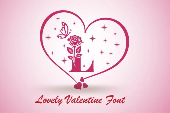
Heart monogram with botanical ornament
Lovely Valentine is a decorative valentine design built around a large heart: a single initial stands inside the heart on a stem of leaves, a rose grows up the stem, a butterfly and a scatter of four-point stars fill the field, and a connected script names the face beneath.
Ideas for this font
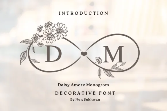
Floral daisy infinity-loop (∞) couple monogram alphabet
Daisy Amore Monogram frames Roman couple initials inside graceful botanical daisy-and-heart infinity loops.
Ideas for this font
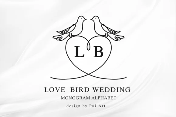
Lovebird-perched heart wedding monogram alphabet
Love Bird Wedding Monogram perches two kissing line-art lovebirds atop a clean heart frame built for couple initials.
Ideas for this font
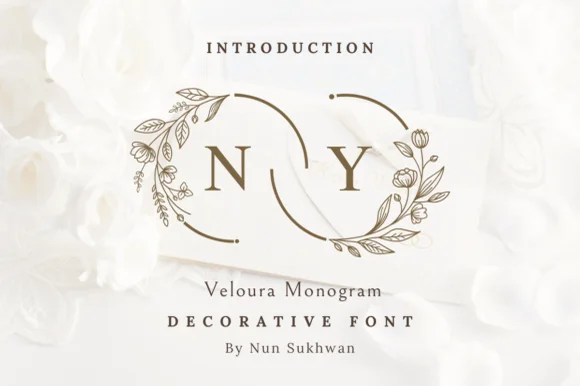
Interlocking floral-ring wedding monogram alphabet
Veloura Monogram is a delicate wedding monogram font framing classic serif initials inside crescent botanical wreaths that interlock like wedding bands.
Ideas for this font
Same independent foundry
Allow optional Google Analytics to measure visits and catalogue actions. Your search words and notes are not included. Privacy & storage