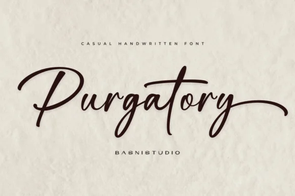
Editorial Serif Anchor

Sederhana + Evoire
Anchors Sederhana's fluid strokes with crisp Roman proportions on wedding suites, headers and packaging.
Inspect Evoire specimenDisclosure: MakerFileHub may earn a commission from qualifying purchases via paid links on this page. How our links work.
Bold handwritten script
Sederhana is a bold handwritten script in white over a wheat field at sunset: a rounded monoline stroke with a slight swell at the entries, a tall looped S, and a baseline that rises gently across the word.
Paid link
Get this fontProject & layout blueprintsAt-a-glance maker compatibility
Cut solid base, outline, and shadow layers in separate vinyl colors and align on registration marks.
Visual anatomy & craft review
The name is set across the middle of the photograph and the drawing is a confident handwriting rather than a formal script: the strokes are thick and even, the entries curl up from the baseline, and the capital S rises into a long diagonal that crosses the following letter's ascender. The d and the h carry simple loops, the word ends in a straight tail rather than a flourish, and the spacing is loose enough that the letters read individually while still appearing connected. Because the stroke is bold, the face holds at small sizes where fine scripts break up, which is what makes it usable for labels and packaging rather than only for headlines. The ground is a field of wheat with the sun low behind hills, so the white word reads on a mid-tone field, and the two caption lines are small tracked capitals in a light sans.
Handwritten, bold, smooth, personal
Two-font hierarchy recipes
Tested contrast partners — pairing Sederhana with grounded secondary typography.
Sederhana + Evoire
Anchors Sederhana's fluid strokes with crisp Roman proportions on wedding suites, headers and packaging.
Inspect Evoire specimen
Sederhana + Godthem
Keeps small-scale dates, URLs, nutrition facts and care instructions crisp and legible below script titles.
Inspect Godthem specimenPractical applications
Concrete hierarchy, scale and production guidance tailored to Sederhana’s stroke geometry.
A bold handwritten script reads as a bakery's own mark on a paper bag, and the thick stroke survives being printed small on a label wrapped around a loaf.
Hierarchy & layout recipe
Print a 90 by 60 mm label: the name at 18 pt, the loaf type in a 7 pt sans caps, and the weight in 6.5 pt. Keep 6 mm clear on all sides and print one ink on uncoated paper so the script's entry strokes stay crisp.
Pre-production check
Check the 18 pt name on uncoated stock, where the thick stroke gains a little weight and the loops can close; proof before ordering. Confirm the 6.5 pt weight stays legible over the crease of the bag and that the label sits without a wrinkle.
A handwritten line breaks up a page of serif body text and signals a personal voice, which is what a farmer's quote needs in a feature about a harvest.
Hierarchy & layout recipe
Set the quote at 40 pt in one line across a 120 mm measure, with the attribution in an 8 pt sans caps beneath at 8 mm. Keep the script in a single colour and place it on a plain field rather than over a photograph so it stays legible at that size.
Pre-production check
Check the line at 40 pt for the width of the measure: a bold script can overrun a narrow column, so count the characters before setting. Confirm the 8 pt attribution keeps a 4.5:1 contrast and that the quote does not sit closer than 12 mm to the body text.
A bold script on a shop board reads as the owner's own hand, and the thick stroke carries across a painted surface where a thin script would lose its detail.
Hierarchy & layout recipe
Paint a 700 by 400 mm board: the name at 80 mm cap height, the opening hours in a 25 mm sans beneath, and a 5 mm hand-drawn rule between. Keep 30 mm between the script's descender and the rule so the tail stays clear.
Pre-production check
Check the board at three metres in daylight, where white on a mid-tone painted surface can lose contrast; use a darker ground or a light outline. Confirm the 25 mm hours line reads from the road and that the descender clears the rule by 10 mm.
Technical & licence verification
Confirm included OTF/TTF/WOFF formats, full glyph tables and licence coverage on the live store page before batch production.
Closest visual alternatives
Matched across letterform anatomy, stroke behaviour and craft applications.
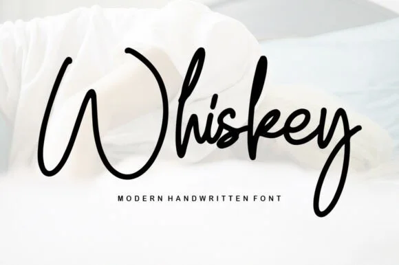
Modern handwritten script with high contrast
Whiskey is a modern handwritten script in black on white fabric: a thick downstroke and a thin upstroke, a capital W that swings across the whole word, tall loops on the h and the k, and a y that drops a long tail back under the line.
Ideas for this font
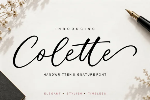
Fluid fountain-pen signature script with double-t bar
Colette is a poised contemporary fountain-pen signature script featuring open airy loops, a sweeping double-'tt' crossbar, and curled end tails.
Ideas for this font
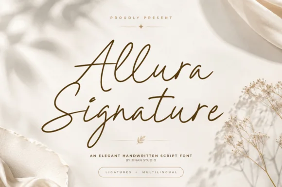
Tall-looped slanted fine-pen wedding signature script
Allura Signature is a slender, slanted handwritten signature script with tall twin-looped capitals/ascenders and fluid ligature flow.
Ideas for this font
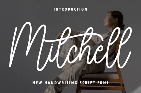
Tall upright brush-pen signature calligraphy script
Mitchell is a stylish, tall-looped brush-signature script pairing high editorial ascenders ('M', 't', 'h', 'l') with smooth, vinyl-friendly stroke weight.
Ideas for this font
Same independent foundry
Allow optional Google Analytics to measure visits and catalogue actions. Your search words and notes are not included. Privacy & storage