Editorial Serif Anchor

Nona + Vanielst Elegant Serif Display Stylistic
Anchors Nona's fluid strokes with crisp Roman proportions on wedding suites, headers and packaging.
Inspect Vanielst Elegant Serif Display Stylistic specimenDisclosure: MakerFileHub may earn a commission from qualifying purchases via paid links on this page. How our links work.
Heavy low connected calligraphy
Nona is a heavy low connected calligraphy in black on sand: fat round letters with a very low x-height, tight joins, and two long horizontal tails that run in from the left and out to the right at the waist.
Paid link
Get this fontProject & layout blueprintsAt-a-glance maker compatibility
Weld or Unite overlapping script joins into one continuous vector path before sending to the blade.
Visual anatomy & craft review
The word sits across a circular portrait, and the face is a heavy script with a flat build: the n and the o are wide round bowls, the a closes into a circle, the letters connect with joins as thick as the stems and the whole line stays low, so the word reads as a band across the sheet rather than a rising phrase. A long tail enters from the left margin and another leaves to the right at the same height, which gives the composition a ruled feel without a rule. Beneath it a second line in the same face names the style, with its own tails. The portrait sits inside a white circle and the ground is a warm sand paper, with tracked capitals above and below. Nona is a script for labels, packaging and signage, and it is at its best in one short word with plenty of horizontal room.
A fat script with long horizontal tails
Two-font hierarchy recipes
Tested contrast partners — pairing Nona with grounded secondary typography.
Nona + Vanielst Elegant Serif Display Stylistic
Anchors Nona's fluid strokes with crisp Roman proportions on wedding suites, headers and packaging.
Inspect Vanielst Elegant Serif Display Stylistic specimen
Nona + Borsen
Keeps small-scale dates, URLs, nutrition facts and care instructions crisp and legible below script titles.
Inspect Borsen specimenPractical applications
Concrete hierarchy, scale and production guidance tailored to Nona’s stroke geometry.
A fat low script with tails turns a name into a band across a board, and the heavy stroke reads at a distance in a bright room.
Hierarchy & layout recipe
Print a 400 by 250 mm board: set the name at 90 pt on one line, keep 20 mm of clear ground beneath before the date at 20 pt, and hold 24 mm of margin on both sides for the tails.
Pre-production check
The tails can run past a board edge; print one at the final size and check both ends before the set.
The face fits a long shop name on a wide box lid, and the heavy stroke holds when the lid is stamped rather than printed.
Hierarchy & layout recipe
Print a 200 by 150 mm lid: set the shop name at 34 pt on one line, keep 16 mm of clear ground beneath before the strap line at 9 pt, and hold 18 mm of margin on both sides.
Pre-production check
A stamp thickens the stroke and can close the counters; proof one lid on the real board and check the o before the order.
A round heavy script suits a card about a small person, and the low band of lettering leaves room for a photograph in the middle.
Hierarchy & layout recipe
Print a 120 by 120 mm square card: set the name at 34 pt on one line across the middle, keep 14 mm of clear ground beneath before the details at 9 pt, and hold 20 mm of margin on both sides.
Pre-production check
A photograph behind the lettering can swallow a thin join; print one card at the finished size and check the contrast before the batch.
Technical & licence verification
Confirm included OTF/TTF/WOFF formats, full glyph tables and licence coverage on the live store page before batch production.
Closest visual alternatives
Matched across letterform anatomy, stroke behaviour and craft applications.
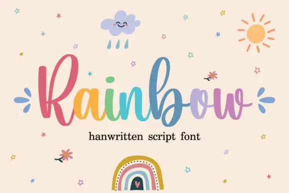
Rounded connected script with tall loops
Rainbow is a rounded connected script in which a narrow looped capital opens the word, the lowercase joins broadly and the b and l rise well above the body, so a single line reads as cheerful handwriting with a lift at the start.
Ideas for this font
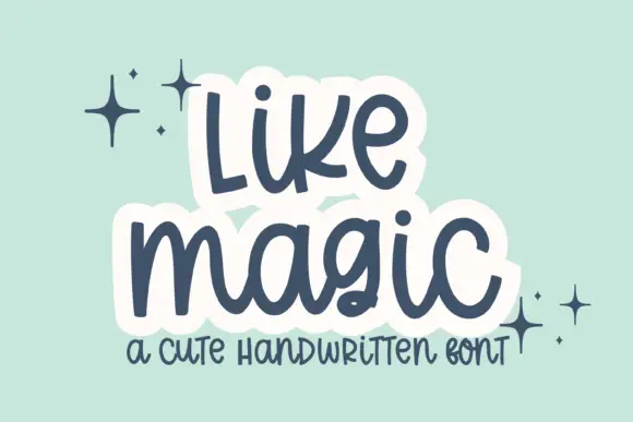
Cute rounded handwritten script
Like Magic is a cute handwritten script in navy on mint: soft rounded strokes, a large x-height, a bouncy baseline and a drawn white panel behind each word that turns the lettering into a sticker.
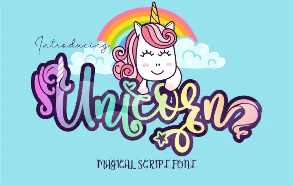
Display
Unicorn is a playful script with a heavy monoline, looping ascenders and a thick dark outline, filled with a lilac-to-mint gradient and shown beneath a cartoon unicorn with a rainbow.
Ideas for this font
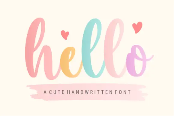
Broad lowercase script with tall repeated loops
Hello shows a large lowercase h followed by tall repeated l loops and a rounded o with a thin exit stroke, and the source specifications list PUA-encoded extra characters available through Character Map and Font Book along with decorative entry and terminal swashes.
Ideas for this font
Same independent foundry
Allow optional Google Analytics to measure visits and catalogue actions. Your search words and notes are not included. Privacy & storage