Editorial Serif Anchor

Natalie + Lumera Editorial
Anchors Natalie's fluid strokes with crisp Roman proportions on wedding suites, headers and packaging.
Inspect Lumera Editorial specimenDisclosure: MakerFileHub may earn a commission from qualifying purchases via paid links on this page. How our links work.
Thin low handwriting with long smooth tails and a gentle forward lean
Natalie is a thin handwriting script in which the letters stay low and small, the stroke never thickens and both ends of the word run out into long smooth tails.
Paid link
Get this fontProject & layout blueprintsAt-a-glance maker compatibility
Weld or Unite overlapping script joins into one continuous vector path before sending to the blade.
Visual anatomy & craft review
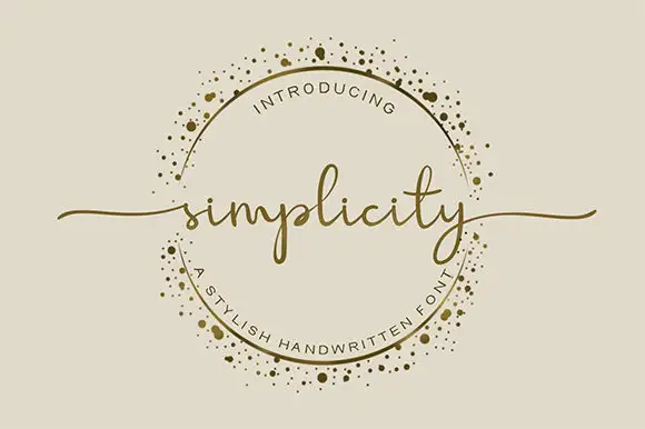
The n opens with a short entry stroke and closes a small shoulder, the a holds an open counter, the t crosses with a fine bar, the l rises only just above the x-height and the i carries a light dot, all at one even weight with a forward lean of a few degrees. The small scale is the character: the word sits low on the line, which is why the face reads as something written quickly on a card rather than designed. The tails are long and smooth, so a short word spans a wide format without a rule beneath it. Because the stroke is light and the letters are small, the face wants 18 pt minimum and a smooth stock. The blush ground, the red ink, the pale shapes and the two tracked caption lines are presentation; the script is the word.
Thin · Low · Tailed
Two-font hierarchy recipes
Tested contrast partners — pairing Natalie with grounded secondary typography.
Natalie + Lumera Editorial
Anchors Natalie's fluid strokes with crisp Roman proportions on wedding suites, headers and packaging.
Inspect Lumera Editorial specimen
Natalie + Corven
Keeps small-scale dates, URLs, nutrition facts and care instructions crisp and legible below script titles.
Inspect Corven specimenPractical applications
Concrete hierarchy, scale and production guidance tailored to Natalie’s stroke geometry.
The low thin line gives a small card its handwritten character, and the long tails let two short names fill a landscape format at 26 pt.
Hierarchy & layout recipe
Print a 148 by 105 mm card: set both names at 26 pt on the centre line, set the date in a 8 pt caps serif beneath, and keep 18 mm of margin at each end so both tails taper inside the trim.
Pre-production check
A thin stroke printed on a textured card breaks between letters; check the proof on the chosen stock and use its smoother face for the names.
The light tail gives a wordmark a horizontal gesture, and the even stroke reproduces in one colour on a card at 14 pt or on a printed proof sheet.
Hierarchy & layout recipe
Print a 90 by 50 mm card: set the photographer's name at 14 pt across the upper third, set the contact lines in a 6 pt sans at the foot, and keep 10 mm of clearance below the baseline so the tails do not touch the block.
Pre-production check
A tail crossing a printed rule reads as a mistake; check the card layout and move the rule rather than shortening the stroke.
The small thin hand keeps a thank-you personal at 15 pt, and the light stroke stops a printed insert from looking like a receipt.
Hierarchy & layout recipe
Print a 90 by 55 mm insert: set the thank-you at 15 pt across the upper half, set the order reference in a 5 pt sans along the foot, and keep 7 mm of margin so both tails stay on the card.
Pre-production check
A tail running to a small card's edge looks cut; check the proof at final size and pull the line in by 2 mm rather than reducing the size.
Technical & licence verification
Confirm included OTF/TTF/WOFF formats, full glyph tables and licence coverage on the live store page before batch production.
Closest visual alternatives
Matched across letterform anatomy, stroke behaviour and craft applications.

Loose script with a looped capital and low tails across the baseline
Easy Handwriting is a loose script in which the capital loops high, the body stays low and the tails run flat along the baseline, so a phrase reads as something written quickly on a card rather than as calligraphy.
Ideas for this font
Monoline handwriting with long open loops
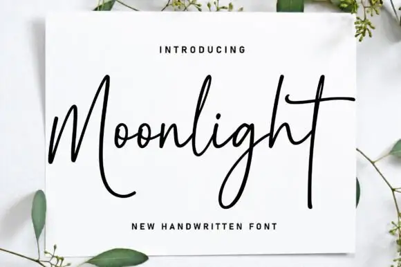
Moonlight is a monoline handwriting script in black on a white card propped against a pale surface: a thin even stroke, a tall M that opens into a big loop, an extended crossbar on the t and a long descending tail, with eucalyptus sprigs around the card.
Ideas for this font
Fine italic script with a broad capital
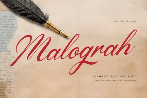
Malograh is a fine italic script in red on aged paper: a broad capital M with a long entry swash, a light slanted body, and a final h whose exit stroke lifts above the line and curls back.
Ideas for this font
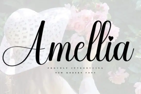
Slanted bridal script with heart tittle and long entry strokes
Amellia is a slanted cursive whose ascenders climb far above a small lowercase body, with a heart in place of the dot on the i and a capital that throws a long thin swash out to the left of the word.
Ideas for this font
Same independent foundry
Allow optional Google Analytics to measure visits and catalogue actions. Your search words and notes are not included. Privacy & storage