Editorial Serif Anchor

Magnolia Calligraphy + The Bilstein Editorial
Anchors Magnolia Calligraphy's fluid strokes with crisp Roman proportions on wedding suites, headers and packaging.
Inspect The Bilstein Editorial specimenDisclosure: MakerFileHub may earn a commission from qualifying purchases via paid links on this page. How our links work.
High-contrast enclosing calligraphy
Magnolia Calligraphy is a formal pointed-pen script in white on deep teal, with capitals that enclose the name in long oval flourishes and a swash that underlines the second word from margin to margin.
Paid link
Get this fontProject & layout blueprintsAt-a-glance maker compatibility
Weld or Unite overlapping script joins into one continuous vector path before sending to the blade.
Visual anatomy & craft review
Magnolia sits above Calligraphy, and the two words are tied together by flourishes rather than by spacing: the capital M opens into a double loop that stretches over the rest of the first word, and the C of Calligraphy sweeps down into an underline that runs under the whole second line. The strokes are pointed-pen: thick on the downstroke, hairline on the up, with sharp entry serifs and a full round bowl on the o and a. The ground is a deep teal with four small captions in the corners, including a ribbon at the top left and the studio credit at the foot. The script is a formal invitation face: it needs a large size to show the hairline, it should be set in one or two colours, and it cannot be crowded.
A formal copperplate script with enclosing swashes
Two-font hierarchy recipes
Tested contrast partners — pairing Magnolia Calligraphy with grounded secondary typography.
Magnolia Calligraphy + The Bilstein Editorial
Anchors Magnolia Calligraphy's fluid strokes with crisp Roman proportions on wedding suites, headers and packaging.
Inspect The Bilstein Editorial specimen
Magnolia Calligraphy + Homies
Keeps small-scale dates, URLs, nutrition facts and care instructions crisp and legible below script titles.
Inspect Homies specimenPractical applications
Concrete hierarchy, scale and production guidance tailored to Magnolia Calligraphy’s stroke geometry.
The enclosing flourishes give a couple's names the depth of an engraved suite, and the hairlines catch light on a coated stock.
Hierarchy & layout recipe
Print a 130 by 180 mm invitation: set the names at 32 pt on one row, keep 22 mm of clear ground beneath before the venue at 9 pt, and hold 16 mm from the outer flourish to the card edge.
Pre-production check
Pointed-pen hairlines break up in laser printing; print one invitation on the actual machine and check a join before the suite.
A studio that sells engraved work needs a mark in the same idiom, and one flourished word reads as a seal rather than as decoration.
Hierarchy & layout recipe
Print a 60 by 40 mm card: set the studio name at 15 pt on one row, keep 5 mm of clear ground beneath before the service line at 4.5 pt, and hold 4 mm from the lowest flourish to the trim.
Pre-production check
Small sizes close the counters of the pointed o; print one card at the real size and check the bowl before the order.
A copperplate script places a feature in a period before it says anything, and a single flourished word carries a spread without imagery.
Hierarchy & layout recipe
Print a 230 by 300 mm opener: set the feature word at 100 pt on one row, keep 30 mm of clear ground beneath before the standfirst at 11 pt, and hold 20 mm of margin so the underline swash stays inside.
Pre-production check
Thin upstrokes drop out at 100 pt on uncoated paper; print one opener on the intended stock and check the hairline before the issue.
Technical & licence verification
Confirm included OTF/TTF/WOFF formats, full glyph tables and licence coverage on the live store page before batch production.
Closest visual alternatives
Matched across letterform anatomy, stroke behaviour and craft applications.
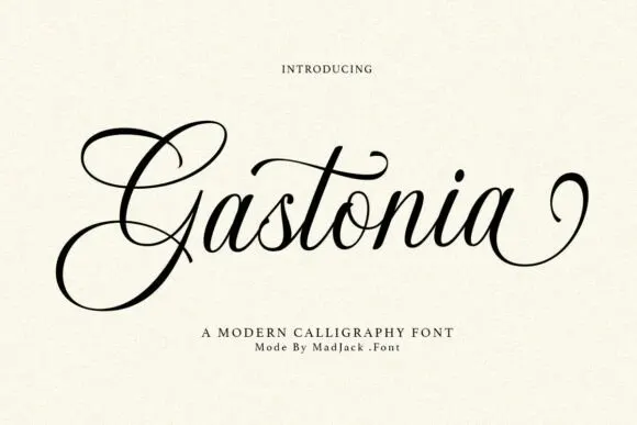
Contrasting calligraphy with a large looped G
Gastonia Script leads with a large double-looped G that extends far above and below the lowercase body, a long crossbar arcs across the central t and the final stroke climbs into a separate loop on the right.
Ideas for this font
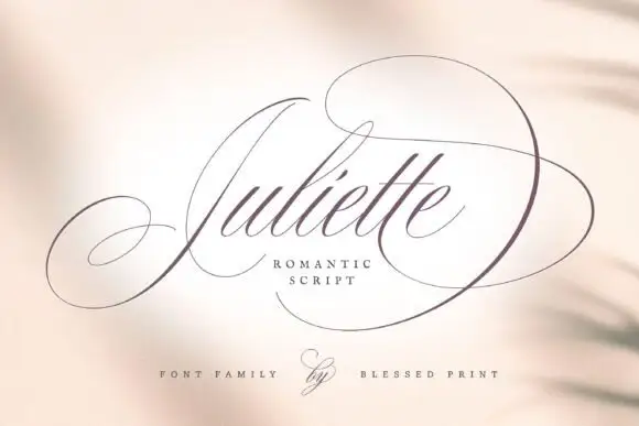
Fine Spencerian calligraphy with oversized flourish loops
Juliette is a fine Spencerian script in which hairline joins run between narrow shaded downstrokes, and the flourish loops thrown off the first and last letters extend far enough to set the width of the whole word.
Ideas for this font
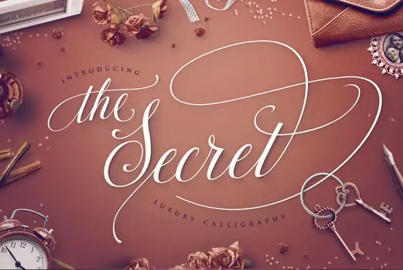
Luxury calligraphy with broad swashes and a fine ornate finish
The Secret is luxury calligraphy in which a broad swash carries across the whole phrase, the stems are shaded and thin and the ornament is drawn at the same weight as the joins.
Ideas for this font
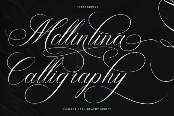
Fine sweeping calligraphy
Mellintina Calligraphy is a formal script in fine white hairlines on black: pointed-pen contrast, closed oval capitals and flourishes that sweep out well beyond the words on both lines.
Ideas for this font
Same independent foundry
Allow optional Google Analytics to measure visits and catalogue actions. Your search words and notes are not included. Privacy & storage