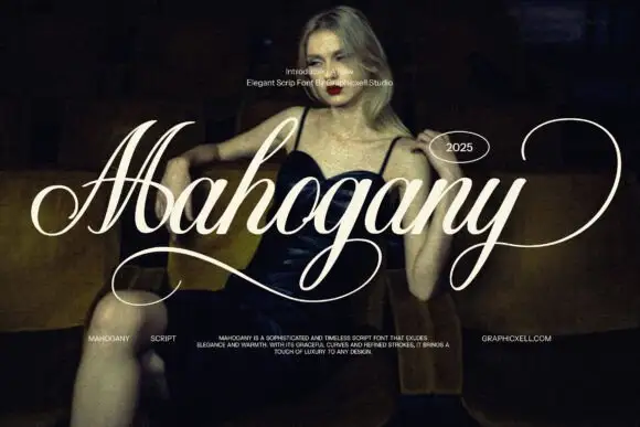
Modern Grotesque Body

Machio + Clyne Sans
Creates crisp high-hierarchy contrast beneath Machio headlines across menus, websites and labels.
Inspect Clyne Sans specimenDisclosure: MakerFileHub may earn a commission from qualifying purchases via paid links on this page. How our links work.
Modern serif with tall proportions
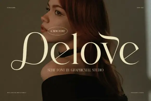
Machio is a modern serif in cream over a warm portrait: tall narrow letters with moderate contrast, fine bracketed serifs and long ascenders, set as one large word with a small capital line beneath and an oval badge above.
Paid link
Get this fontProject & layout blueprintsAt-a-glance maker compatibility
Sturdy stroke walls and open counters weed cleanly on adhesive vinyl, HTV apparel film, and cut cardstock.
Visual anatomy & craft review
The word is set on one line across a close portrait, and the face is a modern serif with proportions that lean tall: the stems are moderately heavy, the joins are fine but not hairlines, the serifs are small and bracketed, the ascenders of the h and the i rise well above the cap line, and the bowls of the o and the c stay narrow rather than round. That narrow structure is what keeps a serif face from feeling heavy on a warm photograph, and it also lets a long word fit a single line at a large size. A small capital line beneath names the style and the studio in the same face at a much smaller size, an oval badge above carries the introduction, and two tiny credits sit in the corners. The ground is a warm, low-lit portrait with soft skin tones. Machio is a serif for editorial titles, packaging, invitations and branding, and it needs a large size and a quiet, warm background.
Modern, elegant, warm
Two-font hierarchy recipes
Tested contrast partners — pairing Machio with grounded secondary typography.
Machio + Clyne Sans
Creates crisp high-hierarchy contrast beneath Machio headlines across menus, websites and labels.
Inspect Clyne Sans specimen
Machio + Bunglon
Adds a warm human signature touch for 1-to-3-word callouts without competing against structured serif capitals.
Inspect Bunglon specimenPractical applications
Concrete hierarchy, scale and production guidance tailored to Machio’s stroke geometry.
A tall modern serif fills a masthead at a large size while staying elegant, and the narrow forms let a long title fit one line.
Hierarchy & layout recipe
Print a 230 by 300 mm cover: set the masthead at 110 pt on one line, keep 28 mm of clear ground beneath before the coverlines at 10 pt, and hold 16 mm of margin at the top and sides.
Pre-production check
A cream serif over a warm photograph loses contrast quickly; proof one cover and check the thinnest joins.
A tall modern serif reads as restrained luxury on a slim bottle, and the fine serifs suit a light foil better than a heavier face would.
Hierarchy & layout recipe
Print a 35 by 75 mm bottle label: set the name at 11 pt on one line, keep 4 mm of clear ground beneath before the volume at 3.5 pt, and hold 3 mm of margin on all four sides.
Pre-production check
At eleven points the bracketed serifs can fill; print one label on the real stock and check the joins.
A modern serif gives a wedding card its formality without ornament, and the tall ascenders keep long names from crowding.
Hierarchy & layout recipe
Print a 130 by 190 mm card: set the names at 26 pt on one line, keep 20 mm of clear ground beneath before the details at 8 pt, and hold 14 mm of margin on all four sides.
Pre-production check
Letterpress can crush fine serifs; order one proof in the real process before approving the suite.
Technical & licence verification
Confirm included OTF/TTF/WOFF formats, full glyph tables and licence coverage on the live store page before batch production.
Closest visual alternatives
Matched across letterform anatomy, stroke behaviour and craft applications.
Elegance serif with swashes
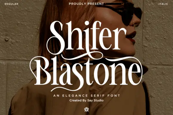
Shifer Blastone is an elegance serif in cream over a portrait photograph: high contrast, fine stems, ball terminals and long swashes that leave the first letters and curve under the words, with a small italic beneath and a flower ornament at the foot.
Heavy compact serif
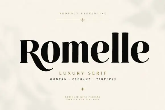
Romelle is a heavy compact serif in black on a pale plaster ground: thick stems with fine hairlines, a low sweeping R leg that runs under the next letter, closed counters and a large x-height, set in title case on one line with a tracked line above, a subtitle and two small notes beneath.
Ideas for this font
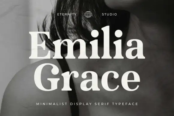
Minimal display serif with fine contrast and generous wide serifs
Emilia Grace is a minimal display serif in which the stems narrow against fine hairlines, the serifs spread wide and flat, and the fit stays airy, so a two-word name reads as a studio mark rather than as a headline.
Ideas for this font
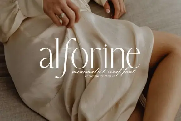
Light lowercase serif with tall ascenders and a deep narrow f descender
Alforine is a light lowercase serif in which the stems stay fine, the bowls round broadly, the ascenders rise tall and the f drops into a narrow deep curve, so a single lowercase word reads as quiet fashion lettering.
Ideas for this font
Same independent foundry
Allow optional Google Analytics to measure visits and catalogue actions. Your search words and notes are not included. Privacy & storage