Modern Grotesque Body

Love Struck + Borsen
Creates crisp high-hierarchy contrast beneath Love Struck headlines across menus, websites and labels.
Inspect Borsen specimenDisclosure: MakerFileHub may earn a commission from qualifying purchases via paid links on this page. How our links work.
Handcrafted serif and script duo
Love Struck is a duo in cream over a weathered timber wall: a high-contrast serif with sharp serifs and a curled R for the display words, and a light monoline script for the last word of the line beneath, with a tracked line under that naming the three cuts.
Paid link
Get this fontProject & layout blueprintsAt-a-glance maker compatibility
Weld or Unite overlapping script joins into one continuous vector path before sending to the blade.
Visual anatomy & craft review
The plate sets the pair in the arrangement the duo is sold for: two heavy words in the serif at display size, and a light line beneath that ends in the script, which lets the buyer see both voices doing a job on the same page. The serif has sharp serifs, a curled R and a tight aperture, and the script is a monoline with a light slant and open loops, so the contrast is between weight and movement rather than between two similar faces. The weathered timber behind is a texture test, and the cream holds because the wood is dark in the centre. The tracked line beneath is set in a small serif with wide spacing, and it names the three cuts, which is the information a buyer needs. Because the serif is high contrast, it works at display sizes only.
Duo, serif, script, handcrafted
Two-font hierarchy recipes
Tested contrast partners — pairing Love Struck with grounded secondary typography.
Love Struck + Borsen
Creates crisp high-hierarchy contrast beneath Love Struck headlines across menus, websites and labels.
Inspect Borsen specimen
Love Struck + Bunglon
Adds a warm human signature touch for 1-to-3-word callouts without competing against structured serif capitals.
Inspect Bunglon specimenPractical applications
Concrete hierarchy, scale and production guidance tailored to Love Struck’s stroke geometry.
A serif and script duo gives a rustic celebration a painted sign in two voices, and the light script keeps the second line from competing with the names.
Hierarchy & layout recipe
A1 board: the names in the serif at 90 mm, the date in the script at 45 mm, and a 4 mm border. Keep 35 mm margins and paint one colour on a dark timber panel.
Pre-production check
Check the board at five metres, where a monoline script can thin out; keep it above 40 mm. Confirm the date reads from the door and that the script tail stays inside the frame.
A duo gives a bottle a name in the serif and a note in the script, which is the hierarchy a 70 mm label needs and a single face cannot supply.
Hierarchy & layout recipe
Print a 70 by 90 mm label: the brand at 15 pt, the expression in the script at 9 pt, and the strength at 6 pt. Keep 4 mm inside the die and print two colours on an uncoated stock.
Pre-production check
Check the 9 pt script on uncoated stock, where a monoline can fill with fibre; keep it above 9 pt. Confirm the 6 pt strength reads on a shelf and that the label holds in a chilled cabinet.
A serif and script pair marks a milestone with two voices, and the cream on a dark ground reads as printed rather than as a filter.
Hierarchy & layout recipe
A5 card: the greeting in the serif at 26 pt, the names in the script at 16 pt, and the date at 9 pt caps. Keep 20 mm margins and print one ink on a deep-toned card.
Pre-production check
Check the 16 pt script on a textured card, where open loops can break; keep the size above 14 pt. Confirm the 9 pt date reads at arm's length and that the card folds without cracking.
Technical & licence verification
Confirm included OTF/TTF/WOFF formats, full glyph tables and licence coverage on the live store page before batch production.
Closest visual alternatives
Matched across letterform anatomy, stroke behaviour and craft applications.
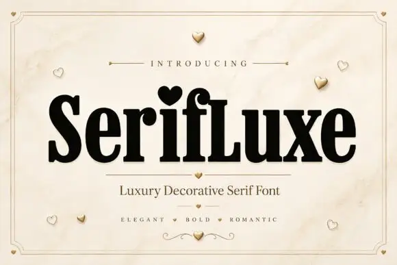
Heavy narrow serif with heart dot
Serifluxe is a heavy narrow serif in black on a marble panel: thick stems with fine joins, a heart-shaped dot over the i, tight counters and a small flourish at the foot, with a tracked line above and two lines of description beneath, framed by a thin double rule with gold hearts scattered across the sheet.
Ideas for this font
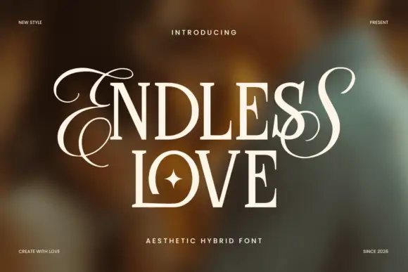
Upright contrasting capitals framed by looping endpoint letters
Endless Love is a contrasting upright capital face in which the first and last letters carry long loops that leave the cap line above and below, so a two-line title reads as a framed romantic lockup.
Ideas for this font
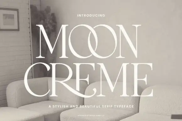
Fine contrasting capitals with overlapping circular bowls
Moon Creme shows tall white serif capitals with fine hairlines and broad round O forms on a muted interior photograph, where the two O letters overlap into a single linked shape and the R leg of the lower row sweeps beneath the following letters before curling away.
Ideas for this font

Elegant feminine serif
Olivia Serif is an elegant serif in black on warm cream: high contrast, bracketed serifs, a large x-height and round bowls, set in title case on one line with a smaller serif line beneath, two tracked caps lines under that, and a fine ornamental frame with fleurons at the corners.
Ideas for this font
Same independent foundry
Allow optional Google Analytics to measure visits and catalogue actions. Your search words and notes are not included. Privacy & storage



