Neutral Sans Workhorse

Leaf + Modern Limited
Lets Leaf own the focal silhouette while handling secondary copy, sizing and subheads cleanly.
Inspect Modern Limited specimenDisclosure: MakerFileHub may earn a commission from qualifying purchases via paid links on this page. How our links work.
Segmented thin display
Leaf is a thin segmented display in white on a deep green wash: capitals built from separate strokes with rounded corners, horizontal arms detached from the stems and a tall pointed A, set as one word with wide letter spacing and no other copy on the sheet.
Paid link
Get this fontProject & layout blueprintsAt-a-glance maker compatibility
Sturdy stroke walls and open counters weed cleanly on adhesive vinyl, HTV apparel film, and cut cardstock.
Visual anatomy & craft review
The plate is almost empty: a single word in the centre of a saturated green field, and the restraint lets the construction be the subject. The drawing is a segmented capital face in which the arms stop short of the stems, so each letter reads as a diagram made of parts, and the rounded corners keep the thin strokes from looking fragile. That construction sets a large size floor, because the gaps between segments fill visually when the letters shrink, and the plate sets the word large enough that every break is clear. The green wash is staging. Because the letters are thin and separated, the face suits a mark, a cover and a screen at display sizes, and it needs a clean substrate rather than a rough one.
Display, thin, segmented, technical
Two-font hierarchy recipes
Tested contrast partners — pairing Leaf with grounded secondary typography.
Leaf + Modern Limited
Lets Leaf own the focal silhouette while handling secondary copy, sizing and subheads cleanly.
Inspect Modern Limited specimen
Leaf + Evoire
Grounds bold display lettering with classic typographic authority on posters, badges and apparel.
Inspect Evoire specimenPractical applications
Concrete hierarchy, scale and production guidance tailored to Leaf’s stroke geometry.
A segmented mark reads as drawn rather than set, and the separated arms give a short name a technical character on a card.
Hierarchy & layout recipe
Set the mark at 20 pt on a card, 100 mm on a window and 14 pt in a footer, keeping the segment gaps above 1 mm at every size. Keep one colour and clear space equal to the cap height.
Pre-production check
Check the 14 pt footer mark, where a gap can close; keep it above 1 mm or drop the size. Confirm the window mark reads at eight metres and that the segments cut cleanly in vinyl.
A segmented display gives a design cover an idea rather than a texture, and the thin strokes hold against a flat field. The idea needs air around it.
Hierarchy & layout recipe
Set the title at 90 mm cap height across 200 mm, the subtitle in an 8.5 pt sans, and the issue at 7 pt. Print one ink on a matte stock and keep 25 mm margins at the head and foot.
Pre-production check
Check the title at 90 mm, where a segment gap can fill on a matte sheet; proof it. Confirm the 7 pt issue survives lamination and that the title clears the trim at both ends.
A segmented face signals a studio culture, and the thin strokes read on an interior panel where a heavy face would shout.
Hierarchy & layout recipe
Fabricate a 900 by 320 mm panel: the school at 100 mm cap height, the floor in a 20 mm sans, and a 3 mm rule. Keep 25 mm margins and specify a matte finish rather than gloss.
Pre-production check
Check the panel at 100 mm, where a segment can vanish in metal; keep the gap above 4 mm. Confirm the 20 mm floor reads at three metres and that the rule clears the fixings.
Technical & licence verification
Confirm included OTF/TTF/WOFF formats, full glyph tables and licence coverage on the live store page before batch production.
Closest visual alternatives
Matched across letterform anatomy, stroke behaviour and craft applications.
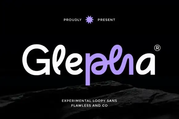
Looped rounded mixed case with interwoven central strokes and a deep p stem
Glepha shows white and purple lettering on black, where a broad open G introduces rounded lowercase forms, the l rises into a narrow loop and the central letters intertwine through a crossing horizontal stroke, while the p drops far below the main bodies and the final a keeps a simple broad bowl.
Ideas for this font
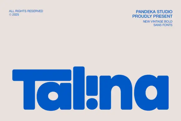
Heavy rounded logo display
Talina is a heavy rounded display in royal blue on a pale sheet: a short name set in very heavy rounded letters with an extended T arm, wide round bowls and an inverted dot-and-stem i that reads as a cut counter, with three small credits in the corners.
Ideas for this font
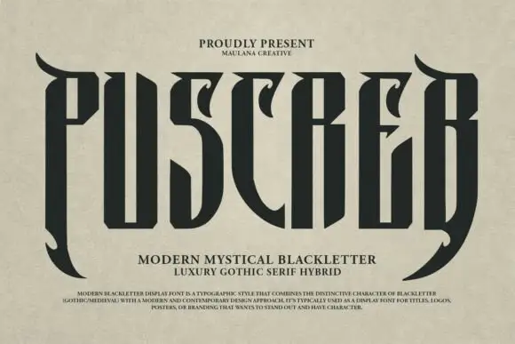
Tall narrow display with curved blades
Puscreb is a very tall narrow display in near-black on an aged paper ground: capitals with curved blades at the outer edges, deep pointed shoulders and narrow bodies, set as one large word above two plain lines and a small paragraph of description.
Ideas for this font
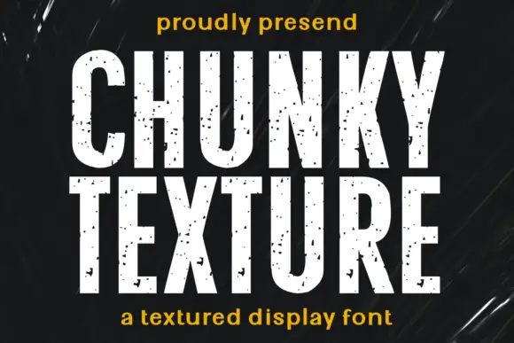
Condensed heavy capitals with sparse chips across pale faces
Chunky Texture is a condensed heavy display in which the stems run straight, the bowls stay compact and fine specks plus occasional larger chips interrupt the faces, so a heading reads as painted stencil with light wear.
Ideas for this font
Allow optional Google Analytics to measure visits and catalogue actions. Your search words and notes are not included. Privacy & storage