Editorial Serif Anchor

Honeymoon + Resquel
Anchors Honeymoon's fluid strokes with crisp Roman proportions on wedding suites, headers and packaging.
Inspect Resquel specimenDisclosure: MakerFileHub may earn a commission from qualifying purchases via paid links on this page. How our links work.
Low rounded monoline swash script with a wide flat baseline
Honeymoon is a low monoline script whose letters sit barely above the baseline, with wide rounded bowls and long entry and exit swashes that stretch a short word across the page.
Paid link
Get this fontProject & layout blueprintsAt-a-glance maker compatibility
Weld or Unite overlapping script joins into one continuous vector path before sending to the blade.
Visual anatomy & craft review
The capital h rises only slightly higher than the x-height letters, and its first stroke begins with a long entry swash from the left that starts near the baseline. Every letter is round: the o and e are near circles, the n keeps a wide arch, the m repeats that arch twice, and the joins are drawn at the x-height midline so the word reads as a string of loops. The final n exits in a long horizontal swash that lifts slightly at the tip, balancing the entry. Weight is uniform and rounded, with no swelling and no sharp taper, and the ends are capped rather than pointed. The small printed flower ornament above and the italic caption below are presentation; the script is the word.
Low · Rounded · Swashy
Two-font hierarchy recipes
Tested contrast partners — pairing Honeymoon with grounded secondary typography.
Honeymoon + Resquel
Anchors Honeymoon's fluid strokes with crisp Roman proportions on wedding suites, headers and packaging.
Inspect Resquel specimen
Honeymoon + Cenura
Keeps small-scale dates, URLs, nutrition facts and care instructions crisp and legible below script titles.
Inspect Cenura specimenPractical applications
Concrete hierarchy, scale and production guidance tailored to Honeymoon’s stroke geometry.
A low rounded script with long swashes reads as a ribbon over a table, and because the letters sit close to the baseline, the banner stays shallow enough to fit under a shelf or a garland.
Hierarchy & layout recipe
Set the word at 90 mm across a 1 m banner, keep the swashes 80 mm clear of each end, and set the date in a narrow sans at 25 mm on a second, smaller banner.
Pre-production check
A shallow banner hangs with a sag; check the assembled banner against the swash height and shorten the entry if it starts to dip below the hem.
The playful rounded swashes keep a commercial thank-you warm without looking childish, and the low x-height keeps the line shallow so the card can hold a handwritten message above it.
Hierarchy & layout recipe
Set the greeting at 22 pt at the head of a 148 by 105 mm card, leave 70 mm in the middle for handwriting, and keep the company name in a 7 pt sans at the foot.
Pre-production check
A low script printed near the top edge of a card can look like it is falling off; check the proof at final size and centre the swashes on the panel rather than the letters.
The wide low lettering suits a painted board over a doorway, and the even monoline stays legible at a distance where a high-contrast script would thin out at the joins.
Hierarchy & layout recipe
Set the name at 16 cm on a 900 by 300 mm board, keep the vacancy notice in a plain sans at 5 cm, and hold 12 cm at each end so both swashes finish inside the frame.
Pre-production check
Painted signage in a coastal climate is repainted every few years; photograph the finished board so the swash proportions can be reproduced exactly next time.
Technical & licence verification
Confirm included OTF/TTF/WOFF formats, full glyph tables and licence coverage on the live store page before batch production.
Closest visual alternatives
Matched across letterform anatomy, stroke behaviour and craft applications.
Rhinestone stencil script
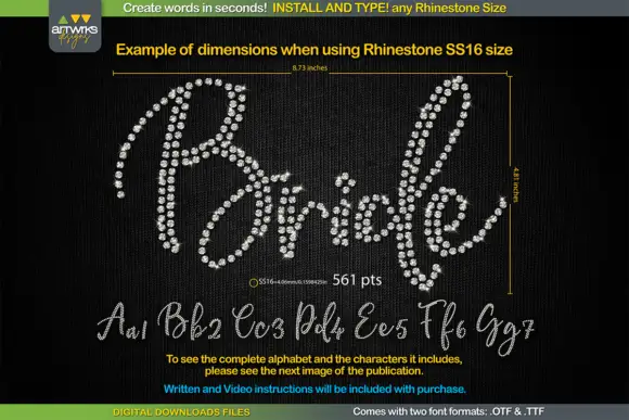
RS01 Cursiva is a rhinestone template script presented as a black template with stone positions: a connected cursive with narrow strokes, drawn at a fixed stone size so the lettering is assembled from a grid of dots rather than printed as a solid.
Ideas for this font
Upright handwritten script with round bowls
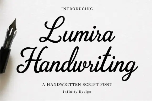
Lumira is an upright handwritten script in warm black: fat round bowls, tall narrow loops on the L and the H, short joins and a stroke that thickens and thins as a fountain pen would.
Ideas for this font
Monoline script with plump rounded bowls
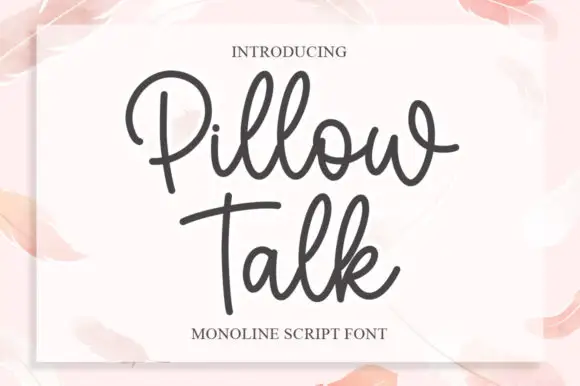
Pillow Talk is a monoline script in charcoal on a soft pink page: plump rounded bowls, a single even stroke, looped ascenders and a tight fit, printed on a white card that sits on a watercolour ground.
Ideas for this font
Rounded monoline-style script
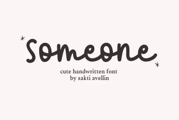
Someone is a rounded monoline script in dark brown on white: fat even strokes, round bowls, a lowercase s that opens with a curl and a final e whose exit loops back over the word.
Same independent foundry
Allow optional Google Analytics to measure visits and catalogue actions. Your search words and notes are not included. Privacy & storage