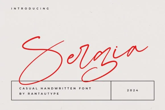
Editorial Serif Anchor

Hollins + Mewah
Anchors Hollins's fluid strokes with crisp Roman proportions on wedding suites, headers and packaging.
Inspect Mewah specimenDisclosure: MakerFileHub may earn a commission from qualifying purchases via paid links on this page. How our links work.
Tall fine signature script with delicate swashes
Hollins is a slender signature script that stretches its ascenders well above the x-height and holds every join at hairline weight, with swashes that leave the word instead of decorating it.
Paid link
Get this fontProject & layout blueprintsAt-a-glance maker compatibility
Weld or Unite overlapping script joins into one continuous vector path before sending to the blade.
Visual anatomy & craft review
The H lifts a long entry stroke from below the baseline, rises into a tall narrow stem and turns into the o with an open loop, and the l, l and i that follow repeat that height so the word is mostly vertical line. The lowercase x-height is small and the exits are long, which spreads the letters apart and gives the sample its quiet, unhurried spacing. Weight is a hairline at every point except where the stroke rests on the baseline, and the final s releases a thin swash that curls up and back rather than out. The round badge over the i-dot, the tracked caption at the foot and the soft fabric edges at the sides of the photograph are cover furniture, not alphabet.
Slender · Signature · Delicate
Two-font hierarchy recipes
Tested contrast partners — pairing Hollins with grounded secondary typography.
Hollins + Mewah
Anchors Hollins's fluid strokes with crisp Roman proportions on wedding suites, headers and packaging.
Inspect Mewah specimen
Hollins + Base Edge
Keeps small-scale dates, URLs, nutrition facts and care instructions crisp and legible below script titles.
Inspect Base Edge specimenPractical applications
Concrete hierarchy, scale and production guidance tailored to Hollins’s stroke geometry.
Fine tall lettering reads as a signature on a treatment-room door, and the small x-height keeps the mark narrow enough to sit beside a stacked service list without crowding it.
Hierarchy & layout recipe
Set the wordmark at 26 pt with the service list in a light sans at 9 pt to the right, and keep 10 mm between the tallest ascender and the top of the panel so the mark has air above it.
Pre-production check
At 26 pt the hairlines need a good substrate; on a painted or frosted panel ask for a cut vinyl in a matte finish rather than a thin print.
A tall signature sits comfortably on a narrow book cover, where a wide script would have to shrink and lose the fine detail that makes the lettering worth using.
Hierarchy & layout recipe
Set the names at 24 pt on a 105 by 148 mm cover, keep the date in a tracked sans at 7 pt at the foot, and centre the block vertically so the swash of the final letter does not run into the spine.
Pre-production check
Bound covers curve away from the block; check the swash clearance after the book is bound, not on a flat proof.
A fine signature closes an opinion column with a personal mark rather than a printed byline, which suits a section that already runs the writer's portrait.
Hierarchy & layout recipe
Set the signature at 15 pt on its own line after the final paragraph, leave 8 mm above it and 10 mm below before the section rule, and keep the printed byline in the standard face at the head of the piece.
Pre-production check
Tempting to track the signature out for effect, but the joins are drawn to meet; added spacing opens the word into unconnected letters.
Technical & licence verification
Confirm included OTF/TTF/WOFF formats, full glyph tables and licence coverage on the live store page before batch production.
Closest visual alternatives
Matched across letterform anatomy, stroke behaviour and craft applications.
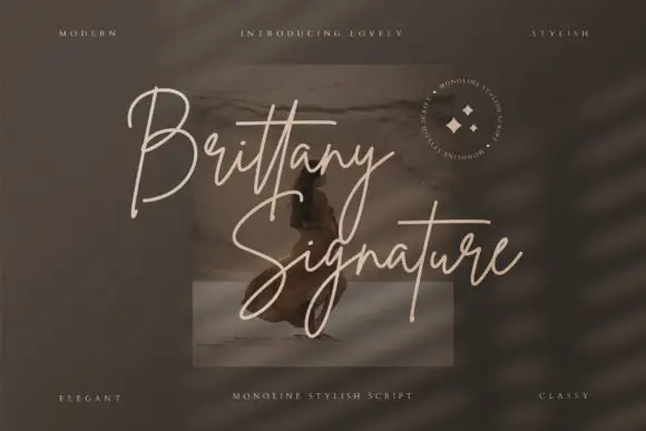
Monoline signature script with tall slender loops
Brittany Signature is a monoline signature script in which the capitals rise into slender loops, the body stays narrow and the joins stay even, so a name reads as a quick signature made with a fine marker.
Ideas for this font
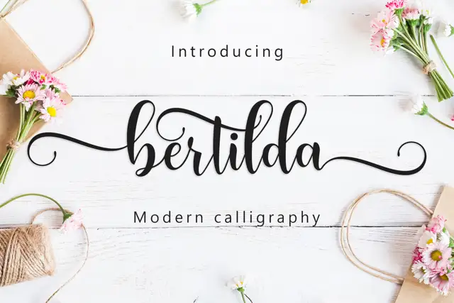
Broad swashed lowercase calligraphy
Bertilda Script is a broad lowercase calligraphy whose entry and exit swashes travel further than the letters themselves, so a seven-letter word occupies the width of a full line.
Ideas for this font
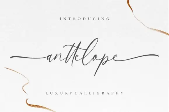
Fine extended calligraphy with long flat entry and exit strokes
Anttelope is fine extended calligraphy whose entry and exit strokes run almost the full width of the panel, with a small x-height and a light even line between them.
Ideas for this font
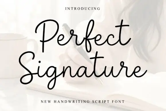
Open fine signature script
Perfect is an open handwriting script in black over a soft photograph: fine even strokes, wide loops on the ascenders and a level baseline, with a long exit stroke that runs out beneath the second line.
Ideas for this font
Same independent foundry
Allow optional Google Analytics to measure visits and catalogue actions. Your search words and notes are not included. Privacy & storage