Editorial Serif Anchor

Bertilda Script + Stanza
Anchors Bertilda Script's fluid strokes with crisp Roman proportions on wedding suites, headers and packaging.
Inspect Stanza specimenDisclosure: MakerFileHub may earn a commission from qualifying purchases via paid links on this page. How our links work.
Broad swashed lowercase calligraphy
Bertilda Script is a broad lowercase calligraphy whose entry and exit swashes travel further than the letters themselves, so a seven-letter word occupies the width of a full line.
Paid link
Get this fontProject & layout blueprintsAt-a-glance maker compatibility
Weld or Unite overlapping script joins into one continuous vector path before sending to the blade.
Visual anatomy & craft review
The b opens with a swash that travels left and curls up before the stem descends, the t, l and d lift tall thin ascenders above a rounded x-height, and the final a releases a long horizontal swash that doubles the width of the last letter. Weight splits the usual way for calligraphy: solid downstrokes, tapering joins and hairlines at every exit, and the contrast is strong enough that the word looks written with a pointed nib rather than drawn. The letters sit close together with no extra tracking, so the swashes do the work of separating them. The white wooden ground, the ribbon and the flowers in the photograph are the setting for the cover, and the light sans Introducing and Modern calligraphy lines belong to a second face.
Swashed · Rounded · Calligraphic
Two-font hierarchy recipes
Tested contrast partners — pairing Bertilda Script with grounded secondary typography.
Bertilda Script + Stanza
Anchors Bertilda Script's fluid strokes with crisp Roman proportions on wedding suites, headers and packaging.
Inspect Stanza specimen
Bertilda Script + Montreal
Keeps small-scale dates, URLs, nutrition facts and care instructions crisp and legible below script titles.
Inspect Montreal specimenPractical applications
Concrete hierarchy, scale and production guidance tailored to Bertilda Script’s stroke geometry.
Swung entry and exit strokes give a menu a header that fills the top of the card, and the strong thick-thin contrast keeps it formal enough for a seated dinner served outdoors.
Hierarchy & layout recipe
Set the header at 34 pt across the card's width, keep the courses in a light serif at 9 pt with 4 mm of leading, and allow the opening swash 12 mm of margin so it is never clipped by the trim.
Pre-production check
The swash is the widest part of the lockup; centre the word on the whole shape rather than on the letters, or the card will look shifted left.
A wide swashed script reads as a hand-painted shop name across glass, and the heavy downstrokes stay solid where a thin display face would wash out in daylight.
Hierarchy & layout recipe
Set the name at 300 mm wide on the fascia, keep the opening hours in a plain sans at 30 mm on the door, and hold the outer swash 40 mm inside the frame so the letters are not cut by the mullion.
Pre-production check
Vinyl on glass shows every wobble in a swash; have the cut checked at full width before the sheet is applied.
The long exit stroke gives an opener a natural rule beneath the title, which the layout can use instead of a drawn line to close the headline block.
Hierarchy & layout recipe
Run the title at 52 pt on the first page, let the closing swash finish flush with the column edge, and start the standfirst 6 mm under the lowest loop rather than on a fixed grid line.
Pre-production check
If the swash stops short of the measure it looks like a printing error; adjust the size until the exit lands on the column edge or drop the effect.
Technical & licence verification
Confirm included OTF/TTF/WOFF formats, full glyph tables and licence coverage on the live store page before batch production.
Closest visual alternatives
Matched across letterform anatomy, stroke behaviour and craft applications.
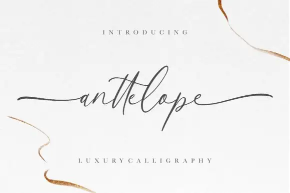
Fine extended calligraphy with long flat entry and exit strokes
Anttelope is fine extended calligraphy whose entry and exit strokes run almost the full width of the panel, with a small x-height and a light even line between them.
Ideas for this font
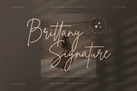
Monoline signature script with tall slender loops
Brittany Signature is a monoline signature script in which the capitals rise into slender loops, the body stays narrow and the joins stay even, so a name reads as a quick signature made with a fine marker.
Ideas for this font
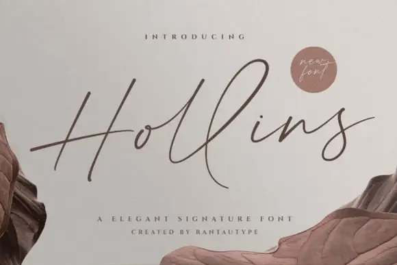
Tall fine signature script with delicate swashes
Hollins is a slender signature script that stretches its ascenders well above the x-height and holds every join at hairline weight, with swashes that leave the word instead of decorating it.
Ideas for this font
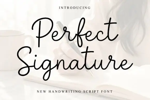
Open fine signature script
Perfect is an open handwriting script in black over a soft photograph: fine even strokes, wide loops on the ascenders and a level baseline, with a long exit stroke that runs out beneath the second line.
Ideas for this font
Allow optional Google Analytics to measure visits and catalogue actions. Your search words and notes are not included. Privacy & storage