Editorial Serif Anchor

Hickery + Lumera Editorial
Anchors Hickery's fluid strokes with crisp Roman proportions on wedding suites, headers and packaging.
Inspect Lumera Editorial specimenDisclosure: MakerFileHub may earn a commission from qualifying purchases via paid links on this page. How our links work.
Vintage bold brush stencil script with posted counters and curled exits
Hickery is a vintage bold brush script in which the joins are broken by narrow stencil gaps, the strokes stay fat and the final letter curls into a wide exit.
Paid link
Get this fontProject & layout blueprintsAt-a-glance maker compatibility
Open counter bridges hold interior islands intact on laser-cut wood, acrylic, and mylar stencils.
Visual anatomy & craft review
The capital H opens as a broad looped stem before the word settles into thick connected letters: the i carries a solid dot, the c and the k close against their joins, the e lifts into a curl and the r and the y repeat the same fat weight. What separates the face from a plain retro script is the stencil logic: narrow gaps are cut through the strokes where a sign painter would have lifted the brush, which lets the lettering be cut in vinyl or stencil film without bridges. Weight is heavy and the exits are curled rather than tapered, giving the word its painted-sign finish. The olive ground, the cream ink, the line-drawn ship and the small credits are presentation; the script is the word.
Vintage · Stencil · Bold
Two-font hierarchy recipes
Tested contrast partners — pairing Hickery with grounded secondary typography.
Hickery + Lumera Editorial
Anchors Hickery's fluid strokes with crisp Roman proportions on wedding suites, headers and packaging.
Inspect Lumera Editorial specimen
Hickery + Nyxar
Keeps small-scale dates, URLs, nutrition facts and care instructions crisp and legible below script titles.
Inspect Nyxar specimenPractical applications
Concrete hierarchy, scale and production guidance tailored to Hickery’s stroke geometry.
The stencil gaps let the mark be cut and applied without bridges, and the fat brush weight reads down a street from the pavement.
Hierarchy & layout recipe
Set the shop name at 20 cm on the glass, keep the opening hours in a condensed bold at 4 cm, and hold 12 cm of clearance so the curled exit stays on the pane.
Pre-production check
Stencil gaps under 2 mm close when the vinyl is weeded; check the cut file at full size and widen the narrowest gap before plotting.
The painted-sign weight suits a period venue, and the stencil construction means a wooden sign can be lettered with a cut template.
Hierarchy & layout recipe
Set the greeting at 12 cm on a 700 by 500 mm board, set both names at 7 cm beneath, and leave 12 cm of margin so the curl and the stencil gaps stay on the board.
Pre-production check
Stencil lettering on timber bleeds under the template; check one letter first and seal the board before the rest are painted.
The vintage script gives a feature its period voice, and the fat weight holds up against a photograph where a fine script would disappear.
Hierarchy & layout recipe
Set the header at 54 pt across the opening spread, keep the body in a 10 pt serif at 13 pt leading, and hold 18 mm below the header so the descenders clear the columns.
Pre-production check
A stencil gap printed small can look like a fault; check the page proof and keep the header above 50 pt so the gaps read as intentional.
Technical & licence verification
Confirm included OTF/TTF/WOFF formats, full glyph tables and licence coverage on the live store page before batch production.
Closest visual alternatives
Matched across letterform anatomy, stroke behaviour and craft applications.
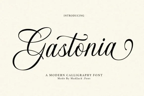
Contrasting calligraphy with a large looped G
Gastonia Script leads with a large double-looped G that extends far above and below the lowercase body, a long crossbar arcs across the central t and the final stroke climbs into a separate loop on the right.
Ideas for this font
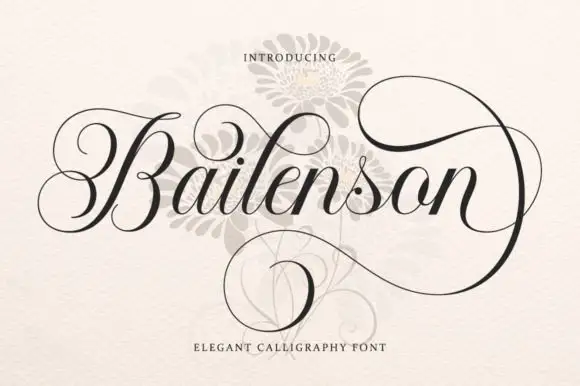
Steeply slanted fine links with thick curved downstrokes
Bailenson runs steeply slanted fine links against thick curved downstrokes, the capital B curls far to the left and the terminal n carries large upper and lower loops that close around the word.
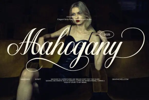
Elegant wide-swash script
Mahogany is an elegant script in white over a dark photograph: heavy shaded downstrokes, hairline joins, a capital M drawn as one wide travelling swash and a y whose tail sweeps out to the edge of the frame.
Ideas for this font
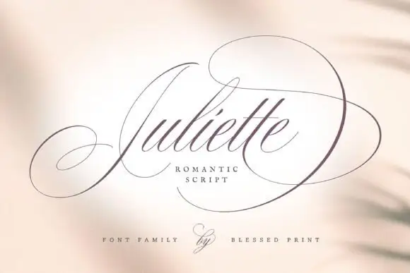
Fine Spencerian calligraphy with oversized flourish loops
Juliette is a fine Spencerian script in which hairline joins run between narrow shaded downstrokes, and the flourish loops thrown off the first and last letters extend far enough to set the width of the whole word.
Ideas for this font
Same independent foundry
Allow optional Google Analytics to measure visits and catalogue actions. Your search words and notes are not included. Privacy & storage



