Modern Grotesque Body

Healing + Bargain Condensed
Creates crisp high-hierarchy contrast beneath Healing headlines across menus, websites and labels.
Inspect Bargain Condensed specimenDisclosure: MakerFileHub may earn a commission from qualifying purchases via paid links on this page. How our links work.
Fine serif title surrounded by large spiral extensions
Healing shows light contrasting mixed-case letters with narrow upright stems and rounded bowls, where large loops rise above the centre of the word and sweep below the title, and the H and g carry curled outer strokes over a dark portrait.
Paid link
Get this fontProject & layout blueprintsAt-a-glance maker compatibility
Crisp hairline serifs shine on stationery, foil stamping, and packaging; add slight offset for small decals.
Visual anatomy & craft review
The stems stay narrow, the bowls stay round, the contrast swings, and two letters throw wide loops above and below the line. That vertical sweep is the character, because the loops turn a single word into a piece of ornament that needs air on both sides. The sparkles, the botanical outline and the portrait belong to the cover, and the source notes ligature variations. Check that your app reaches those alternates, keep 34 pt before the hairlines thin out and plan 30 mm above and below for the loops.
Fine serif title surrounded by large spiral extensions
Two-font hierarchy recipes
Tested contrast partners — pairing Healing with grounded secondary typography.
Healing + Bargain Condensed
Creates crisp high-hierarchy contrast beneath Healing headlines across menus, websites and labels.
Inspect Bargain Condensed specimen
Healing + Simple Alphabet
Adds a warm human signature touch for 1-to-3-word callouts without competing against structured serif capitals.
Inspect Simple Alphabet specimenPractical applications
Concrete hierarchy, scale and production guidance tailored to Healing’s stroke geometry.
The light contrast and the loops give a modern suite its ornament without a border, which suits a couple avoiding traditional frames.
Hierarchy & layout recipe
Print a 120 by 180 mm card: set the names at 34 pt on one row, keep 28 mm of clear ground above for the upper loops and 30 mm beneath, and keep 18 mm of margin at each side.
Pre-production check
The loops need space on both sides; check the card layout before the artwork is finalised.
The narrow stems set an elegant title and the loops supply movement, so a quiet editorial cover still reads as designed.
Hierarchy & layout recipe
Print a 210 by 280 mm cover: set the title at 56 pt on one row, keep 26 mm of clear ground above and 30 mm beneath for the loops, and keep the photograph's calmest area behind the word.
Pre-production check
Hairlines over a photograph disappear; check the cover and place the title on a flat panel.
The light serif gives a small brand a calm register, and the loops turn a short name into a mark that fills a wide label.
Hierarchy & layout recipe
Print an 85 by 55 mm label: set the name at 24 pt on one row, keep 16 mm of clear ground above and below for the loops, and keep 7 mm to the die edge.
Pre-production check
Ligatures are advertised in the source notes; check the file and your app before relying on a joined pair in the name.
Technical & licence verification
Confirm included OTF/TTF/WOFF formats, full glyph tables and licence coverage on the live store page before batch production.
Closest visual alternatives
Matched across letterform anatomy, stroke behaviour and craft applications.
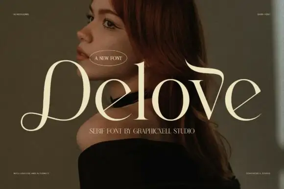
Fine broad serif with a looping initial and a hooked ascending extension
Delove is a fine luxury serif in which the bowls stay large and round, the hairlines thin to almost nothing, the D opens a low looping entry and a long extension curls over the v, so a name reads as couture lettering.
Ideas for this font
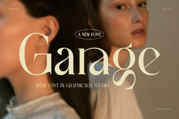
High-contrast fashion serif with broad bowls and a tightly curled g
Garage is a high-contrast fashion serif in which the bowls stay broad, the joins thin to hairlines and the lower g closes a tight curl beneath the baseline, so a mixed-case line reads as an editorial masthead.
Ideas for this font
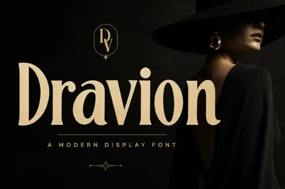
Tall high-contrast serif letters with tapered strokes and rounded counters
Dravion sets a large cream word against a dark photograph, where narrow hairlines meet thick upright strokes, the capital D stands tall and bowed, the a keeps a rounded bowl and the r ends in a soft curved terminal.
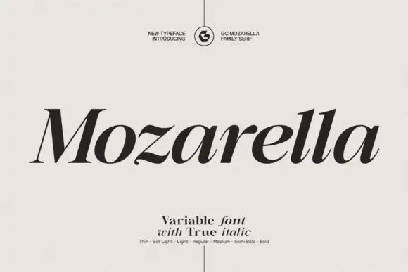
Variable serif with a true italic
Mozarella is a variable serif set in a true italic: high contrast, sharp wedge serifs, a compressed and slanted drawing that keeps its letterforms rather than obliquing them, and a weight axis from thin to bold named on the specimen.
Ideas for this font
Same independent foundry
Allow optional Google Analytics to measure visits and catalogue actions. Your search words and notes are not included. Privacy & storage