Neutral Sans Workhorse

Halloween Alphabet + Lemon Milk Pro FTR
Lets Halloween Alphabet own the focal silhouette while handling secondary copy, sizing and subheads cleanly.
Inspect Lemon Milk Pro FTR specimenDisclosure: MakerFileHub may earn a commission from qualifying purchases via paid links on this page. How our links work.
Outline Halloween treats, eyeballs, fingers and a crescent-marked book
Halloween Alphabet is listed as dingbats and shows black outline objects rather than a readable A to Z row: eyeball sweets, dripping ice cream, a frosted cupcake, a pumpkin bag, pointed nails, socks and a crescent-marked book.
Paid link
Get this fontProject & layout blueprintsAt-a-glance maker compatibility
Sturdy stroke walls and open counters weed cleanly on adhesive vinyl, HTV apparel film, and cut cardstock.
Visual anatomy & craft review
The objects keep broad white interiors inside firm black contours, and the small dark parts sit inside those shapes as pupils, nails and icing lines. The mixture of sizes is the character: the motifs are drawn as a set of pictures rather than as letterforms, which is why the cover shows no alphabet row at all. Because the fine icing lines are thin, set any motif at 30 mm before the interior detail survives, and treat the grotesque sweets as illustration rather than food information. Check the glyph map before relying on a specific number of motifs.
Dingbats · Outline motifs · Seasonal
Two-font hierarchy recipes
Tested contrast partners — pairing Halloween Alphabet with grounded secondary typography.
Halloween Alphabet + Lemon Milk Pro FTR
Lets Halloween Alphabet own the focal silhouette while handling secondary copy, sizing and subheads cleanly.
Inspect Lemon Milk Pro FTR specimen
Halloween Alphabet + Orvelia
Grounds bold display lettering with classic typographic authority on posters, badges and apparel.
Inspect Orvelia specimenPractical applications
Concrete hierarchy, scale and production guidance tailored to Halloween Alphabet’s stroke geometry.
The outlined motifs work as small decorations around a party sheet, and each shape holds its white interior at 25 mm across a printed A4 page. The set also works scattered as decoration rather than in a row.
Hierarchy & layout recipe
Print an A4 sheet: place six motifs at 25 mm each in a loose row, keep 12 mm between them so the contours stay separate, and set the party details at 11 pt in a clean sans in the lower third.
Pre-production check
Two motifs set closer than 6 mm merge their outlines into one shape; check the sheet at full size and open the spacing to 10 mm.
A single outline motif reads on a topper, and the broad interior stays clear when the shape is cut at 60 mm across. A single motif also keeps a small cake from looking busy.
Hierarchy & layout recipe
Print a 60 mm topper: centre one motif on the disc, keep 8 mm of clear card around the contour, and glue the motif to a stick behind the card so the outline stays crisp on the front.
Pre-production check
A motif cut at 30 mm loses the icing lines; check the cutter against the print and scale the motif up rather than thinning its contour.
The outline motifs read from the pavement, and the strong contours stand out on glass at 90 mm without a second colour. Glass also rewards the plain outline over a filled shape.
Hierarchy & layout recipe
Print a set of 90 mm window stickers: keep the contour at 2 mm minimum, keep 20 mm between each motif so a single sticker can be peeled away, and place them no higher than eye level on the glass.
Pre-production check
Contours thinner than 1.5 mm peel at the corners on glass; check the die proof and keep every outline at 2 mm or more.
Technical & licence verification
Confirm included OTF/TTF/WOFF formats, full glyph tables and licence coverage on the live store page before batch production.
Closest visual alternatives
Matched across letterform anatomy, stroke behaviour and craft applications.
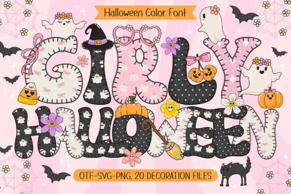
Rounded patchwork letters with pink motifs and small Halloween figures
Girly Halloween sets fat colour capitals in two treatments — cream with tiny black ghosts, and black with white dots — and dresses every letter with a bow, a flower, a pumpkin or a friendly ghost.
Ideas for this font
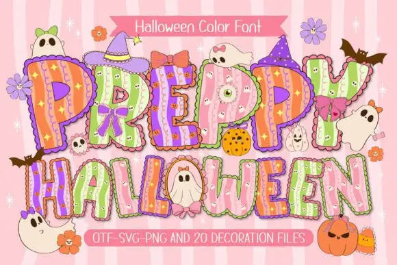
Scalloped pastel Halloween display
Preppy Halloween is a colour display on a pink striped ground: scalloped pastel capitals filled with vertical stripes and tiny spooky motifs, outlined in white with a shadow, decorated with bows, hats, ghosts and pumpkins, with two ribbons that name the format list and the count of decoration files.
Ideas for this font
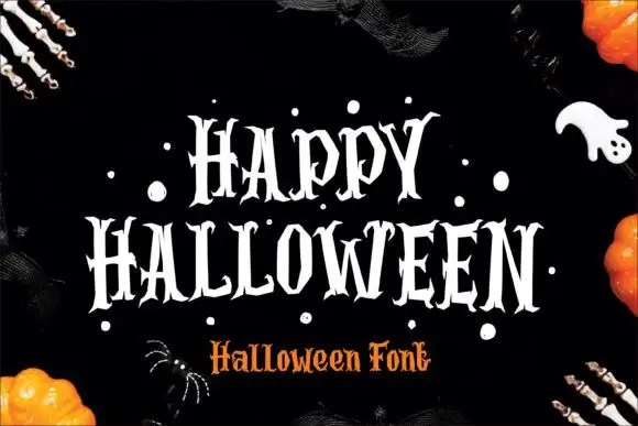
Narrow pointed Halloween capitals
Halloween shows narrow upright capitals with sharply split serifs and jagged pointed terminals, where the H carries a long thin cross-stroke and the O narrows into angular curves above deep pointed feet.
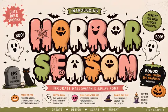
Bubble horror letters with faces and webs
Horror Season mixes puffy capitals with melting lower edges and face-shaped counters, where webs, cracks and small creature details appear inside selected letter bodies and the title is multicoloured with a heavy outline.
Ideas for this font
Allow optional Google Analytics to measure visits and catalogue actions. Your search words and notes are not included. Privacy & storage