Editorial Serif Anchor

Autography + The Bilstein Editorial
Anchors Autography's fluid strokes with crisp Roman proportions on wedding suites, headers and packaging.
Inspect The Bilstein Editorial specimenDisclosure: MakerFileHub may earn a commission from qualifying purchases via paid links on this page. How our links work.
Sharp angled signature script
Autography is a signature script built on sharp angles: strokes turn at points rather than curves, the slant is consistent, and the ascenders are drawn as straight diagonal lifts.
Paid link
Get this fontProject & layout blueprintsAt-a-glance maker compatibility
Weld or Unite overlapping script joins into one continuous vector path before sending to the blade.
Visual anatomy & craft review
The capital A opens with a straight rising stroke, breaks at a point and comes down through the crossbar, and the t that follows lifts a tall thin ascender with a short cross set high. Where a rounded script would bend, this one corners: the tops of the a and u meet in small peaks, the g drops straight before it turns, and the joins between letters sit as short diagonal links rather than as curves. Weight is thin with a slight thickening on the downstrokes, which reads as a fast fountain-pen signature rather than as drawn lettering. The card sits on a maroon ground with a round monogram above the word, and both the monogram and the small copyright line under the caption belong to the presentation, not to the alphabet.
Elegant · Angular · Quick
Two-font hierarchy recipes
Tested contrast partners — pairing Autography with grounded secondary typography.
Autography + The Bilstein Editorial
Anchors Autography's fluid strokes with crisp Roman proportions on wedding suites, headers and packaging.
Inspect The Bilstein Editorial specimen
Autography + Kohilo
Keeps small-scale dates, URLs, nutrition facts and care instructions crisp and legible below script titles.
Inspect Kohilo specimenPractical applications
Concrete hierarchy, scale and production guidance tailored to Autography’s stroke geometry.
An angular signature reads as a quick hand at the bottom of a print, and the straight ascenders keep the mark thin enough to sit in the corner of a frame without covering the image.
Hierarchy & layout recipe
Keep the mark at 22 mm wide in the lower corner of a print, allow 10 mm from the image edge to the first stroke, and set no other text beside it on the front of the mount.
Pre-production check
Signatures on matte mounts catch the light differently from the print; test the placement at the final size before the mount board is cut.
The angular script makes an attribution read as a signature rather than as a caption, which is the difference between a quote that belongs to a person and one that belongs to the page.
Hierarchy & layout recipe
Set the name at 18 pt under the pull quote, keep the role line in a small sans at 8 pt beneath it, and hold 8 mm between the quote's last line and the top of the signature.
Pre-production check
Against a tinted quote panel the thin strokes can sink into the background; check the contrast at the printed size, not on a backlit screen.
A fast signature suits a short personal message and looks written for one person, which is what a printed card has to fake when the run is only a few dozen.
Hierarchy & layout recipe
Set the greeting at 20 pt on a 120 mm square card, keep the message in a light serif at 10 pt, and hold the angled final stroke 12 mm clear of the fold so it is never creased.
Pre-production check
If the card is scored and folded, the score line must miss the longest stroke; mark the fold on the proof before the run goes out.
Technical & licence verification
Confirm included OTF/TTF/WOFF formats, full glyph tables and licence coverage on the live store page before batch production.
Closest visual alternatives
Matched across letterform anatomy, stroke behaviour and craft applications.
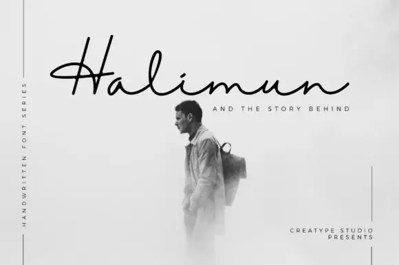
Fine low signature with a crossed capital and a wide flat baseline
Halimun is a fine signature script in which the capital crosses its own stem, the body stays low and the joins stay thin, so a name reads as something written on a photograph with a fine pen.
Ideas for this font
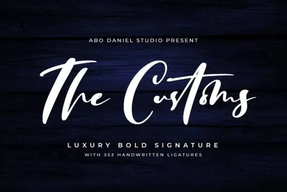
High-contrast signature strokes
The Customs is a high-contrast signature in white on navy timber: a capital T that runs above the line as a long bar, heavy shaded downstrokes, hairline joins, and a capital C drawn as a wide open oval.
Ideas for this font
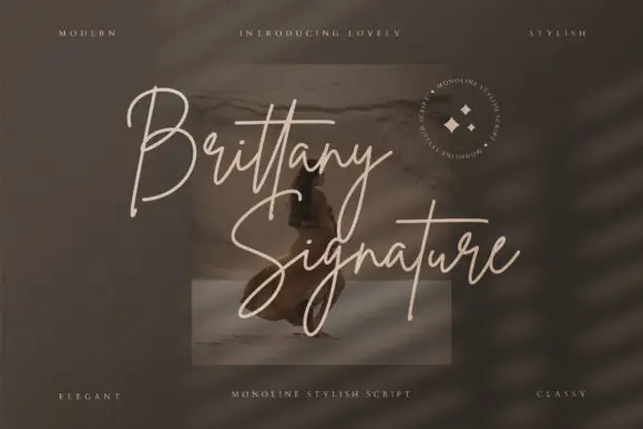
Monoline signature script with tall slender loops
Brittany Signature is a monoline signature script in which the capitals rise into slender loops, the body stays narrow and the joins stay even, so a name reads as a quick signature made with a fine marker.
Ideas for this font
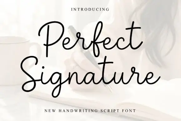
Open fine signature script
Perfect is an open handwriting script in black over a soft photograph: fine even strokes, wide loops on the ascenders and a level baseline, with a long exit stroke that runs out beneath the second line.
Ideas for this font
Same independent foundry
Allow optional Google Analytics to measure visits and catalogue actions. Your search words and notes are not included. Privacy & storage