Modern Grotesque Body

Gloom + Borsen
Creates crisp high-hierarchy contrast beneath Gloom headlines across menus, websites and labels.
Inspect Borsen specimenDisclosure: MakerFileHub may earn a commission from qualifying purchases via paid links on this page. How our links work.
Fine mixed case with overlapping round o bowls
Gloom shows pale high-contrast mixed case against a blurred monochrome scene: the G opens a large bowl, the tall l ends in a fine angled top and the two central o bowls overlap into an interlaced oval while the m stands apart.
Paid link
Get this fontProject & layout blueprintsAt-a-glance maker compatibility
Crisp hairline serifs shine on stationery, foil stamping, and packaging; add slight offset for small decals.
Visual anatomy & craft review
The bowls overlap without merging, the hairlines thin at every join, the ascenders rise on fine stems and the final letters break the circular centre. The interlaced pair is the character: two round letters share an edge and pull the middle of the word together, which is why the sample sets one name over a soft ground. Because the overlap is the point, keep 28 pt before it reads as design rather than a collision, and keep coated stock under the hairlines.
Fine · Overlapping bowls · Interlaced
Two-font hierarchy recipes
Tested contrast partners — pairing Gloom with grounded secondary typography.
Gloom + Borsen
Creates crisp high-hierarchy contrast beneath Gloom headlines across menus, websites and labels.
Inspect Borsen specimen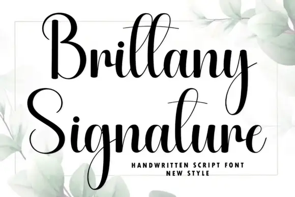
Gloom + Brittany Signature
Adds a warm human signature touch for 1-to-3-word callouts without competing against structured serif capitals.
Inspect Brittany Signature specimenPractical applications
Concrete hierarchy, scale and production guidance tailored to Gloom’s stroke geometry.
The interlaced bowls give a title its centre of gravity, and the fine mixed case holds a one-word heading at 58 pt across a printed spread. The interlaced centre also keeps a short title from reading as a plain serif.
Hierarchy & layout recipe
Print a 210 mm spread: set the title at 58 pt, keep 20 mm of clear ground beneath for the angle-cut ascender, and set the standfirst at 10 pt in a serif on a 64 mm measure. Keep the standfirst on the same measure.
Pre-production check
Two overlapped bowls printed at 24 pt read as a smudge; check the proof and keep the title at 44 pt or above. Ask for a film at 100 percent.
The fine interlaced letters give a flacon a distinct mark, and the hairlines stay readable at 22 pt on a coated label. The overlap also gives a bottle label its single detail.
Hierarchy & layout recipe
Print a 45 by 65 mm label: set the house name at 22 pt, keep 8 mm of clear ground beneath the bowls, and set the volume in a 5 pt caps at the foot with 4 mm of clear space. Keep the label panel square.
Pre-production check
Hairlines spread on an uncoated label at 18 pt; check the proof and keep the name at 20 pt on coated stock. Ask for a wet proof at final size.
The overlapping bowls give a contemporary suite its detail, and the fine letters keep two names light at 24 pt on heavy card stock. The interlaced pair also keeps a formal row from feeling stiff.
Hierarchy & layout recipe
Print a 130 by 180 mm card: set the names at 24 pt, keep 14 mm of clear ground above for the angled ascender, and set the venue at 9 pt in a light serif with 12 mm of clear space below.
Pre-production check
An interlaced pair printed small on textured card closes up; check the card and keep the names at 22 pt on a smooth stock.
Technical & licence verification
Confirm included OTF/TTF/WOFF formats, full glyph tables and licence coverage on the live store page before batch production.
Closest visual alternatives
Matched across letterform anatomy, stroke behaviour and craft applications.
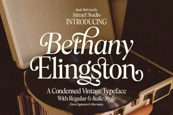
Condensed serif pairing with curled capitals and a looping g
Bethany Elingston shows pale mixed-case serif letters in a slanted upper row and a straighter lower row over an open record player, where curled B and E entries, a tall looped h and a low g extension make the compact stack ornamental, and the cover advertises regular, italic, ligatures and alternates.
Ideas for this font
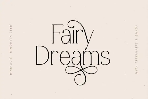
Fine narrow mixed case with oversized upper and lower loops
Fairy Dreams shows thin black mixed case with tall narrow stems and small serif ends. A large upper loop arches across the first line, and a figure-eight-like extension descends below Dreams, while the light lettering sits on plain cream with swash wording along the sides.
Ideas for this font

Fine narrow elegant serif
Wolles Elegant Modern Serif is a fine narrow serif in cream over a warm blurred interior: tall caps with hairline stems, a raised curve on the W and a low tail on the L, long flat serifs and wide spacing, with small tracked notes in the upper corners and a line beneath.
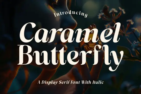
Slanted upper name above upright narrow contrasting mixed case
Caramel Butterfly shows pale serif letters with substantial curved sides and fine joins, where Caramel leans right while Butterfly stands more upright with narrow bowls, a tall curled f and a low sweeping y.
Same independent foundry
Allow optional Google Analytics to measure visits and catalogue actions. Your search words and notes are not included. Privacy & storage