Modern Grotesque Body

Famous Together + Monure
Creates crisp high-hierarchy contrast beneath Famous Together headlines across menus, websites and labels.
Inspect Monure specimenDisclosure: MakerFileHub may earn a commission from qualifying purchases via paid links on this page. How our links work.
Substantial mixed case with broad bowls and a deep descender loop
Famous Together is a substantial mixed-case serif in which the bowls run broad, the stress is nearly vertical and the g drops a deep looped descender, so a word reads as a printed editorial title rather than a display face.
Paid link
Get this fontProject & layout blueprintsAt-a-glance maker compatibility
Sturdy stroke walls and open counters weed cleanly on adhesive vinyl, HTV apparel film, and cut cardstock.
Visual anatomy & craft review
The F keeps two arms and a short middle bar, the a closes a wide bowl, the m holds three even arches, the g drops a loop that reaches well below the baseline and the e loops back at a shallow angle, all at a heavy weight with a moderate contrast and generous width. The deep g is the character: it sets the leading for any stacked line, which is why the sample sets two lines apart. Because the face is broad, two words fill a cover at 64 pt without tracking. The mountain photograph, the white ink, the four corner labels are presentation; the serif is the two words.
Substantial · Broad · Editorial
Two-font hierarchy recipes
Tested contrast partners — pairing Famous Together with grounded secondary typography.
Famous Together + Monure
Creates crisp high-hierarchy contrast beneath Famous Together headlines across menus, websites and labels.
Inspect Monure specimen
Famous Together + Coastal Honey
Adds a warm human signature touch for 1-to-3-word callouts without competing against structured serif capitals.
Inspect Coastal Honey specimenPractical applications
Concrete hierarchy, scale and production guidance tailored to Famous Together’s stroke geometry.
The broad bowls fill a cover at 64 pt, and the deep descender sets a generous leading that keeps two lines from colliding over a photograph.
Hierarchy & layout recipe
Print an A4 cover: set the title at 64 pt in two lines with 18 mm leading, set the standfirst in a 10 pt serif at the foot, and keep 20 mm of margin so the loop of the g stays inside the trim.
Pre-production check
A deep descender printed close to a second line collides; check the proof and open the leading by 3 mm rather than reducing the size.
The editorial weight gives an opening title the calm of a printed magazine, and the broad bowls stay readable at 48 pt across a spread.
Hierarchy & layout recipe
Print an A4 spread: set the title at 48 pt across the left page, set the standfirst in a 11 pt serif at 15 pt leading, and hold 18 mm below the title so the descender loop clears the text.
Pre-production check
A broad title over two columns can look top-heavy; check the imposed spread and keep the title within one column width.
The substantial letters read at 14 cm on a fascia, and the editorial register suits a trade built on print rather than on retail noise.
Hierarchy & layout recipe
Print a 900 by 300 mm fascia panel: set the shop name at 14 cm, set the street in a 4 cm serif beneath, and keep 10 cm of border so the broad bowls sit clear of the panel edge and the fixings.
Pre-production check
An editorial serif at 14 cm needs a solid ink; check the panel proof and avoid a tint that would grey the hairlines.
Technical & licence verification
Confirm included OTF/TTF/WOFF formats, full glyph tables and licence coverage on the live store page before batch production.
Closest visual alternatives
Matched across letterform anatomy, stroke behaviour and craft applications.
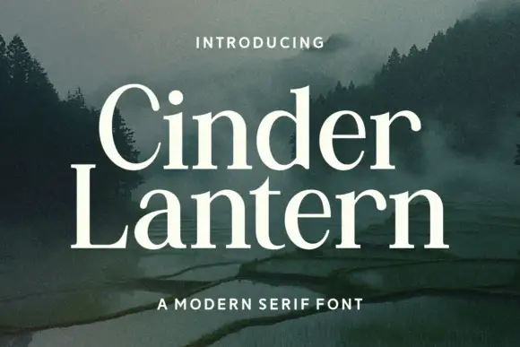
Open traditional serif with contrasting stems and curved serif transitions
Cinder Lantern is an open traditional serif in which the stems contrast clearly, the bowls stay broad and round, the L carries a long fine foot and the t rises above a compact lowercase, so a two-line title reads as a calm editorial head.
Ideas for this font
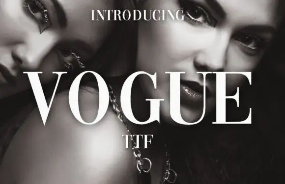
High-contrast didone with hairline serifs
Vogue is a high-contrast didone serif in white over a black-and-white beauty photograph: hairline serifs, a very thin crossbar on the A, a round O and a G with a fine spur, set in capitals as a magazine masthead.
Ideas for this font

High-contrast fashion serif with thin hairlines and sculpted stems across nine weights
Augler is a high-contrast fashion serif in which the hairlines stay razor thin, the stems carry sculpted weight and the family runs across nine cuts, so one word can sit light on a cover or heavy in a caption without changing voice.
Ideas for this font

Editorial display serif with italics
Raffined is a display serif in cream over a warm skin-toned photograph: a high-contrast roman with sharp serifs and a narrow waist, paired with a true italic that carries a flowing tail, set across four lines at increasing sizes with small tracked notes in the corners.
Same independent foundry
Allow optional Google Analytics to measure visits and catalogue actions. Your search words and notes are not included. Privacy & storage