Neutral Sans Workhorse

Cute Dinosaur + Mansory
Lets Cute Dinosaur own the focal silhouette while handling secondary copy, sizing and subheads cleanly.
Inspect Mansory specimenDisclosure: MakerFileHub may earn a commission from qualifying purchases via paid links on this page. How our links work.
Chunky capitals with small dorsal spikes, pale spots and an occasional footprint opening
Cute Dino fills fat rounded capitals with bright colour and then decorates each letter differently, so one carries spots, another stripes and a third a row of spikes, while a white footprint sits inside the O.
Paid link
Get this fontProject & layout blueprintsAt-a-glance maker compatibility
Sturdy stroke walls and open counters weed cleanly on adhesive vinyl, HTV apparel film, and cut cardstock.
Visual anatomy & craft review
CUTE over DINO fills a cream card framed with jungle leaves and cartoon dinosaurs in four poses and colours. Letters keep soft rounded corners and generous bowls, so the decoration never eats the shape, and the interiors alternate between patterned fills and plain colour. The footprint in the O is the one glyph that reads as an illustration, and it gives the word an instant association. Two tracked captions frame the card in bright teal. Because every letter carries a different treatment, the face works as a display line and not as an alphabet you can set long words in without the pattern becoming noise.
Chunky capitals with small dorsal spikes, pale spots and an occasional footprint opening
Two-font hierarchy recipes
Tested contrast partners — pairing Cute Dinosaur with grounded secondary typography.
Cute Dinosaur + Mansory
Lets Cute Dinosaur own the focal silhouette while handling secondary copy, sizing and subheads cleanly.
Inspect Mansory specimen
Cute Dinosaur + Flowsky Editorial
Grounds bold display lettering with classic typographic authority on posters, badges and apparel.
Inspect Flowsky Editorial specimenPractical applications
Concrete hierarchy, scale and production guidance tailored to Cute Dinosaur’s stroke geometry.
The letters carry the theme with their own decorations, so a parent can skip balloons and still get a card that reads as a party.
Hierarchy & layout recipe
Print a 105 by 148 mm invitation: set the name at 34 pt across one row, keep 14 mm of clear ground beneath before the time at 9 pt, and keep 12 mm of margin so no spike is cropped at the corner.
Pre-production check
Decorations differ by letter; check your own word at final size before the invitation card run.
The rounded letters stay friendly at child height, and the bright fills read in a room where a thin script would disappear.
Hierarchy & layout recipe
Print a 297 by 210 mm sign: set the heading at 66 pt on one row, keep 20 mm of clear ground beneath before the opening hours at 14 pt, and keep 18 mm of border so the letters sit inside the frame.
Pre-production check
Bright inks fade in sunlight; check where the sign hangs before the sign print order is confirmed.
The playful weight signals a children's trail rather than a formal exhibit label, and the heavy letters stay readable on a hanging tag.
Hierarchy & layout recipe
Print a 50 by 90 mm tag: set the trail name at 15 pt on one row, keep 6 mm of clear ground beneath before the step number at 6 pt, and keep 5 mm from the art to the punch hole.
Pre-production check
Small interiors blur on a cheap tag stock; check the printed tag sample before ordering the batch.
Technical & licence verification
Confirm included OTF/TTF/WOFF formats, full glyph tables and licence coverage on the live store page before batch production.
Closest visual alternatives
Matched across letterform anatomy, stroke behaviour and craft applications.
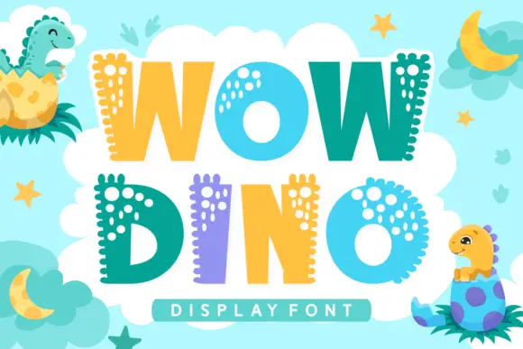
Broad capitals with rounded side bumps and pale spots clustered near one edge
Wow Dino is a playful colour font in which each capital carries a dinosaur spine: a row of rounded plates along the top edge, a dotted pattern inside the strokes and a bright fill that alternates between teal, yellow and lilac.
Ideas for this font
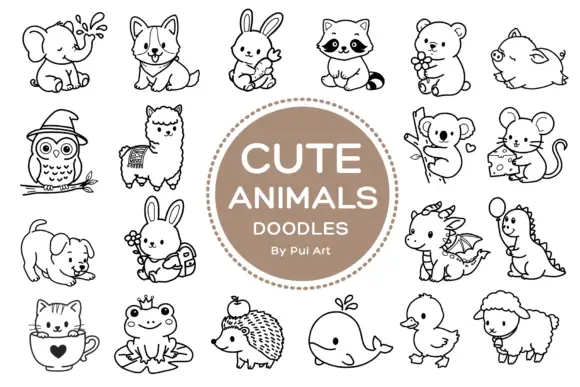
Rounded black outline animal dingbats with simple expressions and props
Cute Animals Doodles is a typable collection of about two dozen animals — elephant, corgi, bunny, raccoon, bear, owl, alpaca, koala, mouse, hedgehog, whale, duck, sheep, a small dragon — each drawn in one even black line.
Ideas for this font
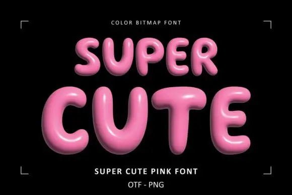
Glossy pink rounded display
Super Cute Font is a colour display on a black ground: glossy pink rounded capitals with soft highlights, dark shaded undersides and a slight taper, set in two lines inside small corner brackets, with a small note above and two plain lines beneath naming the style and the formats.
Ideas for this font
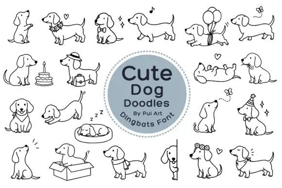
Long-bodied dog outlines with balloons, flowers and playful poses
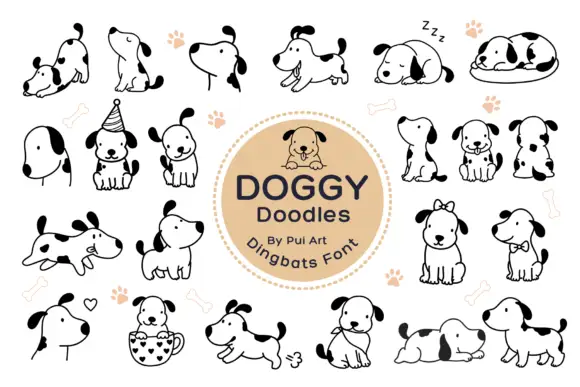
Cute Dog Doodles is a dingbat set of about two dozen line-drawn dachshunds: sitting, sleeping in a bed, standing in a box, wearing a party hat, carrying a cake, holding a balloon, and one draped over a fence.
Same independent foundry
Allow optional Google Analytics to measure visits and catalogue actions. Your search words and notes are not included. Privacy & storage