Editorial Serif Anchor

Cricket + Augler
Anchors Cricket's fluid strokes with crisp Roman proportions on wedding suites, headers and packaging.
Inspect Augler specimenDisclosure: MakerFileHub may earn a commission from qualifying purchases via paid links on this page. How our links work.
Bold smooth brush script with heavy joins and a tight rhythm
Cricket is a bold brush script in one heavy weight, with rounded loaded strokes, joins that stay thick through the connection and counters that close down to small slits, so a word reads as a solid painted shape.
Paid link
Get this fontProject & layout blueprintsAt-a-glance maker compatibility
Weld or Unite overlapping script joins into one continuous vector path before sending to the blade.
Visual anatomy & craft review
The capital C opens as a wide crescent that begins above the cap line and closes tightly at the baseline, and its entry stroke is a short blunt flick rather than a taper. Every following letter is drawn at nearly the same weight as the capital: the r keeps a heavy shoulder, the i carries a round dot, the c and the k sit at x-height with small open counters, and the joins stay as thick as the stems rather than thinning. That consistency is what gives the word its punch at a distance. The final t throws a short horizontal bar that finishes with a blunt end, and the whole line has a slight forward lean without a slant. Nothing tapers and nothing breaks. The grainy monochrome photograph and the tracked studio labels are presentation; the script is the word.
Bold · Smooth · Brushed
Two-font hierarchy recipes
Tested contrast partners — pairing Cricket with grounded secondary typography.
Cricket + Augler
Anchors Cricket's fluid strokes with crisp Roman proportions on wedding suites, headers and packaging.
Inspect Augler specimen
Cricket + Swaraga
Keeps small-scale dates, URLs, nutrition facts and care instructions crisp and legible below script titles.
Inspect Swaraga specimenPractical applications
Concrete hierarchy, scale and production guidance tailored to Cricket’s stroke geometry.
A heavy brush script reads from across a street and holds its weight when it is cut from vinyl or painted on a fascia, and the thick joins mean the word never breaks into separate strokes at a distance.
Hierarchy & layout recipe
Set the name at 45 cm on a 3 m fascia, keep the menu categories in a condensed bold at 8 cm, and leave 20 cm on each side so the capital's entry flick is not cut by the panel edge.
Pre-production check
Vinyl cutters need a minimum bridge between counters; check the vector at full size and open the i and e counters rather than reducing the weight of the stroke.
A bold loaded script gives a food feature appetite and weight, and because the joins stay thick the line holds up over a dark photograph where a light script would vanish entirely.
Hierarchy & layout recipe
Set the cover line at 72 pt on an A4 cover, place it in the lower third over the darkest part of the image, and keep the coverlines in a condensed bold at 11 pt in the top band.
Pre-production check
Heavy script over a busy photograph will clot; check the proof at final size and move the line to a calmer part of the image rather than adding a drop shadow.
A heavy brush script suits a relaxed celebration where the sign is photographed as much as read, and the solid weight survives being painted on rough timber at short notice.
Hierarchy & layout recipe
Set the names at 16 cm on a 700 by 500 mm board, keep the date in the same face at 4 cm beneath, and hold 10 cm of margin so the thick joins do not run into the frame.
Pre-production check
Rough timber pulls the brush and widens the joins; sand and seal the board first and check the first pass before the lettering is completed.
Technical & licence verification
Confirm included OTF/TTF/WOFF formats, full glyph tables and licence coverage on the live store page before batch production.
Closest visual alternatives
Matched across letterform anatomy, stroke behaviour and craft applications.
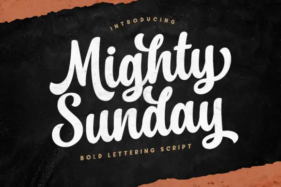
Bold lettering script with heavy looping capitals and a tight stacked fit
Mighty Sunday is a bold lettering script in which the capitals loop heavily, the strokes stay fat through the joins and two stacked words lock together into a single block.
Ideas for this font
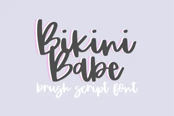
Bouncy brush script with a heavy soft stroke and tilted letter bodies
Bikini Babe is a bouncy brush script in which the letters tilt at slightly different angles, the stroke stays heavy and soft and the baseline rises and falls through the phrase.
Ideas for this font

Bouncing tail script with long entry and exit swashes
Farmhouse is a bouncing tail script in which the letters sit at different heights, the strokes swell on the downstroke and long swashes enter and leave the word, so a name reads as hand lettering on a painted board.
Ideas for this font
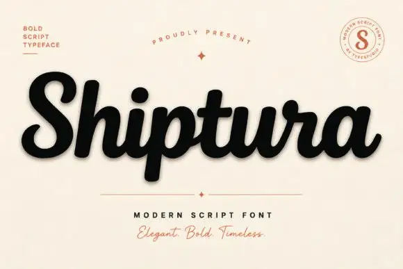
Bold connected script with a slight slant
Shiptura is a bold modern script in black with a soft shadow on cream: thick connected letters with rounded bowls, a slight rightward slant, blunt entry strokes and a small tail on the final letter, presented between two tracked capital lines and a round badge.
Ideas for this font
Allow optional Google Analytics to measure visits and catalogue actions. Your search words and notes are not included. Privacy & storage