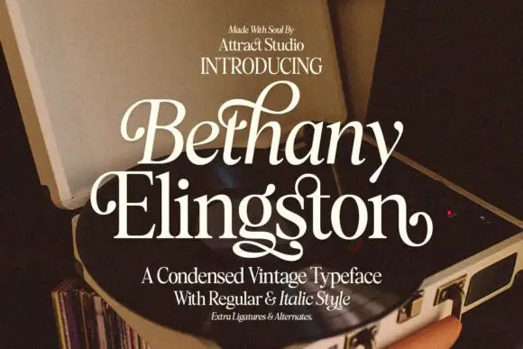
High-Contrast Display Serif

British Green + Evoire
Pairs sculptural editorial warmth with British Green's clean modern geometry.
Inspect Evoire specimenDisclosure: MakerFileHub may earn a commission from qualifying purchases via paid links on this page. How our links work.
Slanted fine serif forms with a looped initial and restrained lower text
British Green shows a pale slanted name on a deep green field, where British begins with a large looped B and fine connecting-looking entries while Green has a more open capital and broad rounded lowercase bowls, with a restrained line of smaller supporting text beneath.
Paid link
Get this fontProject & layout blueprintsAt-a-glance maker compatibility
Sturdy stroke walls and open counters weed cleanly on adhesive vinyl, HTV apparel film, and cut cardstock.
Visual anatomy & craft review
The main line leans right, the initial loops large, the entries look connected and the bowls stay broad and round. That lean with a looped initial is the character: the name reads as an oblique serif rather than a script, which is why the smaller line beneath stays roman and quiet. The captions mention regular, oblique and script directions without a full comparison, so confirm which files your set holds, test the loop against the following letter and keep 30 pt for the fine joins.
Slanted fine serif forms with a looped initial and restrained lower text
Two-font hierarchy recipes
Tested contrast partners — pairing British Green with grounded secondary typography.
British Green + Evoire
Pairs sculptural editorial warmth with British Green's clean modern geometry.
Inspect Evoire specimen
British Green + Autography
Introduces organic movement on pull-quotes, signatures and gift tags.
Inspect Autography specimenPractical applications
Concrete hierarchy, scale and production guidance tailored to British Green’s stroke geometry.
The slanted serif suits an outdoor ceremony, and the looped capital holds a surname at 30 pt on a folded card, where the lean adds movement without becoming a script.
Hierarchy & layout recipe
Print a 120 mm square card: set the surname at 30 pt on one row, keep 18 mm of clear ground beneath before the date line at 9 pt in a roman serif, and keep 16 mm of margin at each end for the loop.
Pre-production check
The looped B touching the next letter reads as a ligature; check the spacing and add 15 units between the pair.
The fine serif gives a tin a traditional note, and the slanted forms hold a two-word name at 20 pt on a 60 by 45 mm label, where the pale type on green stays readable.
Hierarchy & layout recipe
Print a 60 by 45 mm tin label: set the name at 20 pt on one row, keep 9 mm of clear ground beneath before the origin at 6 pt, and keep a light tint behind the type so the fine joins hold on metal.
Pre-production check
Pale type on a dark tin loses the hairlines; check a printed sample and increase the type weight.
The oblique serif sets a soft opener, and the broad lowercase bowls hold a short standfirst at 24 pt under a headline, where the lean separates it from the roman body.
Hierarchy & layout recipe
Print a 210 mm page: set the standfirst at 24 pt over two lines, keep 12 mm of clear ground beneath before the body at 10 pt, and keep the line length under 70 characters so the slant stays comfortable.
Pre-production check
A long slanted line tires the reader; check the page and keep the standfirst to two lines.
Technical & licence verification
Confirm included OTF/TTF/WOFF formats, full glyph tables and licence coverage on the live store page before batch production.
Closest visual alternatives
Matched across letterform anatomy, stroke behaviour and craft applications.
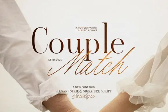
Duo pairing a high-contrast serif with a quick signature script
Couple Match is a two-cut family in which a high-contrast serif sets a formal word and a quick signature script writes the second, so a design gets a staged and a handwritten line from one purchase.
Ideas for this font
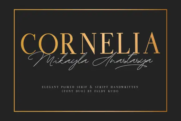
Upright fine serif capitals paired with a thin sweeping signature line
Cornelia pairs a gold serif capital line with a thin signature script, and sets the two on charcoal inside a rule so the pair reads as an engraved card rather than a poster.
Ideas for this font
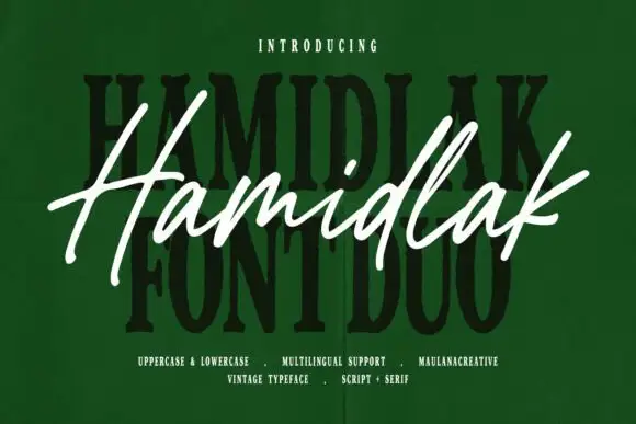
Brush signature script layered over a heavy vintage serif
Hamidlak layers a loose brush signature over a heavy vintage serif, so the same word appears twice in the sample — once as a signature and once as a stamped plate.
Ideas for this font
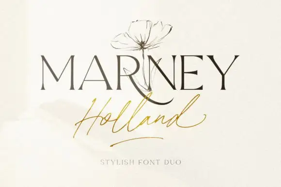
Fine serif and loose signature duo
Marney Holland pairs a tall high-contrast serif capital cut with a loose thin script: the R curls its leg below the serif line, the script runs light through its joins and a long low exit stroke closes the written line.
Ideas for this font
Same independent foundry
Allow optional Google Analytics to measure visits and catalogue actions. Your search words and notes are not included. Privacy & storage