Neutral Sans Workhorse

Composition Book Pattern + Modern Heritage
Lets Composition Book Pattern own the focal silhouette while handling secondary copy, sizing and subheads cleanly.
Inspect Modern Heritage specimenDisclosure: MakerFileHub may earn a commission from qualifying purchases via paid links on this page. How our links work.
Rounded black capitals with dense composition-notebook speckling
Composition Book Pattern is a colour font in which the letters are filled with a black-and-white marbled cover pattern, sketched with a heavy outline and surrounded by stationery doodles.
Paid link
Get this fontProject & layout blueprintsAt-a-glance maker compatibility
Sturdy stroke walls and open counters weed cleanly on adhesive vinyl, HTV apparel film, and cut cardstock.
Visual anatomy & craft review
ABCD fills the middle of the card, each letter a fat rounded shape filled edge to edge with a marbled black and white pattern, drawn with a heavy hand-sketched outline and small highlights. Around the letters the card is a sticker sheet of school objects: a pencil, a bow, a badge, a peace sign, a flower, a laptop, cherries, lips, a rainbow and a smiling face. Under the words a plain sans line names the pattern and the word alphabet, and a bar at the foot lists the formats and the count of decorations. A dark label at the upper left marks this as the black version. Because the pattern is dense and the outline heavy, the letters read as objects at a distance and the marbling appears up close, which makes the set work on folders, labels and classroom print.
Rounded black capitals with dense composition-notebook speckling
Two-font hierarchy recipes
Tested contrast partners — pairing Composition Book Pattern with grounded secondary typography.
Composition Book Pattern + Modern Heritage
Lets Composition Book Pattern own the focal silhouette while handling secondary copy, sizing and subheads cleanly.
Inspect Modern Heritage specimen
Composition Book Pattern + Bulgary
Grounds bold display lettering with classic typographic authority on posters, badges and apparel.
Inspect Bulgary specimenPractical applications
Concrete hierarchy, scale and production guidance tailored to Composition Book Pattern’s stroke geometry.
The marbled fill matches the covers in a classroom, and the heavy outline keeps a short name readable on a book that is handled all year.
Hierarchy & layout recipe
Print an A4 cover: set the pupil's name at 54 pt on one row, keep 18 mm of clear ground beneath before the subject at 12 pt, and hold 20 mm of border so the outline stays whole.
Pre-production check
Dense patterns bleed together below 30 pt; print one cover at the finished size and check the marbling before the set.
The pattern says what the shop sells before a customer reads the name, and the sketched outline gives a plain label a handmade character.
Hierarchy & layout recipe
Print a 60 by 45 mm label: set the shop name at 16 pt on one row, keep 5 mm of clear ground beneath before the street at 4.5 pt, and hold 4 mm from the outline to the label edge.
Pre-production check
Marbled patterns fill in on small labels; print one label on the real stock and check the letters read.
The marbling dates the page in one element, and the heavy letters hold over a flat colour where a thin display face would need a panel behind it.
Hierarchy & layout recipe
Print a 210 by 297 mm opener: set the feature title at 90 pt across two rows, keep 26 mm of clear ground beneath before the standfirst at 11 pt, and hold 20 mm of margin so no doodle collides with the type.
Pre-production check
Dense fills moire in screen printing; print one sheet on the intended press and check the pattern before the issue.
Technical & licence verification
Confirm included OTF/TTF/WOFF formats, full glyph tables and licence coverage on the live store page before batch production.
Closest visual alternatives
Matched across letterform anatomy, stroke behaviour and craft applications.
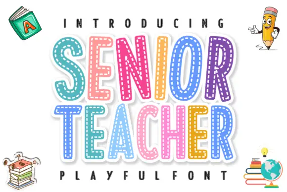
Layered stitched capitals in colour
Senior Teacher is a layered decorative display: fat capitals with a thick white outline and a dashed stitched line inside each letter, each one in a different bright colour, with drawn school objects around them.
Ideas for this font
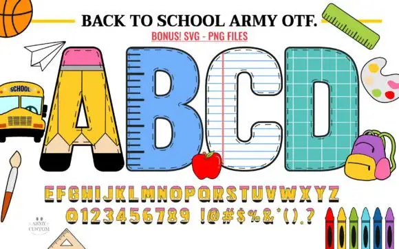
Broad school-material capitals with pencil, ruler, paper and grid treatments
Back to School Army builds every capital from classroom equipment: a pencil for the A, a ruler for the B, ruled paper for the C, a chalkboard for the D, with a matching alphabet, numbers and punctuation below.
Ideas for this font
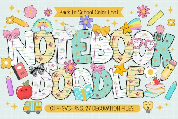
School-paper doodle colour display
Notebook Doodle is a colour display on a pale study scene: fat capitals filled with ruled paper, graph paper and star patterns, outlined in dark ink, decorated with bows, flower clips, pencils and stickers, with two ribbons that name the format list and the count of decoration files.
Ideas for this font
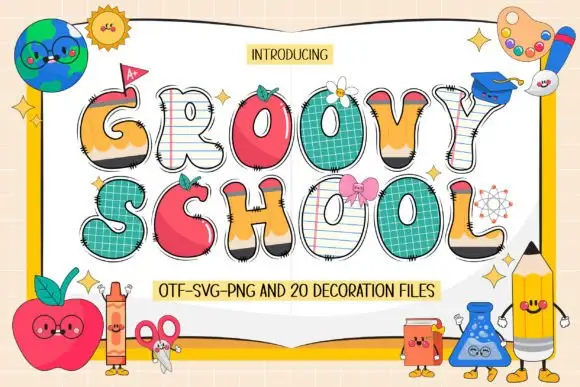
Swelling school-themed capitals mixing pencil, apple, paper and grid surfaces
Groovy School draws every capital as a piece of classroom stationery — a notebook page, an apple, a ruler, a pencil — then adds a face, a bow or a patch to most of them, plus a set of matching decoration files.
Ideas for this font
Same independent foundry
Allow optional Google Analytics to measure visits and catalogue actions. Your search words and notes are not included. Privacy & storage