High-Contrast Display Serif

Classical Pride Duo Font + Things
Pairs sculptural editorial warmth with Classical Pride Duo Font's clean modern geometry.
Inspect Things specimenDisclosure: MakerFileHub may earn a commission from qualifying purchases via paid links on this page. How our links work.
Fine script and heavy serif pairing
Classical Pride Duo Font pairs a very thin slanted script title with bold serif capitals below, where large open C and P loops extend across a dark painted portrait background and the contrast between hairline script and heavy caps carries the hierarchy.
Paid link
Get this fontProject & layout blueprintsAt-a-glance maker compatibility
Weld or Unite overlapping script joins into one continuous vector path before sending to the blade.
Visual anatomy & craft review
The script stays hairline and slanted, the caps stay bold and upright, the loops open wide and the masses contrast strongly. That pairing is the character: a delicate line floats above a solid base, which is why the sample stacks them on a painted ground. Both files need checking for metrics, so test your own phrase, keep 20 mm between the rows for the loops, hold the script at 24 pt and keep the caps for the words that must carry weight.
Fine script and heavy serif pairing
Two-font hierarchy recipes
Tested contrast partners — pairing Classical Pride Duo Font with grounded secondary typography.
Classical Pride Duo Font + Things
Pairs sculptural editorial warmth with Classical Pride Duo Font's clean modern geometry.
Inspect Things specimen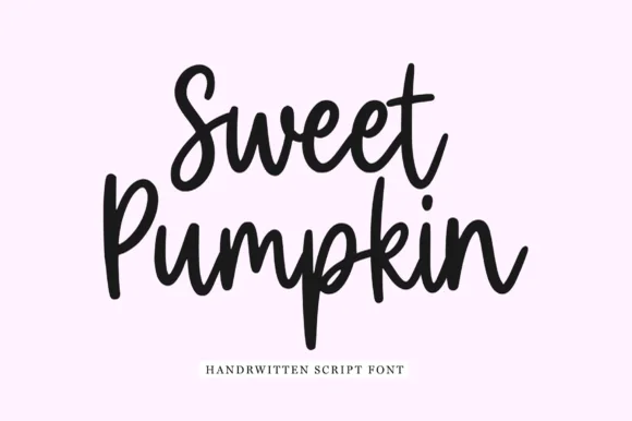
Classical Pride Duo Font + Sweet Pumpkin
Introduces organic movement on pull-quotes, signatures and gift tags.
Inspect Sweet Pumpkin specimenPractical applications
Concrete hierarchy, scale and production guidance tailored to Classical Pride Duo Font’s stroke geometry.
The script and heavy caps suit an engraved suite, and the two masses fit at 30 pt and 24 pt on heavy card, where the open loops frame the names above.
Hierarchy & layout recipe
Print a 130 by 180 mm invitation: set the script at 30 pt, set the caps at 24 pt beneath with 20 mm of clear ground, and keep 18 mm of margin so the loops stay inside the trim.
Pre-production check
Loops touching the cap row look tangled; check the card, open the gap to 22 mm and print one card before the full set.
The pairing gives a small label hierarchy, and the bold caps hold the brand at 22 pt with the script at 18 pt above, where the loop sits inside the panel.
Hierarchy & layout recipe
Print a 55 by 70 mm label: set the script at 18 pt on the upper line, set the caps at 22 pt beneath with 12 mm of clear ground, and keep 6 mm of border so the loop is not cut.
Pre-production check
A hairline script at 14 pt vanishes on a label; check the plate proof and hold it at 16 pt.
The two voices set a cultural cover, and the bold caps hold a one-word title at 66 pt on a coated cover, where the script supplies a light line above.
Hierarchy & layout recipe
Print an A4 cover: set the caps at 66 pt, set the script at 28 pt above with 22 mm of clear ground, and keep the cover lines at 9 pt well clear of the loops.
Pre-production check
Hairlines over a painted ground disappear; check the cover and keep the script on the plainest area.
Technical & licence verification
Confirm included OTF/TTF/WOFF formats, full glyph tables and licence coverage on the live store page before batch production.
Closest visual alternatives
Matched across letterform anatomy, stroke behaviour and craft applications.
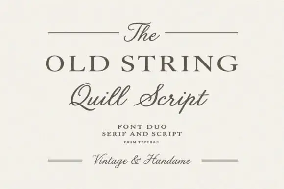
Serif and quill script duo
The Old String is a duo in soft grey-brown on cream: a wide classical serif in caps for the main line, a quill script with fine hairlines and long tails for the second, and small tracked notes between hairline rules, with the script repeated at the foot in a smaller size.
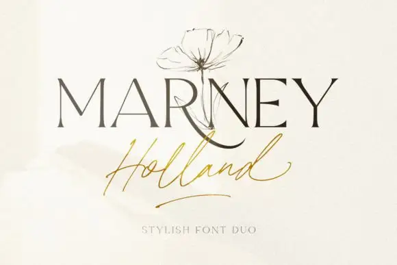
Fine serif and loose signature duo
Marney Holland pairs a tall high-contrast serif capital cut with a loose thin script: the R curls its leg below the serif line, the script runs light through its joins and a long low exit stroke closes the written line.
Ideas for this font
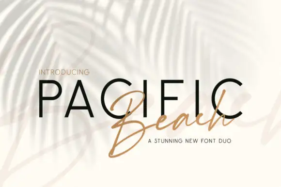
Upright sans capitals and slanted signature
Pacific Beach is a duo: wide upright sans capitals with thin strokes and generous tracking, paired with a slanted brush signature that is set across them.
Ornamental serif and script duo
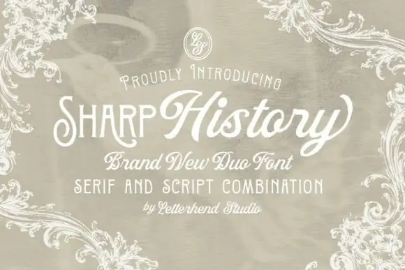
Sharp History is a duo in white on a warm greige ground: a narrow ornamental serif in caps for the first word, a broad connected script for the second, a small line beneath naming the pairing, and an engraved frame of acanthus scrollwork around the whole sheet.
Ideas for this font
Same independent foundry
Allow optional Google Analytics to measure visits and catalogue actions. Your search words and notes are not included. Privacy & storage



