Neutral Sans Workhorse

Christmas Moonday + Swaraga
Lets Christmas Moonday own the focal silhouette while handling secondary copy, sizing and subheads cleanly.
Inspect Swaraga specimenDisclosure: MakerFileHub may earn a commission from qualifying purchases via paid links on this page. How our links work.
Ornate all-caps display serif with curled stems and diamond ornaments
Christmas Moonday is an ornate all-caps display serif in which the stems curl at the foot, the bars carry drawn diamonds and the terminals finish in spirals, so a two-word greeting reads as engraved seasonal stationery.
Paid link
Get this fontProject & layout blueprintsAt-a-glance maker compatibility
Sturdy stroke walls and open counters weed cleanly on adhesive vinyl, HTV apparel film, and cut cardstock.
Visual anatomy & craft review
The C rolls both terminals into curls, the H sets two stems with a diamond on the bar, the R turns a swash leg, the M carries two curled stems, the D closes a bowl on a spiral and the Y splays two arms into hooks, all at a moderate contrast with fine serifs and diamond ornaments set inside the letters. The ornaments are the character: they are drawn into the letterforms, so the face needs generous leading and cannot be tracked tight. It works from 24 pt upward in one colour per word and wants a smooth card. The cream ground, the snowflake doodles, the frame rules and the studio line are presentation; the red and green display words are the face.
Ornate · Festive · All caps
Two-font hierarchy recipes
Tested contrast partners — pairing Christmas Moonday with grounded secondary typography.
Christmas Moonday + Swaraga
Lets Christmas Moonday own the focal silhouette while handling secondary copy, sizing and subheads cleanly.
Inspect Swaraga specimen
Christmas Moonday + Alerigue
Grounds bold display lettering with classic typographic authority on posters, badges and apparel.
Inspect Alerigue specimenPractical applications
Concrete hierarchy, scale and production guidance tailored to Christmas Moonday’s stroke geometry.
The engraved ornaments give a printed card the look of a foil-blocked greeting, and the moderate contrast holds the curls at 28 pt.
Hierarchy & layout recipe
Print a 120 by 170 mm card: set the greeting at 28 pt on two lines, allow 1.5 line spacing so the curled feet of the first line clear the ornaments below, and keep 15 mm of margin for the spirals.
Pre-production check
Curled feet on stacked lines collide at normal leading; check the printed card and open the spacing before reducing the size.
The ornamented caps make a plain box feel gift-wrapped, and the moderate weight prints in one colour at 20 pt on a smooth label.
Hierarchy & layout recipe
Print a 70 by 50 mm label: set the brand name at 20 pt, set the flavour line in a 7 pt serif beneath, and keep 5 mm from the die so the spiral feet are not cut away.
Pre-production check
A spiral foot cut by a label die looks broken; check the imposed label and raise the type block by 2 mm.
The ornate capitals suit a gift-wrapping service in December, and the moderate contrast holds a short name at 20 pt on card.
Hierarchy & layout recipe
Print a 45 by 90 mm tag: set the service name at 20 pt in the upper third, punch a 4 mm hole 10 mm from the top, and keep the curled first letter clear of the punched hole so the string does not tear it.
Pre-production check
A spiral curling into a punched hole tears under the string; check the assembled tag and turn the word so the curl faces the lower edge.
Technical & licence verification
Confirm included OTF/TTF/WOFF formats, full glyph tables and licence coverage on the live store page before batch production.
Closest visual alternatives
Matched across letterform anatomy, stroke behaviour and craft applications.
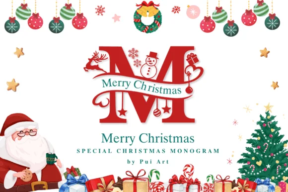
Ornate Christmas monogram with inset figures
Merry Christmas Monogram is a red ornamental initial in which a deer, a snowman and a pair of skates are drawn inside the letterforms: a heavy didone-style M with fine hairline accents, a green banner of serif capitals crossing it, and a page full of baubles, a wreath, a Santa and a tree.
Ideas for this font
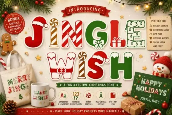
Christmas capitals dressed as festive objects
Jingle Wish shows chunky capitals decorated with candy stripes, hats, gifts and winter-clothing details: some characters arrive as outlines while others are solid filled shapes, so one word mixes two finishes.
Ideas for this font
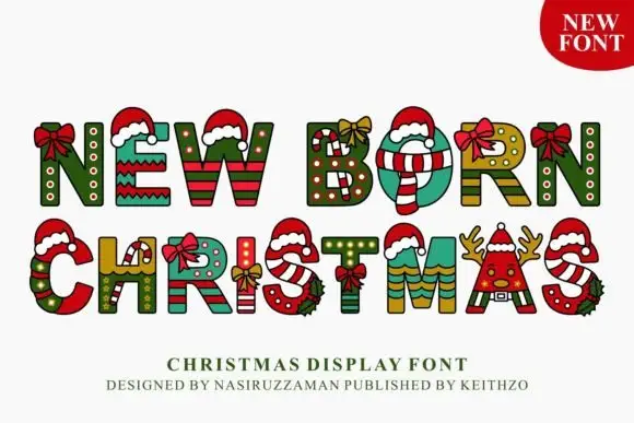
Patterned Christmas display
New Born Christmas is a decorative display in red, green and cream on white: each letter is filled with a different festive pattern — stripes, polka dots, gift wrap — and topped with a santa hat or a bow, with a small stepped shadow, so the pair reads as a set of decorated baubles.
Ideas for this font
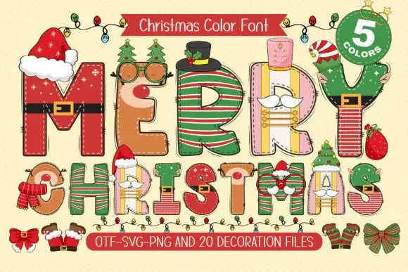
Festive dressed capitals
Merry Christmas is a festive display on a cream ground: tall capitals each dressed with a different costume — belts, hats, stripes, scarves and small faces — with a garland above and a ribbon below that lists the file formats and the count of colours.
Same independent foundry
Allow optional Google Analytics to measure visits and catalogue actions. Your search words and notes are not included. Privacy & storage