Editorial Serif Anchor

Christmas Honey + Glofi
Anchors Christmas Honey's fluid strokes with crisp Roman proportions on wedding suites, headers and packaging.
Inspect Glofi specimenDisclosure: MakerFileHub may earn a commission from qualifying purchases via paid links on this page. How our links work.
Dense festive calligraphy with swashed caps and stacked words
Christmas Honey is dense festive calligraphy whose two words stack into a near-square composition, with swashed capitals, tight inner spaces and flourishes that loop over the letters below.
Paid link
Get this fontProject & layout blueprintsAt-a-glance maker compatibility
Weld or Unite overlapping script joins into one continuous vector path before sending to the blade.
Visual anatomy & craft review
The capital C opens with a heavy swash that curls above the cap line and then drops into a tight crescent, and the lowercase that follows is packed close: the r and the i sit inside the arm of the h, the s closes into a double curve, the t is crossed high and the m keeps three narrow arches. Weight is heavy on the downstrokes and thin on the joins, which produces real contrast inside a very tight fit, and the second word repeats the same density directly beneath the first so the two lines lock together. Flourishes leave the word on both sides and curl back over it rather than running straight out, which is what gives the composition its ornament without extra elements. The red ribbon at the left, the small stars and the two captions are presentation; the calligraphy is the two words.
Dense · Festive · Swashed
Two-font hierarchy recipes
Tested contrast partners — pairing Christmas Honey with grounded secondary typography.
Christmas Honey + Glofi
Anchors Christmas Honey's fluid strokes with crisp Roman proportions on wedding suites, headers and packaging.
Inspect Glofi specimen
Christmas Honey + Corven
Keeps small-scale dates, URLs, nutrition facts and care instructions crisp and legible below script titles.
Inspect Corven specimenPractical applications
Concrete hierarchy, scale and production guidance tailored to Christmas Honey’s stroke geometry.
The dense swash fills a card front on its own without illustration, and the contrast keeps the words readable even though the two lines are packed tightly together.
Hierarchy & layout recipe
Set both words at 42 pt on a 148 by 105 mm card, keep the family name in a small caps serif at 9 pt, and hold 14 mm below the lower flourish so nothing collides with the signature.
Pre-production check
Dense flourishes printed over each other clot at 42 pt; check the proof at final size and remove one flourish rather than opening the whole fit.
One dense line turns a plain tag into a finished package, and the heavy downstrokes hold up when the tag is printed in one colour on kraft.
Hierarchy & layout recipe
Set the greeting at 18 pt on a 50 by 90 mm tag, keep the recipient's name in a 7 pt sans, and leave a 12 mm hole zone clear so no flourish crosses the punched hole.
Pre-production check
Kraft drinks ink and closes tight counters; print one tag on the actual stock and open the m arches if they begin to fill.
The festive density suits a seasonal thank-you, and the tight fit means a short message fills a small card without extra ornament.
Hierarchy & layout recipe
Set the message at 20 pt on a 105 by 148 mm card, keep the order number in a 7 pt sans at the foot, and leave the middle third clear for a handwritten line.
Pre-production check
A heavy swash in a two-colour print needs accurate registration; check the pull and keep the flourish in the darker plate only.
Technical & licence verification
Confirm included OTF/TTF/WOFF formats, full glyph tables and licence coverage on the live store page before batch production.
Closest visual alternatives
Matched across letterform anatomy, stroke behaviour and craft applications.
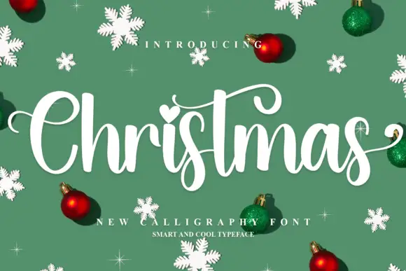
Upright Christmas script with a heart dot
Christmas shows a broad C, rounded joined letters, a long curled t bar and descending s loops, where the i carries a heart-shaped dot and baubles, snowflakes and small sparkles fill the sample around the word.
Ideas for this font
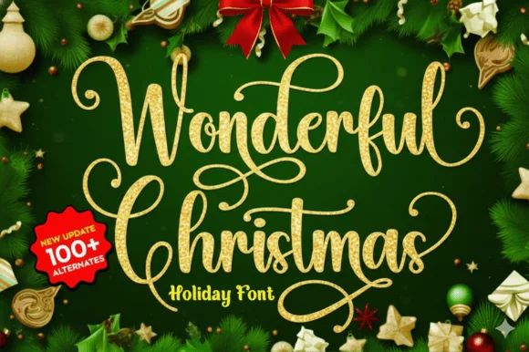
Ornate gold holiday calligraphy
Wonderful Christmas builds tall looping calligraphy flourishes with spiral loops that crown the capitals and descenders across a two-line specimen, pairing fine hairlines with medium calligraphic downstrokes.
Ideas for this font
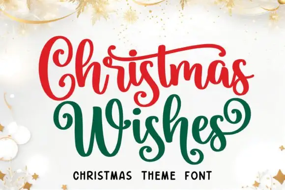
Christmas script with curled capitals, long cross strokes and low looping s forms
Christmas Wishes is a festive script in which the capital curls forward, the W spreads wide, the cross strokes run long and the s forms loop low, so a two-word greeting reads as ribbon lettering on a card.
Ideas for this font
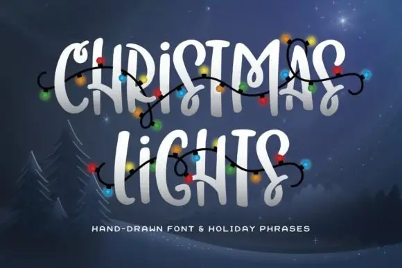
Hand-drawn caps with curly hooks and connecting swashes
Christmas Lights is a hand-drawn capital alphabet in which the strokes end in curls, some letters carry connecting hooks and the fit stays loose, so a two-word greeting reads as lettering drawn with a brush pen and decorated with a string of bulbs.
Ideas for this font
Same independent foundry
Allow optional Google Analytics to measure visits and catalogue actions. Your search words and notes are not included. Privacy & storage