Modern Grotesque Body

Chrimson + Homies
Creates crisp high-hierarchy contrast beneath Chrimson headlines across menus, websites and labels.
Inspect Homies specimenDisclosure: MakerFileHub may earn a commission from qualifying purchases via paid links on this page. How our links work.
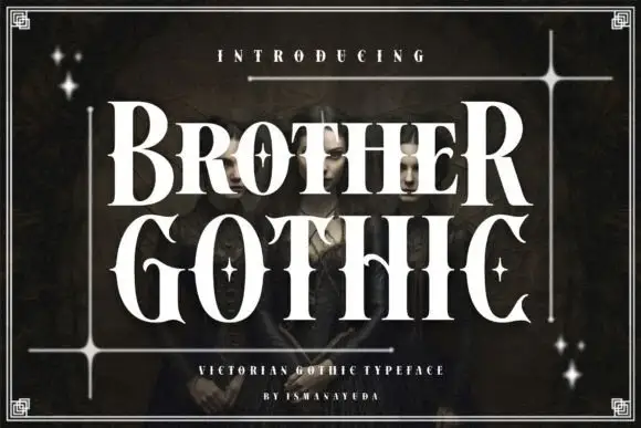
Pinched display capitals with broad curled C and oversized N
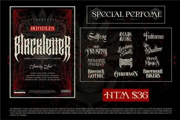
Chrimson shows white capitals inside gold ornamental framing, where the C curls strongly inward at both ends, the N rises taller than the central letters and narrow waists with long oval counters give the middle of the word its rhythm.
Paid link
Get this fontProject & layout blueprintsAt-a-glance maker compatibility
Sturdy stroke walls and open counters weed cleanly on adhesive vinyl, HTV apparel film, and cut cardstock.
Visual anatomy & craft review
The waists pinch in, the counters stretch into ovals, the end letters grow beyond the rest and thin curls finish the C. That pinched contrast is the character: the word reads as a carved sign with decorated ends rather than a neutral cap row, which is why the cover frames it in gold. The inner star and the frame are composition elements, so give the oversized end letters their own room and check the actual capital sequence before scaling the sign down.
Pinched waists · Curled caps · Oversized
Two-font hierarchy recipes
Tested contrast partners — pairing Chrimson with grounded secondary typography.
Chrimson + Homies
Creates crisp high-hierarchy contrast beneath Chrimson headlines across menus, websites and labels.
Inspect Homies specimen
Chrimson + Coastal Honey
Adds a warm human signature touch for 1-to-3-word callouts without competing against structured serif capitals.
Inspect Coastal Honey specimenPractical applications
Concrete hierarchy, scale and production guidance tailored to Chrimson’s stroke geometry.
The pinched caps set a quarterly title, and the curled end letters hold a one-word heading at 60 pt on a coated cover, where the narrow waists still hold their contrast in print.
Hierarchy & layout recipe
Print an A4 cover: set the title at 60 pt on one row, keep 24 mm of clear ground beneath before the issue line at 10 pt, and keep 22 mm of margin so the C curl stays inside the trim.
Pre-production check
Thin curls printed at 30 pt read as specks; check the cover and keep the title at 52 pt or above.
The curled caps give a boutique a decorative mark, and the narrow waists hold a short name at 26 pt on a card, with the curls given their own clear ground at each end.
Hierarchy & layout recipe
Print an 85 by 55 mm card: set the shop name at 26 pt on one row, keep 16 mm of clear ground at each end for the curls, and set the hours at 7 pt in small caps beneath.
Pre-production check
A curled initial at 20 pt closes into the following letter; check the proof and open 3 mm of tracking.
The decorated caps suit a formal winter card, and the oval counters hold two names at 28 pt on heavy stock, where the long counters keep the middle letters from crowding.
Hierarchy & layout recipe
Print a 105 by 148 mm card: set the two names at 28 pt on one row, keep 20 mm of clear ground beneath before the date at 9 pt, and keep 18 mm of margin so the outer curls stay whole.
Pre-production check
Two oversized end letters crowd a shared ampersand; check the card and set the mark smaller in a plain serif.
Technical & licence verification
Confirm included OTF/TTF/WOFF formats, full glyph tables and licence coverage on the live store page before batch production.
Closest visual alternatives
Matched across letterform anatomy, stroke behaviour and craft applications.

Fine serif title with large upper and lower loops
Amilea shows pale yellow high-contrast letters with fine tapered serifs and broad rounded lowercase over a dark portrait, where a thin loop curves below the capital A and a tall upper flourish crosses the central ascender before sweeping right.
Fine lowercase serif with broad open bowls and tall ascenders
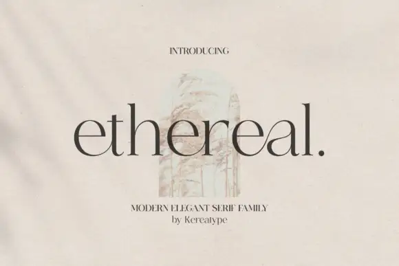
Ethereal shows dark lowercase letters with high contrast, thin joins and broad circular bowls, where tall h and l stems rise well above the rounded e forms and a small full stop ends the title.
Condensed serif pairing with curled capitals and a looping g
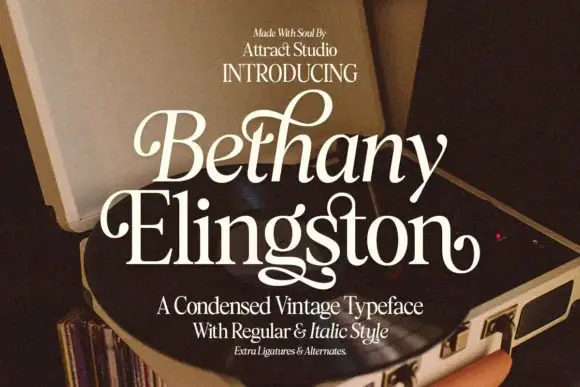
Bethany Elingston shows pale mixed-case serif letters in a slanted upper row and a straighter lower row over an open record player, where curled B and E entries, a tall looped h and a low g extension make the compact stack ornamental, and the cover advertises regular, italic, ligatures and alternates.
Ideas for this font
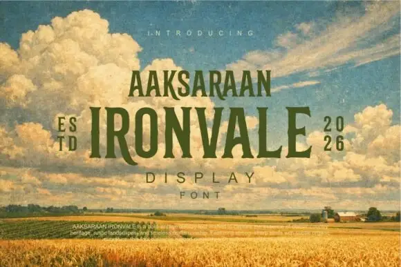
Condensed tapered serif display with wide letterspaced caps
Ironvale is a condensed display serif in which the stems taper toward the middle, the serifs flare and the caps sit wide apart, so a title reads as a printed heritage poster from the plains rather than as a modern serif.
Ideas for this font
Same independent foundry
Allow optional Google Analytics to measure visits and catalogue actions. Your search words and notes are not included. Privacy & storage