Editorial Serif Anchor

Calligraphy + Papillon Serif – Elegant Modern Luxury
Anchors Calligraphy's fluid strokes with crisp Roman proportions on wedding suites, headers and packaging.
Inspect Papillon Serif – Elegant Modern Luxury specimenDisclosure: MakerFileHub may earn a commission from qualifying purchases via paid links on this page. How our links work.
Narrow looping script with high contrast and tight counters
Calligraphy is a narrow looping script with high contrast, tight counters and long ascender loops, drawn so a single word fills a wide measure with fine detail.
Paid link
Get this fontProject & layout blueprintsAt-a-glance maker compatibility
Weld or Unite overlapping script joins into one continuous vector path before sending to the blade.
Visual anatomy & craft review
The capital C opens with a narrow loop that closes almost immediately, and the letters after it are compressed: the a and the l keep tall stems with small bowls, the double l rises into two narrow loops that do not close, the g drops a tight descender loop and the p and the h repeat the narrow construction. Contrast is high between the heavy stems and the hairline joins, and the joins stay visible even at the tightest points, which keeps the word readable despite its narrowness. Ascenders run well above the x-height, so the silhouette is tall and the phrase reads as a band of vertical strokes. Ends taper. The pale textured ground and the two tracked captions are presentation; the script is the word.
Narrow · Contrasted · Looped
Two-font hierarchy recipes
Tested contrast partners — pairing Calligraphy with grounded secondary typography.
Calligraphy + Papillon Serif – Elegant Modern Luxury
Anchors Calligraphy's fluid strokes with crisp Roman proportions on wedding suites, headers and packaging.
Inspect Papillon Serif – Elegant Modern Luxury specimen
Calligraphy + Swaraga
Keeps small-scale dates, URLs, nutrition facts and care instructions crisp and legible below script titles.
Inspect Swaraga specimenPractical applications
Concrete hierarchy, scale and production guidance tailored to Calligraphy’s stroke geometry.
The narrow proportions fit a long guest name on a small card, and the high contrast keeps the lettering elegant at the size a place card allows.
Hierarchy & layout recipe
Set the name at 14 pt on a 90 by 45 mm card, keep the table number in a 6 pt caps serif, and leave 6 mm at the right so the descender loop stays inside the card.
Pre-production check
A tight counter at 14 pt can fill in on uncoated card; print one card on the actual stock and open the spacing slightly if the loop closes.
The narrow contrasted lettering reads as a hand-written tag on a garment, and the tight proportions let a long boutique name fit a hanging label.
Hierarchy & layout recipe
Set the boutique name at 11 pt on a 30 by 70 mm tag, keep the size range in a 5 pt sans, and leave 5 mm so the final loop does not run under the stitching line.
Pre-production check
Woven and printed tags both compress a tight loop; check a sample on the actual label stock and simplify the narrowest loop if it closes.
The face demonstrates the technique the workshop teaches, and the narrow contrast shows a student exactly what pen pressure produces.
Hierarchy & layout recipe
Set the workshop name at 20 pt on a 105 by 148 mm card, keep the dates in a 7 pt sans, and hold 12 mm below so the descender loop does not cross the date block.
Pre-production check
Printed examples in a workshop get handled; check the card on the actual stock and confirm the hairlines survive a few days of use.
Technical & licence verification
Confirm included OTF/TTF/WOFF formats, full glyph tables and licence coverage on the live store page before batch production.
Closest visual alternatives
Matched across letterform anatomy, stroke behaviour and craft applications.
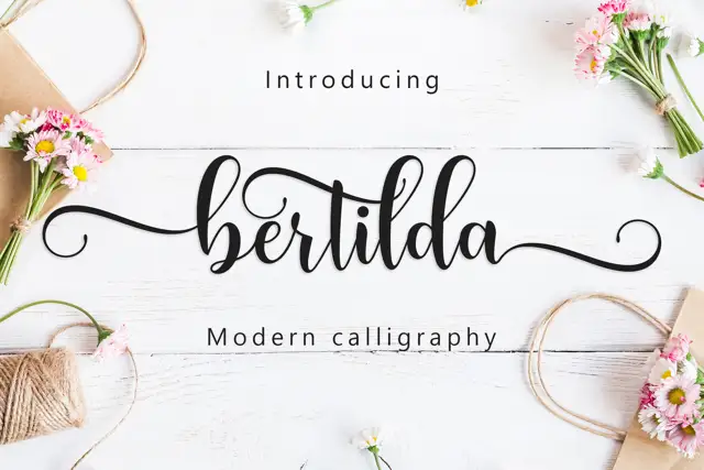
Broad swashed lowercase calligraphy
Bertilda Script is a broad lowercase calligraphy whose entry and exit swashes travel further than the letters themselves, so a seven-letter word occupies the width of a full line.
Ideas for this font
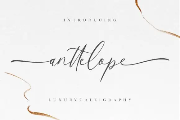
Fine extended calligraphy with long flat entry and exit strokes
Anttelope is fine extended calligraphy whose entry and exit strokes run almost the full width of the panel, with a small x-height and a light even line between them.
Ideas for this font
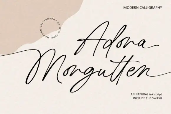
Fine angular modern calligraphy with open corners and swash alternates
Adora Morgutten is fine modern calligraphy drawn with angular rather than rounded turns, so the strokes change direction at open corners and the phrase reads as a written line with edges.
Ideas for this font
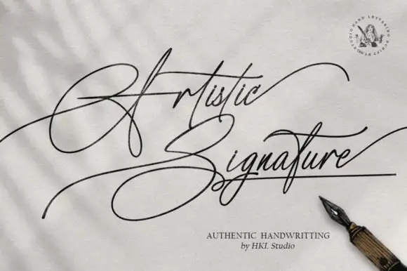
Fine crossed signature calligraphy with long horizontal sweeps
Artistic Signature is fine signature calligraphy in which the pen line crosses itself repeatedly, so the phrase reads as one continuous gesture with long horizontal sweeps in and out.
Ideas for this font
Same independent foundry
Allow optional Google Analytics to measure visits and catalogue actions. Your search words and notes are not included. Privacy & storage