Editorial Serif Anchor

Bloom Winter + Evoire
Anchors Bloom Winter's fluid strokes with crisp Roman proportions on wedding suites, headers and packaging.
Inspect Evoire specimenDisclosure: MakerFileHub may earn a commission from qualifying purchases via paid links on this page. How our links work.
Fine rising handwriting with a heart join and a light even stroke
Bloom Winter is fine handwriting that rises gently across the line, with a heart worked into the join between the two words and a light even stroke throughout.
Paid link
Get this fontProject & layout blueprintsAt-a-glance maker compatibility
Weld or Unite overlapping script joins into one continuous vector path before sending to the blade.
Visual anatomy & craft review
The phrase begins low on the left and climbs slightly to the right, which is what gives it the feel of a line written on an unruled card. The letters are drawn at a single light weight: the B opens a narrow loop, the l and the m stay small, the W rises into two shallow points, the n and the t close tightly and the r holds a short arm. Between the words the stroke rises into an open heart before joining the second word, and the ends taper away rather than stopping. Because the weight is even and light, the face reads best at 24 pt and above on a card, and it needs a decent stock to hold the joins. The cream ground, the arched caption at the top right and the two centred lines beneath are presentation; the script is the two words.
Fine · Rising · Romantic
Two-font hierarchy recipes
Tested contrast partners — pairing Bloom Winter with grounded secondary typography.
Bloom Winter + Evoire
Anchors Bloom Winter's fluid strokes with crisp Roman proportions on wedding suites, headers and packaging.
Inspect Evoire specimen
Bloom Winter + Headline
Keeps small-scale dates, URLs, nutrition facts and care instructions crisp and legible below script titles.
Inspect Headline specimenPractical applications
Concrete hierarchy, scale and production guidance tailored to Bloom Winter’s stroke geometry.
The gently rising line suits a cold-season card and the heart join gives the pair of words a single gesture without a printed symbol.
Hierarchy & layout recipe
Set both words at 26 pt on a 148 by 105 mm card, set the date in a small caps serif at 8 pt, and leave 18 mm at each end so the tapered ends stay inside the trim.
Pre-production check
A rising baseline can read as a setting error if it climbs too far; check the proof at final size and keep the rise to a few millimetres.
The light rising hand gives a winter greeting a quiet voice, and the heart join keeps the sentiment visible at 22 pt without extra ornament.
Hierarchy & layout recipe
Set the greeting at 22 pt on a 105 by 148 mm card, keep the sender in the same face at 11 pt, and hold 14 mm below the join so the second word has clear space.
Pre-production check
A light stroke under 0.15 mm can drop out on uncoated card; print one card on the actual stock and thicken the joins rather than the letters.
The fine join suits a small jar label where a heavy script would look crowded, and the heart carries the occasion at 11 pt without a second element.
Hierarchy & layout recipe
Set both names at 11 pt on a 45 mm square jar label, keep the date in a 5 pt sans beneath, and leave 5 mm of margin so the heart stays inside the label edge.
Pre-production check
A heart printed at 11 pt can fill in; check the label at final size and thicken the heart line only if it stops reading as a heart.
Technical & licence verification
Confirm included OTF/TTF/WOFF formats, full glyph tables and licence coverage on the live store page before batch production.
Closest visual alternatives
Matched across letterform anatomy, stroke behaviour and craft applications.
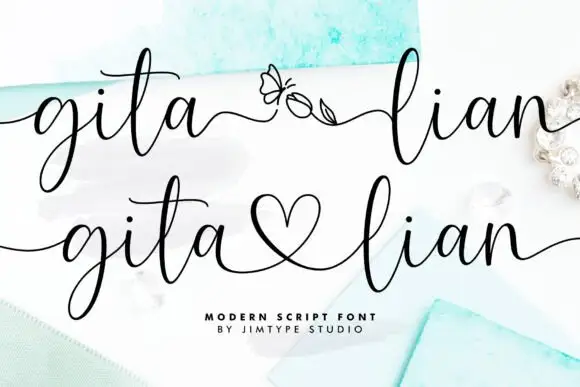
Elegant script with long entry swashes and drawn connectors
Gita Lian is an elegant script in which long swashes enter and leave the word and a drawn connector ties two names together, so a two-name lockup reads as a single written gesture rather than as two separate words.
Ideas for this font

Fine lowercase script with a heart worked into the central connector
Hello Honey is fine lowercase script in which the two words are joined by a heart drawn into the connector, with long flat tails on both sides and a small even x-height.

Heavy lowercase calligraphy with heart dots and a mirrored entrance
Abigail is heavy lowercase calligraphy in which the i dots are small hearts, the entry curls in from the left and the letter bodies carry a real shaded weight.
Ideas for this font
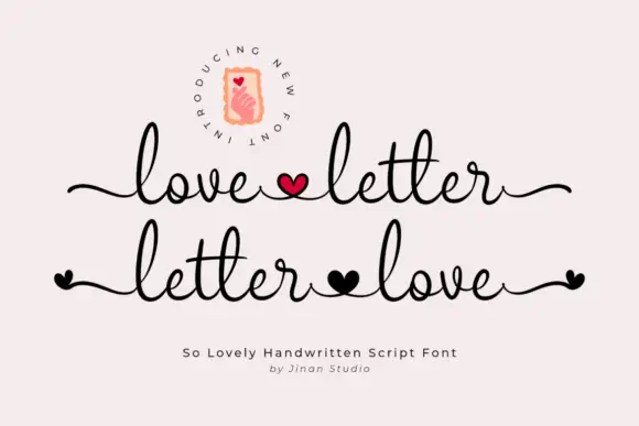
Monoline handwritten script with heart glyphs
Love Letter is a monoline handwritten script with tall loops, long trailing swashes and small hearts drawn as glyphs, so two words can be tied together with a heart in the middle of the line.
Allow optional Google Analytics to measure visits and catalogue actions. Your search words and notes are not included. Privacy & storage