Modern Grotesque Body

Blistao + Lemon Milk Pro FTR
Creates crisp high-hierarchy contrast beneath Blistao headlines across menus, websites and labels.
Inspect Lemon Milk Pro FTR specimenDisclosure: MakerFileHub may earn a commission from qualifying purchases via paid links on this page. How our links work.
Tall contrasting capitals with spiral terminals and a star-like O centre
Blistao is a high-contrast display serif in capitals whose thin strokes end in curling spirals, with a heavy stem weight and a small star cut into the last counter.
Paid link
Get this fontProject & layout blueprintsAt-a-glance maker compatibility
Sturdy stroke walls and open counters weed cleanly on adhesive vinyl, HTV apparel film, and cut cardstock.
Visual anatomy & craft review
BLISTAO crosses the card in a warm cream over a dark portrait, and the letters are drawn at a size where the contrast is the subject: stems as thick as a finger, joins as fine as a hair, and terminals that roll into spirals at the top of the B, inside the S and under the O. The A carries a long diagonal that reaches into the middle of the word, and the final O has a four-pointed star cut out of its counter, which gives the line an endpoint. Above the word a small line names the studio and a second line credits the type designer; below it a paragraph of description sits in a small sans at a fraction of the size. The face is meant for one word on a large surface: a bottle, a poster, a magazine cover. The hairlines that make it look expensive are also the reason it should never be set small or printed on absorbent paper.
Tall contrasting capitals with spiral terminals and a star-like O centre
Two-font hierarchy recipes
Tested contrast partners — pairing Blistao with grounded secondary typography.
Blistao + Lemon Milk Pro FTR
Creates crisp high-hierarchy contrast beneath Blistao headlines across menus, websites and labels.
Inspect Lemon Milk Pro FTR specimen
Blistao + Autography
Adds a warm human signature touch for 1-to-3-word callouts without competing against structured serif capitals.
Inspect Autography specimenPractical applications
Concrete hierarchy, scale and production guidance tailored to Blistao’s stroke geometry.
One word becomes the image for the whole cover, and the spiral terminals give a plain photograph a drawn element without a second graphic on the page.
Hierarchy & layout recipe
Print a 230 by 300 mm cover: set the cover word at 160 pt across one row, keep 34 mm of clear ground beneath before the cover lines at 11 pt, and hold 20 mm from the last spiral to the right trim.
Pre-production check
Hairlines under a tenth of a millimetre fill in on coated stock; print one cover and inspect the joins under a lamp before the run.
The contrast reads as expensive at label size where a modern sans reads as ordinary, and the star counter gives the bottle a mark to be recognised by.
Hierarchy & layout recipe
Print a 60 by 115 mm label: set the brand name at 34 pt on one row, keep 10 mm of clear ground beneath before the strength at 5 pt, and hold 7 mm from the widest stem to the label edge.
Pre-production check
The label curve squeezes spirals at the ends; print one label and wrap it on the bottle before the run is ordered.
The hairlines suit an invitation that has no ornament, and the spiral tails carry the couple's names in one line without a rule or a drawn wreath.
Hierarchy & layout recipe
Print a 148 by 210 mm invitation: set the names at 36 pt across one row, keep 24 mm of clear ground beneath before the venue at 9 pt, and hold 18 mm of margin left and right of the widest letter.
Pre-production check
Letterpress and hairlines do not always agree; print one invitation in the intended process and check the thin strokes first.
Technical & licence verification
Confirm included OTF/TTF/WOFF formats, full glyph tables and licence coverage on the live store page before batch production.
Closest visual alternatives
Matched across letterform anatomy, stroke behaviour and craft applications.
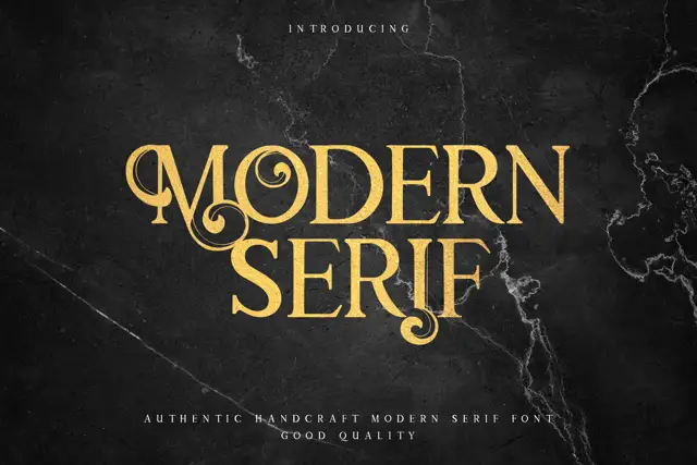
Display serif with ornate curled details
Modern Serif is a display serif in gold on dark marble: heavy letters with curled hairlines growing out of the stems, small flourishes at the feet and a moderate contrast, set as two stacked words with a tracked line beneath.
Ideas for this font

Fine serif title with large upper and lower loops
Amilea shows pale yellow high-contrast letters with fine tapered serifs and broad rounded lowercase over a dark portrait, where a thin loop curves below the capital A and a tall upper flourish crosses the central ascender before sweeping right.
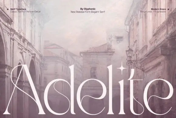
Fine tall serif with inward curls in the lowercase bowls and a crossing capital
Adelite is a fine tall serif in which the stems stretch upward, the lowercase bowls curl inward at their exits and the capital carries a long crossing extension, so a single word reads as an editorial headline rather than a logo.
Ideas for this font
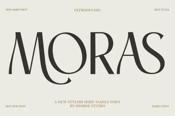
Stylish display serif family
Moras is a stylish serif family in near-black on pale stone: very high contrast, hairline stems and thin flat serifs, with a curling tail on the R, a swooping S and a ligature between the O and the R, set as one wide word with tracked corner notes.
Ideas for this font
Same independent foundry
Allow optional Google Analytics to measure visits and catalogue actions. Your search words and notes are not included. Privacy & storage