Neutral Sans Workhorse

Amazing Summer + Saltriver Grotesk
Lets Amazing Summer own the focal silhouette while handling secondary copy, sizing and subheads cleanly.
Inspect Saltriver Grotesk specimenDisclosure: MakerFileHub may earn a commission from qualifying purchases via paid links on this page. How our links work.
Tall heavy capitals crossed near the baseline by palm trees and wavy water bands
Amazing Summer sets very tall white capitals and then cuts a beach scene through their lower half, so palm silhouettes and water lines run across the whole word like a horizon behind the letters.
Paid link
Get this fontProject & layout blueprintsAt-a-glance maker compatibility
Sturdy stroke walls and open counters weed cleanly on adhesive vinyl, HTV apparel film, and cut cardstock.
Visual anatomy & craft review
AMAZING over SUMMER fills the frame in heavy condensed capitals with flat tops and straight sides, and every letter is interrupted at the same height by a band of trunks, fronds and two wavy water lines. That shared horizon is what holds the two rows together, and the negative space does all the illustration work. The sample sits on a sunset photograph, with small arcs and a badge above and a plain caption below. The scene inside the letters is part of the glyph, so the face cannot be printed at a size where the wave lines close up, and it cannot be recoloured into a single spot without losing the picture.
Tall heavy capitals crossed near the baseline by palm trees and wavy water bands
Two-font hierarchy recipes
Tested contrast partners — pairing Amazing Summer with grounded secondary typography.
Amazing Summer + Saltriver Grotesk
Lets Amazing Summer own the focal silhouette while handling secondary copy, sizing and subheads cleanly.
Inspect Saltriver Grotesk specimen
Amazing Summer + The Bilstein Editorial
Grounds bold display lettering with classic typographic authority on posters, badges and apparel.
Inspect The Bilstein Editorial specimenPractical applications
Concrete hierarchy, scale and production guidance tailored to Amazing Summer’s stroke geometry.
The cut horizon turns a plain white headline into a picture of the shoreline, which is exactly the promise a beach festival poster has to make.
Hierarchy & layout recipe
Print an A2 poster: set the two rows at 120 pt with 30 mm between baselines, keep 30 mm of clear ground beneath before the line-up at 16 pt, and keep 26 mm of border so the fronds stay inside the sheet.
Pre-production check
Water lines merge under 50 pt; check the proof and keep the heading at 80 pt or above on paper.
The silhouette band reads at newsstand distance and gives a travel cover a seasonal image without buying a photograph of the coast.
Hierarchy & layout recipe
Print a 210 by 280 mm cover: set the cover line at 92 pt across one row, keep 22 mm of clear ground beneath before the standfirst at 11 pt, and keep 18 mm of margin from the trim on all sides.
Pre-production check
The scene needs a dark ground; check the cover proof before setting white type over a light photograph.
The palm horizon says summer on a bottle without a printed illustration, and the tall capitals keep a short product name legible on a curved surface.
Hierarchy & layout recipe
Print a 50 by 120 mm wrap label: set the product name at 20 pt on one row, keep 10 mm of clear ground beneath before the SPF number at 8 pt, and keep 6 mm of clear area at each side so the wave lines do not wrap out of sight.
Pre-production check
Curved stock distorts fine detail; check a wrapped mock-up of the bottle before the label run.
Technical & licence verification
Confirm included OTF/TTF/WOFF formats, full glyph tables and licence coverage on the live store page before batch production.
Closest visual alternatives
Matched across letterform anatomy, stroke behaviour and craft applications.
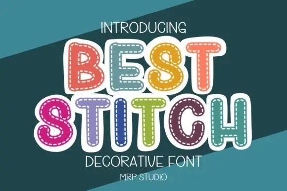
Rounded outlined capitals with a dashed inner stitch-like border
Best Stitch draws fat rounded letters in pastel colour and runs a dashed stitch line inside every outline, so a word looks like a row of applique patches sewn onto fabric.
Ideas for this font
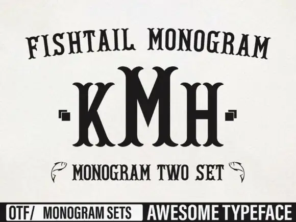
Tall monogram capitals with split fishtail ends
Fishtail Monogram shows a tall central M standing between narrower K and H, where split curved terminals flare at both ends of every upright, small square marks sit beside the outer letters and a fish outline appears at each side of a lower line.
Ideas for this font
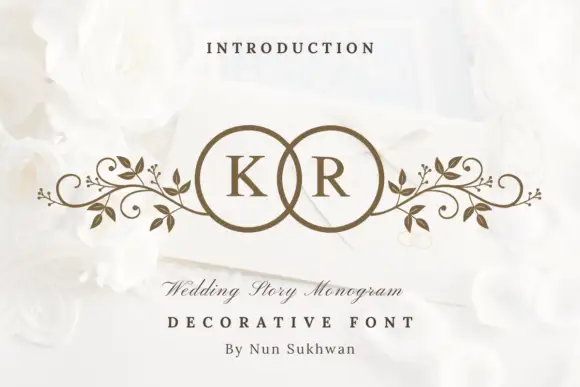
Circle-pair monogram with scrolls
Wedding Story Monogram is a two-initial monogram in bronze on a white still life: two serif capitals set inside two overlapping circles, with mirrored leafy scrolls extending sideways from the rings, staged on an envelope among white roses with a small line above and two lines beneath.
Ideas for this font
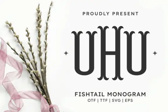
Fishtail initials with a taller central letter
Fishtail Monogram Regular Font is shown as three narrow initials with a taller central H, where the upright stems end in paired curved fishtail tips rather than plain slab feet, and the two U-shaped side letters sit close to the centre without joining it.
Ideas for this font
Same independent foundry
Allow optional Google Analytics to measure visits and catalogue actions. Your search words and notes are not included. Privacy & storage