High-Contrast Display Serif

Amastery + Flowsky Editorial
Pairs sculptural editorial warmth with Amastery's clean modern geometry.
Inspect Flowsky Editorial specimenDisclosure: MakerFileHub may earn a commission from qualifying purchases via paid links on this page. How our links work.
Swash script paired with narrow hand lettering
Amastery is a duo pairing a swash-laden script with a narrow hand-lettered caps line, plus a small ornament set, so a title can carry a decorative first word and a plain second.
Paid link
Get this fontProject & layout blueprintsAt-a-glance maker compatibility
Weld or Unite overlapping script joins into one continuous vector path before sending to the blade.
Visual anatomy & craft review
The script half opens with a heavy curled capital and continues in a broad brush weight with long swashes that leave the word at both ends, its exits rolling into spirals rather than tapering. The narrow caps half is a monoline hand lettering with tall stems, tight spacing and slightly uneven heights, drawn as if lettered quickly with a pen, which is what keeps it from looking like a machine font. The ornament collection in the sample consists of small independent flourishes rather than part of the letters, and it is the designer's extras. The pairing works because the two halves share an irregular rhythm: the script's spiral exits echo the caps' uneven heights. The photograph of the forest, the banner and the small ribbon labels are presentation; the duo is the two words.
Swashed · Paired · Ornamented
Two-font hierarchy recipes
Tested contrast partners — pairing Amastery with grounded secondary typography.
Amastery + Flowsky Editorial
Pairs sculptural editorial warmth with Amastery's clean modern geometry.
Inspect Flowsky Editorial specimen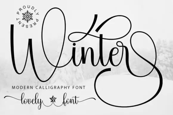
Amastery + Winter
Introduces organic movement on pull-quotes, signatures and gift tags.
Inspect Winter specimenPractical applications
Concrete hierarchy, scale and production guidance tailored to Amastery’s stroke geometry.
The script gives the names ornament while the narrow hand caps keep the date and venue legible, so a single invitation holds both without a third typeface.
Hierarchy & layout recipe
Set the names in the script at 28 pt on a 120 by 180 mm card, set the date in the narrow caps at 11 pt, and hold 12 mm between the two so the swash exits do not cross the caps.
Pre-production check
A swash that leaves the word at both ends needs room inside the trim; check the proof at final size and inset both lines by 6 mm before approving.
The duo lets a cake label carry a decorative product name and a plain weight line, and the hand-lettered caps stay readable at the small size of a box sticker.
Hierarchy & layout recipe
Set the cake name in the script at 14 pt on a 60 by 60 mm label, set the flavour in the narrow caps at 7 pt, and leave 5 mm so the swash exit does not run under the label edge.
Pre-production check
Small labels on a roll drift in registration; check the second impression and confirm the fine swash stays a single stroke.
The ornamented script gives a title page the feel of a set piece, and the narrow hand caps carry the author without introducing a machine-made contrast.
Hierarchy & layout recipe
Set the title in the script at 44 pt on an A5 title page, set the author in the narrow caps at 12 pt, and leave a 20 mm band below for the publisher mark.
Pre-production check
A spiral exit can print as a blob at small sizes; check the title with the printer's minimum line in mind and simplify the tightest curl if needed.
Technical & licence verification
Confirm included OTF/TTF/WOFF formats, full glyph tables and licence coverage on the live store page before batch production.
Closest visual alternatives
Matched across letterform anatomy, stroke behaviour and craft applications.

Casual script with a sans companion
Malley Jacklist is a duo: a heavy casual script in cream with wide loops and a light sans companion, presented as a hand-lettered pair on a deep green photograph of leaves.
Ideas for this font
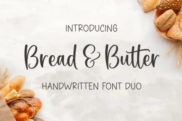
Rounded handwritten script paired with a narrow print in mixed case
Bread and Butter Duo pairs a rounded handwritten script with a narrow mixed-case print, so a label can carry a warm name and a quiet supporting line in the same ink without a second style.
Ideas for this font
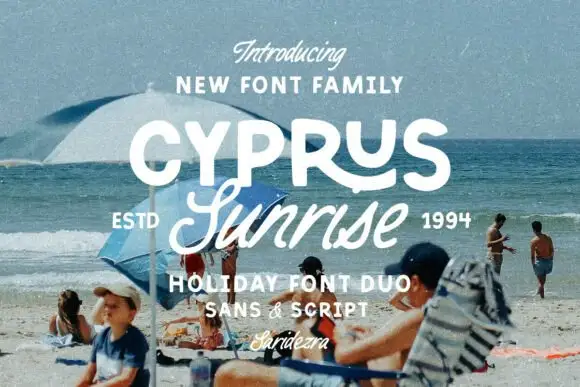
Rounded uppercase paired with a connected sloping script and a sweeping R leg
Cyprus Sunrise Duo places white rounded capitals above a flowing script word on a beach photograph, where the upper R sends a long curved leg beneath the following letters and the script S opens a large lower loop before the remaining letters connect on a rising rhythm.
Ideas for this font
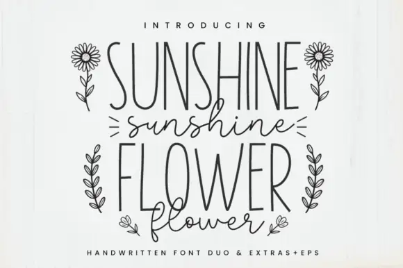
Tall narrow print and fine script
Sunshine Flower is a hand-drawn duo: a tall thin monoline capital face and a loose thin script, supplied with line-art flowers and shown in black on white.
Ideas for this font
Allow optional Google Analytics to measure visits and catalogue actions. Your search words and notes are not included. Privacy & storage