Neutral Sans Workhorse

Wreath Monogram + Borsen
Lets Wreath Monogram own the focal silhouette while handling secondary copy, sizing and subheads cleanly.
Inspect Borsen specimenDisclosure: MakerFileHub may earn a commission from qualifying purchases via paid links on this page. How our links work.
Asymmetric vine wreath monogram
Wreath Monogram is a monogram design in black on a pale draped ground: a serif W inside an asymmetric circular vine with fine leaves and round berries, the circle open at the right, with a rule beneath and a script line and two plain lines below.
Paid link
Get this fontProject & layout blueprintsAt-a-glance maker compatibility
Sturdy stroke walls and open counters weed cleanly on adhesive vinyl, HTV apparel film, and cut cardstock.
Visual anatomy & craft review
The plate is restrained and the mark is the whole design: the circle is drawn as a vine that runs heavier on the left and thins to a curl on the right, so the wreath is asymmetric and the letter sits slightly off centre, which is what stops it from looking like a badge. The berries are drawn at a consistent size, so they read as a rhythm rather than as filler. That construction sets a moderate size floor, because the berries and the fine leaves close first. The script line and the two plain lines beneath are product copy. It suits a wedding mark, a bookplate and a label, and the asymmetric composition is best used centred with generous space around it rather than crowded.
Decorative, monogram, wreath, botanical
Two-font hierarchy recipes
Tested contrast partners — pairing Wreath Monogram with grounded secondary typography.
Wreath Monogram + Borsen
Lets Wreath Monogram own the focal silhouette while handling secondary copy, sizing and subheads cleanly.
Inspect Borsen specimen
Wreath Monogram + Askinо
Grounds bold display lettering with classic typographic authority on posters, badges and apparel.
Inspect Askinо specimenPractical applications
Concrete hierarchy, scale and production guidance tailored to Wreath Monogram’s stroke geometry.
A vine wreath gives a couple a botanical crest, and the asymmetric circle keeps it from looking like a badge. The vine gives it a frame.
Hierarchy & layout recipe
Set the monogram at 45 mm wide on the invitation, 26 mm on the menu and 16 mm on a tag, in one ink. Keep the finest leaf above 0.3 mm and hold 6 mm clear space.
Pre-production check
Check the 16 mm tag, where a berry can close; keep it above 0.4 mm. Confirm the 45 mm invitation holds in letterpress and that the circle stays open at the right.
A vine mark reads as a florist, and the asymmetric construction gives a single initial a botanical frame. It names the trade.
Hierarchy & layout recipe
Set the mark at 18 pt on a card, 80 mm on a window and 13 pt on a label, keeping the berries only above 22 pt. Keep one colour and clear space equal to the mark height.
Pre-production check
Check the 13 pt label mark, where a berry can close; simplify at that size. Confirm the window mark reads at six metres and that the vine cuts evenly in vinyl.
A wreath initial makes a bookplate feel drawn rather than printed, and the single letter carries a personal mark. It reads as a drawn plate.
Hierarchy & layout recipe
Print a 90 by 60 mm plate: the mark at 34 mm, the name in a 9 pt serif, and one ink on a cream stock. Keep 8 mm margins and keep the finest leaf above 0.3 mm.
Pre-production check
Check the 34 mm mark on a small plate, where the berries can fill; keep them above 0.3 mm. Confirm the 9 pt name reads at arm's length and that the plate pastes flat.
Technical & licence verification
Confirm included OTF/TTF/WOFF formats, full glyph tables and licence coverage on the live store page before batch production.
Closest visual alternatives
Matched across letterform anatomy, stroke behaviour and craft applications.
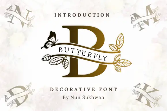
A serif B crossed by an open ribbon with butterfly and outlined leaf branches
Butterfly Vine Monogram draws a heavy serif initial, crosses it with a curved ribbon banner, and finishes both ends of the ribbon with line-drawn leaves and a single butterfly.
Ideas for this font
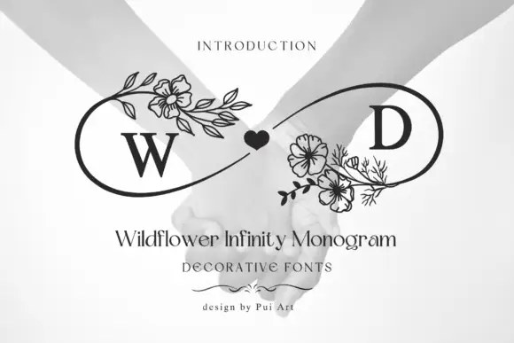
Infinity-loop floral monogram
Wildflower Infinity Monogram is a mark on a pale photographic ground: a serif W and D set inside an open infinity-shaped outline, a small solid heart at the crossing, and fine botanical clusters of flowers and leaves at the left and centre, with a serif title and two small credit lines beneath.
Ideas for this font
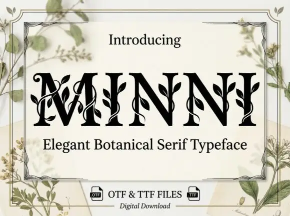
Botanical ornamented serif
Minni is a botanical serif in black on cream: high-contrast caps whose stems sprout leaves and curling vines, sharp serifs and a narrow waist, with a light botanical frame and small file badges at the foot.
Ideas for this font
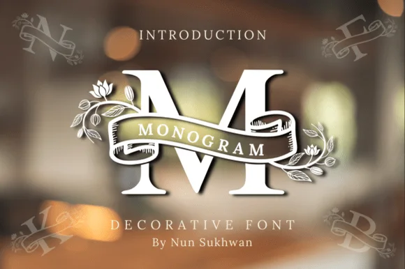
Ribbon-banner floral serif monogram
Amorette Monogram wraps classically built serif initials in a curved ribbon scroll and blooming botanical vines, and the corner specimens show N, F, K and B each carrying their own banner and floral detailing around bold structural stems.
Ideas for this font
Same independent foundry
Allow optional Google Analytics to measure visits and catalogue actions. Your search words and notes are not included. Privacy & storage