Editorial Serif Anchor

Welcome Script + Grandeur – Elegant Classic Serif
Anchors Welcome Script's fluid strokes with crisp Roman proportions on wedding suites, headers and packaging.
Inspect Grandeur – Elegant Classic Serif specimenDisclosure: MakerFileHub may earn a commission from qualifying purchases via paid links on this page. How our links work.
Low rounded calligraphy with long entry swashes
Welcome Script is a low rounded calligraphy in navy on a kraft ground: fat downstrokes, a horizontal entry swash that runs to both margins, and a border of line-drawn flowers supplied with the file.
Paid link
Get this fontProject & layout blueprintsAt-a-glance maker compatibility
Weld or Unite overlapping script joins into one continuous vector path before sending to the blade.
Visual anatomy & craft review
welcome is set in lowercase across the card, and the lettering is a modern calligraphy with very little contrast: the strokes are a heavy monoline, the bowls of the e and the o are wide ovals, the l lifts into a modest loop and the m turns over into a long exit stroke. The entry swash on the w runs out almost the full width of the card and turns upward at the end, so the word sits inside a drawn underline. Around it a navy border frames line-drawn poppies and leaves at the top and the foot, and two captions in the middle name the face and the clipart that comes with it. The face is a signage and stationery script: the long swash means it wants a wide measure, it holds at large sizes in one ink, and the supplied flower line art lets a small brand build a frame without a separate illustration.
A wide calligraphy with drawn flower clipart
Two-font hierarchy recipes
Tested contrast partners — pairing Welcome Script with grounded secondary typography.
Welcome Script + Grandeur – Elegant Classic Serif
Anchors Welcome Script's fluid strokes with crisp Roman proportions on wedding suites, headers and packaging.
Inspect Grandeur – Elegant Classic Serif specimen
Welcome Script + Sailors
Keeps small-scale dates, URLs, nutrition facts and care instructions crisp and legible below script titles.
Inspect Sailors specimenPractical applications
Concrete hierarchy, scale and production guidance tailored to Welcome Script’s stroke geometry.
One wide word with a long swash is exactly what an entrance sign needs, and the drawn flowers mean the board reads as decorated without a frame.
Hierarchy & layout recipe
Print a 600 by 400 mm board: set the word at 130 pt on one row, keep 26 mm of clear ground beneath before the names at 26 pt, and hold 24 mm of margin so the swash is not trimmed.
Pre-production check
A long swash at 130 pt can look like a rule rather than a flourish; print one board at the final size and check the ends before the set.
The clipart and the script come from the same hand, so a small farm can make a card and a sign that look drawn by one person.
Hierarchy & layout recipe
Print an 85 by 55 mm card: set the farm name at 15 pt on one row, keep 6 mm of clear ground beneath before the opening times at 6.5 pt, and hold 5 mm of margin on all sides.
Pre-production check
Line-drawn flowers at card size become a smudge; print one card at the real size and check the border before the order.
A wide script fits a round jar label because the swash can follow the curve, and one navy ink on kraft is a cheap, honest print.
Hierarchy & layout recipe
Print a 60 mm round label: set the word at 16 pt on one row, keep 6 mm of clear ground between the swash and the rim, and leave 8 mm beneath for the weight at 5 pt.
Pre-production check
Navy ink on kraft can turn grey; print one label on the real stock and check the contrast before the order.
Technical & licence verification
Confirm included OTF/TTF/WOFF formats, full glyph tables and licence coverage on the live store page before batch production.
Closest visual alternatives
Matched across letterform anatomy, stroke behaviour and craft applications.
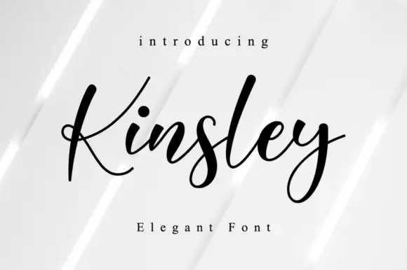
Tapered script with an open capital
Kinsley Script is a tapered, high-waisted script whose open capital K carries a wide diagonal arm while the lowercase stays narrow, even and airy on the line.
Ideas for this font
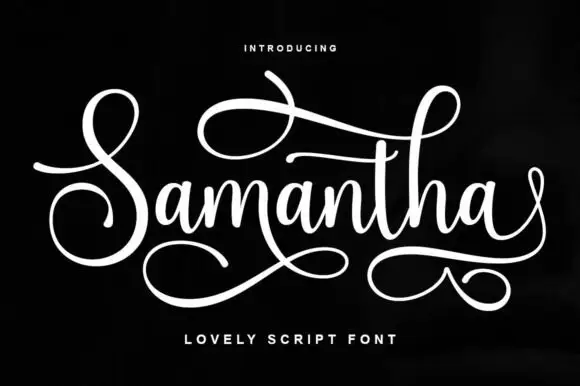
Flourished script with a long underline
Samantha is a flourished script in white on black: a tall looping capital S, a narrow connecting body and two long swashes, one crossing above the word and one curling beneath it.
Ideas for this font
Rounded contrast calligraphy
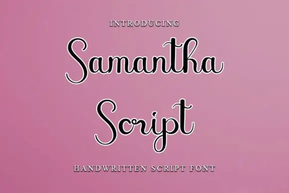
Samantha Script is a rounded contrast calligraphy in black with a white keyline on pink: fat round bowls, hairline joins, tall narrow loops and rounded terminals that soften a formal script.

Very slanted calligraphy with broad lower sweeps and fine hairlines
Silken Luxe is a formal calligraphy script with a steep slant, broad lower sweeps and hairlines that thin almost to nothing, drawn so two words build an ornamental diagonal across the plate.
Ideas for this font
Same independent foundry
Allow optional Google Analytics to measure visits and catalogue actions. Your search words and notes are not included. Privacy & storage