High-Contrast Display Serif

Ventaro + Augler
Pairs sculptural editorial warmth with Ventaro's clean modern geometry.
Inspect Augler specimenDisclosure: MakerFileHub may earn a commission from qualifying purchases via paid links on this page. How our links work.
Neo-grotesque variable sans
Ventaro is a neo-grotesque sans presented as a dark specification sheet: a compact header with the foundry name, a right-aligned stack naming nine weights, italic, four hundred glyphs and extended language support, a plain line describing it as a new variable sans serif, then the word at a very large size across the base.
Paid link
Get this fontProject & layout blueprintsAt-a-glance maker compatibility
Sturdy stroke walls and open counters weed cleanly on adhesive vinyl, HTV apparel film, and cut cardstock.
Visual anatomy & craft review
The plate is a specification sheet rather than a specimen, and that is what makes it useful: the stack at the right names the weights, the italic, the glyph count and the language coverage in one glance, and the word at the base shows the default weight at display size. The drawing is a neo-grotesque with broad open e bowls and a compact double-storey a, so the face reads as neutral and the tight sidebearings keep a line even at large sizes. Because the family is variable, the practical decision is the weight range rather than a single cut, and the buyer should pick axes before a size. The header and the credit are product copy. It suits an interface, a report and a corporate identity.
Sans serif, variable, neutral, corporate
Two-font hierarchy recipes
Tested contrast partners — pairing Ventaro with grounded secondary typography.
Ventaro + Augler
Pairs sculptural editorial warmth with Ventaro's clean modern geometry.
Inspect Augler specimen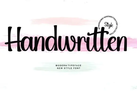
Ventaro + Handwritten
Introduces organic movement on pull-quotes, signatures and gift tags.
Inspect Handwritten specimenPractical applications
Concrete hierarchy, scale and production guidance tailored to Ventaro’s stroke geometry.
A neutral grotesque reads as a company rather than a campaign, and the broad open bowls hold at interface and signage sizes alike.
Hierarchy & layout recipe
Set the mark at 9 pt bold on a card, 90 mm on a wall and 7.5 pt regular on a report, using two weights of one variable family. Keep one colour and clear space equal to the cap height.
Pre-production check
Check the 7.5 pt report mark, where the a can fill; keep the size above 8.5 pt at that weight. Confirm the wall mark reads at ten metres and that the two weights match optically.
A neo-grotesque is the standard sign face, and the open bowls hold on a board read at an angle in poor light. It reads at an angle in low light.
Hierarchy & layout recipe
Fabricate a 1200 by 400 mm sign: the destination at 140 mm cap height, the platform at 60 mm, and two weights of the same family in white on a dark panel. Keep 40 mm margins and keep the strokes above 8 mm.
Pre-production check
Check the sign at 140 mm, where a bowl can fill with paint; keep it above 8 mm. Confirm the 60 mm platform reads at twelve metres and that the letters clear the frame.
A neutral sans carries a long report, and the compact a keeps a narrow column even at small sizes. It holds a long report.
Hierarchy & layout recipe
A4 report: body at 9.5 pt on a 15 pt leading in a 115 mm column, captions at 7.5 pt, and headings at 14 pt in a heavier weight of the same family. Keep 20 mm margins and print one ink.
Pre-production check
Check the 9.5 pt body in proof, where a narrow column can set loose; adjust the tracking rather than the size. Confirm the 7.5 pt captions read in hand and that the headings match the body optically.
Technical & licence verification
Confirm included OTF/TTF/WOFF formats, full glyph tables and licence coverage on the live store page before batch production.
Closest visual alternatives
Matched across letterform anatomy, stroke behaviour and craft applications.

Modern geometric grotesque caps
Limited Coffee is a modern geometric grotesque in black on cream: wide round capitals, a circular O and C, a low crossbar on the A, flat terminals and even spacing, so the pair reads as a contemporary retail sign rather than a period revival.
Ideas for this font
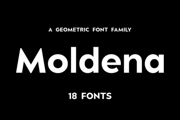
Geometric heavy sans family
Moldena is a heavy geometric sans in white on black: mixed case with circular bowls, a sharply peaked M and flat terminals, set as one word between a small tracked line above and a count of the fonts beneath.
Ideas for this font

Light geometric capitals with circular O and broad angular diagonals
Modern Heritage shows black capitals in two closely stacked lines on white, where thin nearly even strokes form a circular O, a broad M and N and a large triangular A, while the G keeps an open right side with a short inner bar.
Ideas for this font
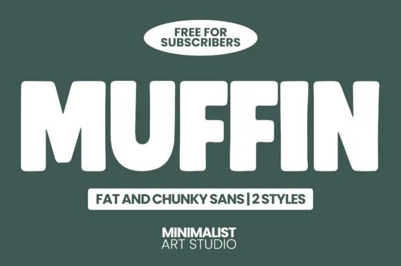
Fat chunky sans display
Muffin is a fat chunky sans in white on dark green: extremely heavy caps with squared corners, narrow counters, and a slightly condensed width, presented as a two-style family with a tracked label beneath and a badge above.
Ideas for this font
Allow optional Google Analytics to measure visits and catalogue actions. Your search words and notes are not included. Privacy & storage