Neutral Sans Workhorse

Thick Jungle + Borsen
Lets Thick Jungle own the focal silhouette while handling secondary copy, sizing and subheads cleanly.
Inspect Borsen specimenDisclosure: MakerFileHub may earn a commission from qualifying purchases via paid links on this page. How our links work.
Mixed cute playful display
Thick Jungle is a mixed cute display in five pastel colours with a heavy dark outline on a striped cream ground: rounded letters in two different widths, an open e and a hooked j, small hearts and four-point stars scattered around the block, and a tracked note beneath.
Paid link
Get this fontProject & layout blueprintsAt-a-glance maker compatibility
Set Cricut or Silhouette operation to Pen, Foil Quill, or Laser Score — not Basic Blade Cut.
Visual anatomy & craft review
The two words are stacked and each letter is a rounded form drawn in one of two widths, which is what gives the face its mixed quality: some letters are wide and squat, others tall and narrow, and the difference is deliberate rather than an error of spacing. The heavy dark outline holds the colours together and gives the block its sticker quality, and the small hearts and stars fill the gaps without touching the letters. Because the shapes are thick and the counters open, the face reads at sticker and poster size, and the specimen sets it large on a striped ground. The tracked note beneath is set in a rounded sans, which keeps the plate friendly and avoids introducing a formal voice.
Playful, rounded, multicolour, cute
Two-font hierarchy recipes
Tested contrast partners — pairing Thick Jungle with grounded secondary typography.
Thick Jungle + Borsen
Lets Thick Jungle own the focal silhouette while handling secondary copy, sizing and subheads cleanly.
Inspect Borsen specimen
Thick Jungle + Rosemode
Grounds bold display lettering with classic typographic authority on posters, badges and apparel.
Inspect Rosemode specimenPractical applications
Concrete hierarchy, scale and production guidance tailored to Thick Jungle’s stroke geometry.
A mixed-width display keeps a sticker sheet from looking mechanical, and the thick outline lets each sticker be cut with a clean edge.
Hierarchy & layout recipe
Die-cut six 40 mm stickers: the phrases at 12 pt, the names at 8 pt, and 2 mm clear to each die. Keep the smallest counter at 4 mm and print four flat colours on white vinyl.
Pre-production check
Check the die cut at 40 mm, where a heart can merge with the outline; keep it 2 mm clear. Confirm the stickers peel cleanly and that the mixed widths still read as one set.
A playful mixed face reads at card size and photographs well, and the outline keeps the letters legible over a patterned background.
Hierarchy & layout recipe
A6 card: the name at 30 pt with a 1.5 mm outline, the details in a 9 pt rounded sans, and two stars. Keep 12 mm margins and print four colours on a white card.
Pre-production check
Check the 30 pt name, where an outline can fill a heart; keep the counter above 2 mm. Confirm the 9 pt details keep a 4.5:1 contrast and that the stars clear the trim.
A mixed display gives a small brand personality, and the heavy outline makes one artwork work on a white or a kraft label.
Hierarchy & layout recipe
Print a 55 mm round label: the brand at 13 pt, the product in a 6 pt sans, and 4 mm inside the die. Keep three colours per label so the shelf stays calm, and print on a white stock.
Pre-production check
Check the 13 pt brand, where the outline can close a counter; reduce the outline below 18 pt. Confirm the 6 pt product reads on the shelf and that the label adheres to a box.
Technical & licence verification
Confirm included OTF/TTF/WOFF formats, full glyph tables and licence coverage on the live store page before batch production.
Closest visual alternatives
Matched across letterform anatomy, stroke behaviour and craft applications.
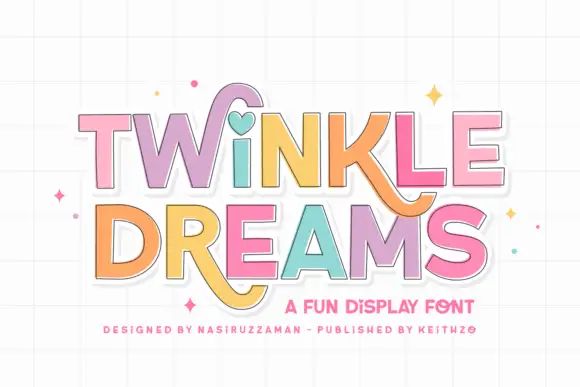
Block display with heart and swash accents
Twinkle Dreams combines firm block capitals with a heart-shaped dot above the i and curling extensions on selected letters, where the R and K tails swing below the main rows, each letter takes a pastel fill with a fine dark edge and the whole block sits on a faint grid.
Ideas for this font
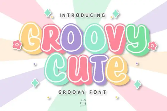
Rounded groovy forms with irregular bowls and inset edging
Groovy Cute shows thick soft letters with varied case-like shapes and uneven widths, where the lower u and e have smaller bodies than the large rounded capitals around them, pastel faces carry fine pale inset contours and a substantial lower-right offset adds depth.
Ideas for this font
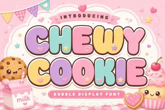
Squat bubble capitals packed tightly with heart accents between letters
Chewy Cookie is a squat bubble capital alphabet packed so tightly that the letters touch, with small hearts scattered into the gaps and a soft outline around the whole phrase.
Ideas for this font
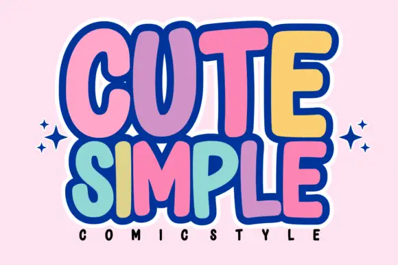
Tall rounded comic blocks with bubble outlines and per-letter colour
Cute Simple is a tall rounded comic alphabet in which the blocks stack tightly, the outlines bubble outward and each letter can take its own colour without breaking the composition.
Ideas for this font
Same independent foundry
Allow optional Google Analytics to measure visits and catalogue actions. Your search words and notes are not included. Privacy & storage