Editorial Serif Anchor

Garden Whimsy + Flowsky Editorial
Anchors Garden Whimsy's fluid strokes with crisp Roman proportions on wedding suites, headers and packaging.
Inspect Flowsky Editorial specimenDisclosure: MakerFileHub may earn a commission from qualifying purchases via paid links on this page. How our links work.
Bouncing looped garden script with open arches and generous spacing
Garden Whimsy is a bouncing looped script in which the baseline rises and falls between letters, the arches stay wide open and the spacing is generous enough for each letter to breathe.
Paid link
Get this fontProject & layout blueprintsAt-a-glance maker compatibility
Weld or Unite overlapping script joins into one continuous vector path before sending to the blade.
Visual anatomy & craft review
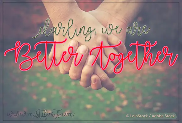
The capital G opens with a large loop that crosses its own stem, and the letters after it keep a loose rhythm: the a closes a wide bowl, the r holds a long arm, the d and the e bounce up and down by several points, and the n keeps a broad open shoulder. Weight is medium and even, with rounded ends and no contrast, so the word reads as written rather than drawn. The ascenders loop above the x-height and the descenders on the W and the y curl back under the line, which is what gives the composition its movement. The wide spacing is deliberate: the letterfit is loose enough that a long word fills a wide measure without tracking. The blurred flowers behind the sample, the red accent text and the small caption are presentation; the script is the two words.
Bouncy · Looped · Open
Two-font hierarchy recipes
Tested contrast partners — pairing Garden Whimsy with grounded secondary typography.
Garden Whimsy + Flowsky Editorial
Anchors Garden Whimsy's fluid strokes with crisp Roman proportions on wedding suites, headers and packaging.
Inspect Flowsky Editorial specimen
Garden Whimsy + Bareum
Keeps small-scale dates, URLs, nutrition facts and care instructions crisp and legible below script titles.
Inspect Bareum specimenPractical applications
Concrete hierarchy, scale and production guidance tailored to Garden Whimsy’s stroke geometry.
The open bouncy hand reads as friendly rather than corporate, and the loose fit fills a long board with a short name without stretched tracking.
Hierarchy & layout recipe
Set the shop name at 20 cm on a 2 m board, keep the opening hours in a clean sans at 5 cm, and leave 15 cm of margin at each end so the loops are inside the panel.
Pre-production check
Outdoor boards catch the weather; check the sign after the first rain and re-coat the descender loops rather than thickening the lettering.
The bouncing rhythm matches the informality of an outdoor ceremony, and the open arches stay legible against planting where closed forms would disappear.
Hierarchy & layout recipe
Set the greeting at 12 cm on a 600 by 400 mm board, set the names in the same face at 6 cm beneath, and leave 10 cm of margin so the descenders clear the frame.
Pre-production check
Foliage behind a painted board breaks open counters; check the sign in position and add a plain panel behind the lettering if the leaves compete.
The loose hand thanks a customer warmly and the generous spacing keeps a short message readable at card size even with natural variation in the baseline.
Hierarchy & layout recipe
Set the message at 18 pt on a 148 by 105 mm card, keep the order details in a 7 pt sans, and leave the middle of the card clear for a handwritten line.
Pre-production check
A bouncing baseline printed twice on one card looks careless; check the proof and use one line of script only before approving the run.
Technical & licence verification
Confirm included OTF/TTF/WOFF formats, full glyph tables and licence coverage on the live store page before batch production.
Closest visual alternatives
Matched across letterform anatomy, stroke behaviour and craft applications.
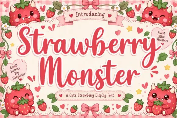
Sweet display script with heart flourishes
Strawberry Monster is a display script in strawberry red on pink gingham: fat rounded strokes, tight loops, hearts worked into the flourishes and small berry characters drawn around the frame.
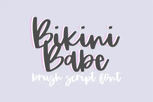
Bouncy brush script with a heavy soft stroke and tilted letter bodies
Bikini Babe is a bouncy brush script in which the letters tilt at slightly different angles, the stroke stays heavy and soft and the baseline rises and falls through the phrase.
Ideas for this font

Light lowercase script with long outer tails and a low even stroke
Abigail is a light lowercase-only script in which the word sits low on the line and both ends run out as long flat tails, so a name reads as a single signed line rather than as a set of letters.
Ideas for this font
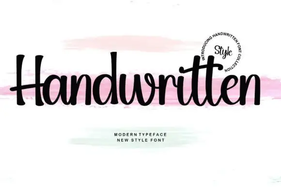
Upright compact script with flared terminals and closed tight fit
Handwritten is a compact upright script in which the letters stay close together, the strokes run heavy and even, and the terminals flare slightly where the pen lifts.
Ideas for this font
Same independent foundry
Allow optional Google Analytics to measure visits and catalogue actions. Your search words and notes are not included. Privacy & storage