Modern Grotesque Body

Ganito + Memoir Slang
Creates crisp high-hierarchy contrast beneath Ganito headlines across menus, websites and labels.
Inspect Memoir Slang specimenDisclosure: MakerFileHub may earn a commission from qualifying purchases via paid links on this page. How our links work.
Very heavy contrasting mixed case with a fine diagonal crossing stroke
Ganito shows large pale lettering on an orange-and-black portrait, where broad heavy bowls meet very fine joins, the G and a carry substantial rounded masses and the o reduces its counter to a narrow vertical opening.
Paid link
Get this fontProject & layout blueprintsAt-a-glance maker compatibility
Crisp hairline serifs shine on stationery, foil stamping, and packaging; add slight offset for small decals.
Visual anatomy & craft review
The masses stay heavy, the joins thin to hairlines, one narrow counter survives inside an otherwise solid o and a fine diagonal stroke crosses from the a toward the n while the i dot rises into a loop. That crossing stroke is the character: a heavy contrast face gains a single drawn gesture, which is why the sample keeps one short word on a portrait. Confirm whether the crossing stroke is a character or cover art, then keep 30 pt before the hairlines break.
Ultra-contrast · Crossing stroke · Heavy bowls
Two-font hierarchy recipes
Tested contrast partners — pairing Ganito with grounded secondary typography.
Ganito + Memoir Slang
Creates crisp high-hierarchy contrast beneath Ganito headlines across menus, websites and labels.
Inspect Memoir Slang specimen
Ganito + Wishful Women
Adds a warm human signature touch for 1-to-3-word callouts without competing against structured serif capitals.
Inspect Wishful Women specimenPractical applications
Concrete hierarchy, scale and production guidance tailored to Ganito’s stroke geometry.
The ultra-contrast mark suits a fashion label, and the heavy bowls hold a short name at 28 pt on a card, where the hairlines keep their edge.
Hierarchy & layout recipe
Print an 85 by 55 mm card: set the wordmark at 28 pt on one row, keep 14 mm of clear ground beneath for the looped dot, and set the season at 7 pt in a plain sans at the foot.
Pre-production check
The crossing stroke drawn in layout drifts from the letters; check the file and use the glyph if it ships.
The heavy contrast sets a cover line, and the narrow o counter holds a one-word title at 66 pt on a coated cover, where the thin joins survive.
Hierarchy & layout recipe
Print an A4 cover: set the title at 66 pt on one row, keep every hairline on the palest band of the image, and keep 24 mm of clear ground beneath before the cover lines at 9 pt.
Pre-production check
Hairline joins over a dark portrait close up; check the proof and print the title in a pale ink.
The heavy forms give a card confidence, and the fine crossing stroke adds one flourish at 30 pt on heavy stock, clear of the line beneath.
Hierarchy & layout recipe
Print an A6 card: set the line at 30 pt on one row, keep 18 mm of clear ground beneath for the descending loop, and leave the lower third blank so the stroke reads as a gesture.
Pre-production check
Two heavy rows on a small card crush the hairline; check the card and keep the second line in a serif.
Technical & licence verification
Confirm included OTF/TTF/WOFF formats, full glyph tables and licence coverage on the live store page before batch production.
Closest visual alternatives
Matched across letterform anatomy, stroke behaviour and craft applications.
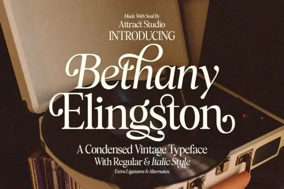
Condensed serif pairing with curled capitals and a looping g
Bethany Elingston shows pale mixed-case serif letters in a slanted upper row and a straighter lower row over an open record player, where curled B and E entries, a tall looped h and a low g extension make the compact stack ornamental, and the cover advertises regular, italic, ligatures and alternates.
Ideas for this font
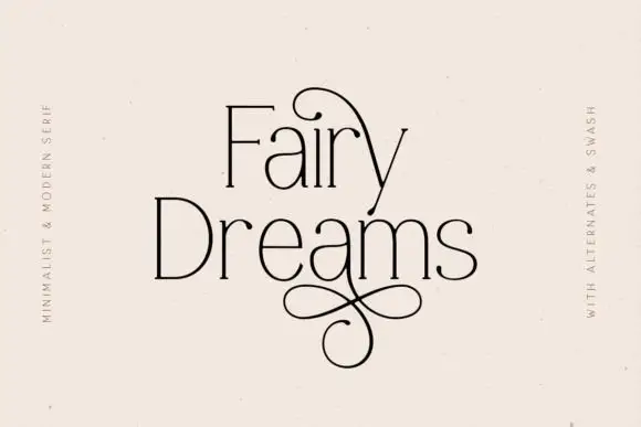
Fine narrow mixed case with oversized upper and lower loops
Fairy Dreams shows thin black mixed case with tall narrow stems and small serif ends. A large upper loop arches across the first line, and a figure-eight-like extension descends below Dreams, while the light lettering sits on plain cream with swash wording along the sides.
Ideas for this font
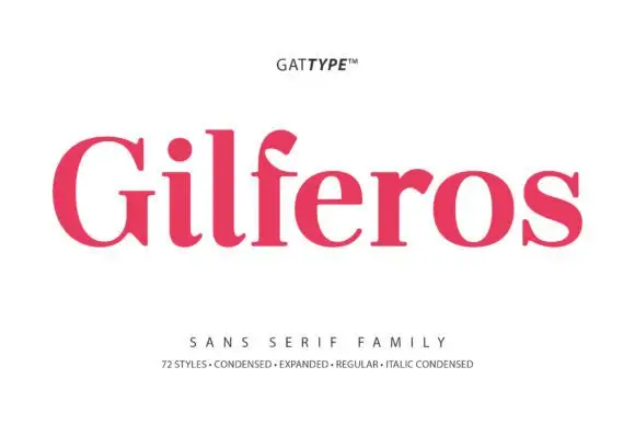
Substantial mixed case with short visible serif feet and curved terminals
Gilferos is a substantial mixed-case family shown in its footed cut, where the stems carry weight, the bowls stay broad, short serifs sit flat on the baseline and the f curls its top, and the listing advertises seventy-two styles from condensed to expanded.
Ideas for this font

Fine narrow elegant serif
Wolles Elegant Modern Serif is a fine narrow serif in cream over a warm blurred interior: tall caps with hairline stems, a raised curve on the W and a low tail on the L, long flat serifs and wide spacing, with small tracked notes in the upper corners and a line beneath.
Same independent foundry
Allow optional Google Analytics to measure visits and catalogue actions. Your search words and notes are not included. Privacy & storage