Modern Grotesque Body

Brittany Signature + Bargain Condensed
Creates crisp high-hierarchy contrast beneath Brittany Signature headlines across menus, websites and labels.
Inspect Bargain Condensed specimenDisclosure: MakerFileHub may earn a commission from qualifying purchases via paid links on this page. How our links work.
Fine upright serif with looped extensions and a soft shadow
Brittany Signature is a fine display serif in which the ascenders and descenders loop away from the letter body, so a name reads as a signed mark rather than as set type.
Paid link
Get this fontProject & layout blueprintsAt-a-glance maker compatibility
Crisp hairline serifs shine on stationery, foil stamping, and packaging; add slight offset for small decals.
Visual anatomy & craft review
The b rises into a narrow stem that ends in an open loop, the r keeps a fine shoulder, the i carries a light dot, the double t crosses with a thin bar and the y drops a descender that swings out into a loop and returns. Weight sits thinly in the stems with a low contrast, which keeps the loops legible at 24 pt and lets the face read as delicate without disappearing. Because the loops extend beyond the letter body, two words stack into a tall lockup that fills a portrait format, which is how the sample uses it. The fit is open, so the loops never tangle. The pale ground, the soft shadow, the brown ink and the two tracked caption lines are presentation; the serif is the two words.
Upright · Looped · Elegant
Two-font hierarchy recipes
Tested contrast partners — pairing Brittany Signature with grounded secondary typography.
Brittany Signature + Bargain Condensed
Creates crisp high-hierarchy contrast beneath Brittany Signature headlines across menus, websites and labels.
Inspect Bargain Condensed specimen
Brittany Signature + Honey
Adds a warm human signature touch for 1-to-3-word callouts without competing against structured serif capitals.
Inspect Honey specimenPractical applications
Concrete hierarchy, scale and production guidance tailored to Brittany Signature’s stroke geometry.
The looped ascenders give a wordmark a signed quality, and the fine stems still reproduce at 14 pt on a card where a script would clot.
Hierarchy & layout recipe
Print a 90 by 55 mm card: set the designer name at 14 pt across the upper half, set the studio line in a 6 pt caps serif below, and keep 10 mm of space around the loops so neither the ascender nor the descender touches the block.
Pre-production check
Looped ascenders close at small sizes; check the printed card and keep the face above 12 pt where the loops begin to fill.
The upright loops read as engraved stationery, and the two stacked words fill a portrait card at 26 pt without a second face on the page.
Hierarchy & layout recipe
Print a 120 by 180 mm card: set both names at 26 pt in two lines with 8 mm leading, set the details in an 8 pt caps serif beneath, and keep 18 mm of margin so the loops stay inside the trim.
Pre-production check
Two looped lines set close merge their ascenders and descenders; check the proof and open the leading by 2 mm rather than shrinking the type.
The fine looped serif gives a small label a couture register, and the low contrast keeps it legible at 12 pt on a coated bottle label.
Hierarchy & layout recipe
Print a 40 by 75 mm coated label: set the house name at 12 pt, set the volume in a 5 pt caps serif at the foot, and keep 5 mm of margin so the descender loop sits on the flat of the label.
Pre-production check
A loop wrapping a bottle curve distorts; check one labelled bottle and keep the lettering inside the flat central band.
Technical & licence verification
Confirm included OTF/TTF/WOFF formats, full glyph tables and licence coverage on the live store page before batch production.
Closest visual alternatives
Matched across letterform anatomy, stroke behaviour and craft applications.
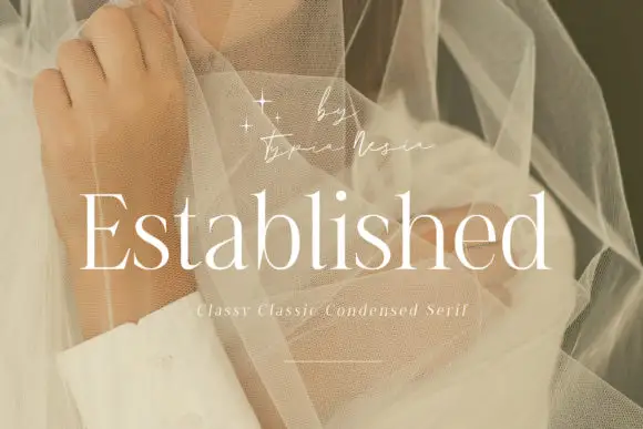
Fine condensed mixed case with long straight ascenders
Established shows light white serif letters with narrow rounded bowls and tall upright stems, where the thin horizontal strokes and small serifs keep a long word visually delicate, and the title overlays a pale portrait behind translucent fabric with a small script credit above.
Ideas for this font

Display serif with slanted accent
The Lumina Awesome is a display serif in cream over a close portrait: a light slanted line in mixed case above, and a substantial upright caps line beneath at a larger size, with a tracked note at the top left and a bracketed line at the foot naming the count of cuts.

Large contrasting mixed case with a very tall capital and a wide open e
Evoire is a high-contrast editorial serif in which one capital rises far above the lowercase, the bowls stay broad and round, the i dot is a large circle and the final e opens wide to the right, so a name reads as a fashion masthead.
Ideas for this font

High-contrast italic editorial serif
The Simple Editorial is a high-contrast italic serif in near-black on white: very fine hairlines, sharp serifs, a strong forward slant and a tall waist, shown in a full specimen with weight and width labels in a small caps grid around the display line.
Ideas for this font
Allow optional Google Analytics to measure visits and catalogue actions. Your search words and notes are not included. Privacy & storage