High-Contrast Display Serif

Beautiful Handwitten + The Bilstein Editorial
Pairs sculptural editorial warmth with Beautiful Handwitten's clean modern geometry.
Inspect The Bilstein Editorial specimenDisclosure: MakerFileHub may earn a commission from qualifying purchases via paid links on this page. How our links work.
Multi-face calligraphy sampler with signatures
Beautiful Handwitten collects several distinct calligraphic faces in one set: fine signatures, heavy rounded scripts and a brush sans arranged as a specimen wall.
Paid link
Get this fontProject & layout blueprintsAt-a-glance maker compatibility
Weld or Unite overlapping script joins into one continuous vector path before sending to the blade.
Visual anatomy & craft review
The cover is a grid of small samples rather than one headline, so the useful information is in how the faces differ: the top line is a fine slanted signature with a long crossbar, the middle rows mix a rounded upright script with a thick brush set, and the lower-left names are shorter, simpler connected shapes. Several samples keep a small heart or dot as a tittle, and the connecting strokes vary from hairline to near-solid within the same line. Because this is a collection rather than a family, each sample can carry a different weight, which is what makes the wall feel curated instead of repetitive. The pink script across the top is a promotional lockup for the set, not one of the display faces.
Varied · Collected · Display
Two-font hierarchy recipes
Tested contrast partners — pairing Beautiful Handwitten with grounded secondary typography.
Beautiful Handwitten + The Bilstein Editorial
Pairs sculptural editorial warmth with Beautiful Handwitten's clean modern geometry.
Inspect The Bilstein Editorial specimen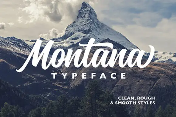
Beautiful Handwitten + Montana
Introduces organic movement on pull-quotes, signatures and gift tags.
Inspect Montana specimenPractical applications
Concrete hierarchy, scale and production guidance tailored to Beautiful Handwitten’s stroke geometry.
A multi-face set lets one studio cover a formal signature, a rounded script for signage and a heavier face for stamps without buying three separate products.
Hierarchy & layout recipe
Assign one face per job before designing anything: signature for the letterhead, rounded script for the shop sign, brush for the rubber stamp, and keep each to a single role in the kit.
Pre-production check
Check that the licence covers all the faces you plan to use commercially, because a bundle can carry one licence for the collection rather than per face.
Using two faces from the same collection keeps the suite coherent while still giving names and logistics visibly different voices.
Hierarchy & layout recipe
Set the couple's names in the fine signature at 32 pt, the venue and date in the rounded script at 11 pt, and hold them at least 10 mm apart so the two loop styles never touch.
Pre-production check
Proof the two faces side by side at final size; families sold together do not always share x-height, and the mismatch shows first in the smaller line.
A set of contrasting samples is exactly the material a magazine spread about calligraphy wants, with no need to source faces separately.
Hierarchy & layout recipe
Lay out six samples in a three-by-two grid at 24 pt each, caption every one, and keep the grid on one baseline so the different weights stay comparable.
Pre-production check
Make sure the caption names the actual face used in each cell, since a viewer will assume the set is one font and be misled by the grid.
Technical & licence verification
Confirm included OTF/TTF/WOFF formats, full glyph tables and licence coverage on the live store page before batch production.
Closest visual alternatives
Matched across letterform anatomy, stroke behaviour and craft applications.
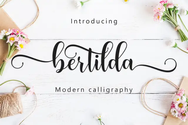
Broad swashed lowercase calligraphy
Bertilda Script is a broad lowercase calligraphy whose entry and exit swashes travel further than the letters themselves, so a seven-letter word occupies the width of a full line.
Ideas for this font
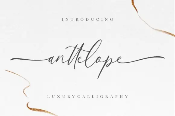
Fine extended calligraphy with long flat entry and exit strokes
Anttelope is fine extended calligraphy whose entry and exit strokes run almost the full width of the panel, with a small x-height and a light even line between them.
Ideas for this font
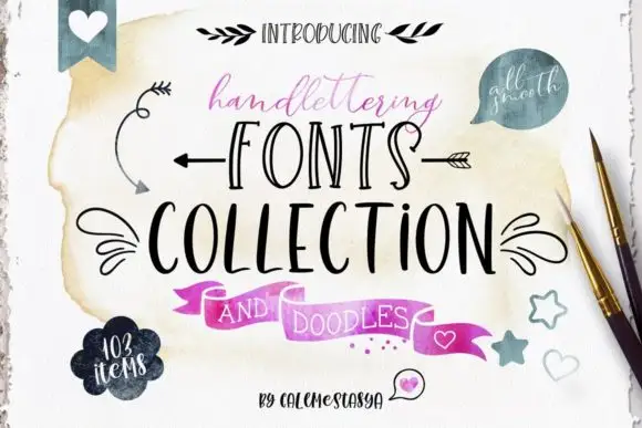
Ten-font hand-lettering bundle with drawn doodle elements
Handlettering Fonts Collection is a ten-font bundle rather than one alphabet: three scripts with italics, two decorative all-caps faces, a serif, a sans and a set of drawn doodles.
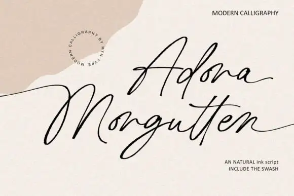
Fine angular modern calligraphy with open corners and swash alternates
Adora Morgutten is fine modern calligraphy drawn with angular rather than rounded turns, so the strokes change direction at open corners and the phrase reads as a written line with edges.
Ideas for this font
Allow optional Google Analytics to measure visits and catalogue actions. Your search words and notes are not included. Privacy & storage