Editorial Serif Anchor

Antura + Stanza
Anchors Antura's fluid strokes with crisp Roman proportions on wedding suites, headers and packaging.
Inspect Stanza specimenDisclosure: MakerFileHub may earn a commission from qualifying purchases via paid links on this page. How our links work.
Fine copperplate script with oversized lower loops
Antura sets narrow slanted downstrokes against exceptionally thin connecting curves, with lower loops that drop close to a full x-height below the baseline.
Paid link
Get this fontProject & layout blueprintsAt-a-glance maker compatibility
Weld or Unite overlapping script joins into one continuous vector path before sending to the blade.
Visual anatomy & craft review
The specimen is white on a near-black ground, which makes the weight contrast the first thing you notice: hairline entry strokes climb into a tall oval A, then thicken sharply through the downstroke before pinching back to a hair on the exit. The y and the final a both release loops that fall close to a full x-height below the baseline, so a single line occupies much more vertical space than the cap height suggests. Spacing is generous and even, so the word reads as engraved rather than handwritten. The small tracked caption under the sample is a label line, not part of the alphabet, and the shadow behind the script belongs to the cover artwork.
Formal · Looped · Slanted
Two-font hierarchy recipes
Tested contrast partners — pairing Antura with grounded secondary typography.
Antura + Stanza
Anchors Antura's fluid strokes with crisp Roman proportions on wedding suites, headers and packaging.
Inspect Stanza specimen
Antura + Limited Coffee
Keeps small-scale dates, URLs, nutrition facts and care instructions crisp and legible below script titles.
Inspect Limited Coffee specimenPractical applications
Concrete hierarchy, scale and production guidance tailored to Antura’s stroke geometry.
High contrast between hairline joins and heavy downstrokes is what reads as engraved copperplate on a printed card, which is the register a formal suite needs.
Hierarchy & layout recipe
Set the names at 36 pt on a 5 by 7 inch card, keep the first line to eleven characters, and leave 12 mm under the baseline so the y and a loops never meet the date block.
Pre-production check
The connecting hairlines are the first thing to close up in letterpress; proof them on the actual stock before ordering plates.
The narrow slant keeps a long product name inside a short label while the heavy downstrokes hold the ink at small sizes.
Hierarchy & layout recipe
Keep the script at 13 pt on a 70 by 40 mm label, set the volume number in a tracked serif at 7 pt beneath, and keep 5 mm clear at the right for the exit hairline.
Pre-production check
At label size the upstrokes thin to almost nothing, so check the printer can hold a 0.15 mm line before committing the run.
A slanted copperplate headline gives an editorial opener its formal voice while the thin joins keep the page from feeling heavy.
Hierarchy & layout recipe
Run the headline at 54 pt across a single column, allow the lower loops to break into the caption zone by no more than 6 mm, and start body copy three lines lower.
Pre-production check
Check the loop of the final letter against the caption rule; on a narrow measure the descender will cross a line of text if you keep default leading.
Technical & licence verification
Confirm included OTF/TTF/WOFF formats, full glyph tables and licence coverage on the live store page before batch production.
Closest visual alternatives
Matched across letterform anatomy, stroke behaviour and craft applications.
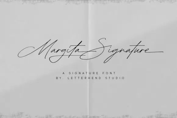
Very fine elongated signature script
Margita Signature is a very fine elongated signature in black on a pale sheet: long flat entry strokes, tall narrow loops, and letters that stretch horizontally rather than vertically.
Ideas for this font
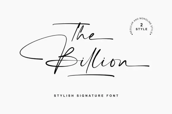
Wide fine signature with long swashes
The Billion is a wide fine signature in black on white: hairline monoline letters, a capital T that runs above the line as a long bar, and an S whose swash sweeps under the word and returns in one continuous gesture.
Ideas for this font
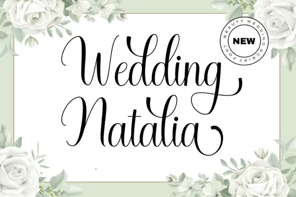
Fine italic calligraphy with tall loops
Wedding Natalia is a fine italic calligraphy in black on white: hairline ascenders, a soft forward slant, a capital W drawn as a tall double loop and a capital N whose first stroke rises above the line.
Ideas for this font
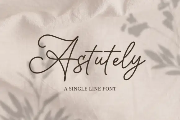
Single-line monoline script with connected ribbon strokes
Astutely is a single-line script: one unvarying stroke loops through every letter without swelling, thinning or overlapping, so the word reads as a piece of bent wire rather than written ink.
Ideas for this font
Allow optional Google Analytics to measure visits and catalogue actions. Your search words and notes are not included. Privacy & storage