Editorial Serif Anchor

Amergo + Grandeur – Elegant Classic Serif
Anchors Amergo's fluid strokes with crisp Roman proportions on wedding suites, headers and packaging.
Inspect Grandeur – Elegant Classic Serif specimenDisclosure: MakerFileHub may earn a commission from qualifying purchases via paid links on this page. How our links work.
Towering rounded initial script
Amergo opens with a towering rounded capital whose swash rises to roughly three times the x-height and finishes in a wide curl above the following letters.
Paid link
Get this fontProject & layout blueprintsAt-a-glance maker compatibility
Weld or Unite overlapping script joins into one continuous vector path before sending to the blade.
Visual anatomy & craft review
The first letter is drawn at roughly three times the x-height, loops back on itself, and its rising stroke ends in a curl that sits above the following letters, so the word reads as a monogram plus a signature. The remaining lowercase is small, rounded and evenly spaced, with short connections and a single-storey a, which is what keeps the lockup balanced against the oversized capital. Weight is consistent and slightly heavy, so the face survives reduction better than a hairline script. The lake and mountain photograph behind the card is context, the small Introducing line and the tracked caption beneath belong to separate label faces.
Towering · Rounded · Sweeping
Two-font hierarchy recipes
Tested contrast partners — pairing Amergo with grounded secondary typography.
Amergo + Grandeur – Elegant Classic Serif
Anchors Amergo's fluid strokes with crisp Roman proportions on wedding suites, headers and packaging.
Inspect Grandeur – Elegant Classic Serif specimen
Amergo + Saltriver Grotesk
Keeps small-scale dates, URLs, nutrition facts and care instructions crisp and legible below script titles.
Inspect Saltriver Grotesk specimenPractical applications
Concrete hierarchy, scale and production guidance tailored to Amergo’s stroke geometry.
A towering initial turns a first name into a recognisable mark, which is what a freelancer needs on invoices and social profiles.
Hierarchy & layout recipe
Set the mark at 60 pt, keep the curl inside a square area of its own height so nothing crowds it, and do not add a separate icon, badge or tagline beside it.
Pre-production check
The curl is the thinnest part of the mark; check it at avatar size before using the logo on social platforms.
An oversized initial reads as a monogram without needing a separate monogram frame, which keeps a small save-the-date card simple.
Hierarchy & layout recipe
Set the pair of initials at 48 pt on a 4 by 6 inch card, keep the two curls from touching each other, and leave 10 mm of space below them for the date line.
Pre-production check
Two towering capitals side by side can collide; set them first, then adjust the space between them by eye rather than by tracking.
The oversized initial works as a drawn drop cap, which gives a chapter opener real personality without a full display treatment.
Hierarchy & layout recipe
Set the initial at 72 pt on the first line of the chapter, let the lowercase follow at 11 pt, and indent the first three lines so the curl sits clear of the text.
Pre-production check
The rising curl will overlap a tight measure; check the column width before choosing the initial size.
Technical & licence verification
Confirm included OTF/TTF/WOFF formats, full glyph tables and licence coverage on the live store page before batch production.
Closest visual alternatives
Matched across letterform anatomy, stroke behaviour and craft applications.
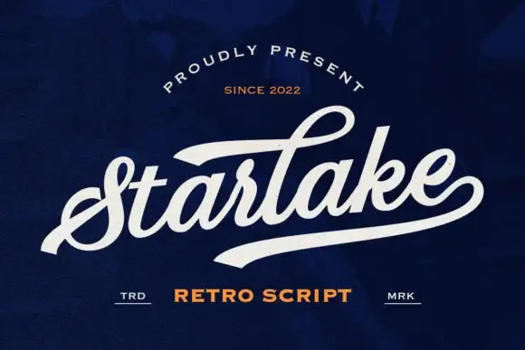
Swashed retro connected script with a wide underline tail
Starlake is a swashed retro connected script in which the first letter rises into a broad swash, the strokes stay heavy and the word finishes on a wide tail that acts as an underline.
Ideas for this font
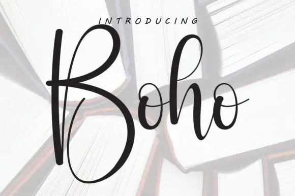
Tall high-contrast script with an oversized B
Boho opens with an oversized narrow B that drops a deep lower bowl, the h lifts a tall loop and the two small o forms join through fine crossing connectors, so a single short name reads as a tall written line.
Ideas for this font
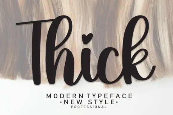
Heavy upright script with a heart dot
Thick is a heavy upright script in black over a pale textured ground: very fat even strokes, a tall narrow capital T drawn with a long bar, a heart in place of the dot on the i and a heavy leg on the k.
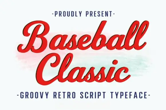
Thick retro sports script with high contrast and a lean
Baseball Classic is a thick retro sports script that leans forward, its downstrokes heavy and its joins thin, with looped capitals on both words and a small ball terminal at the exits.
Ideas for this font
Allow optional Google Analytics to measure visits and catalogue actions. Your search words and notes are not included. Privacy & storage