Editorial Serif Anchor

Streaking + The Lumina Awesome
Anchors Streaking's fluid strokes with crisp Roman proportions on wedding suites, headers and packaging.
Inspect The Lumina Awesome specimenDisclosure: MakerFileHub may earn a commission from qualifying purchases via paid links on this page. How our links work.
Bold dry brush script with a gold underline
Streaking is a bold dry brush script in black with a sweeping gold underline, shown on cream between black paint daubs and a row of feature icons.
Paid link
Get this fontProject & layout blueprintsAt-a-glance maker compatibility
Weld or Unite overlapping script joins into one continuous vector path before sending to the blade.
Visual anatomy & craft review
Streaking fills the card in one word, and the lettering is a confident brush script: the S opens with a heavy diagonal, the t and the k carry short sharp ascenders, the joins are broad and the whole line leans forward with a dry edge on the exits. Beneath the word a single gold swash runs the full width as an underline, and it is the only colour in the composition. The ground is cream with heavy black brush daubs at the corners, a badge at the top right and a row of five small icons at the foot that list the character set. The face is a brush display for packaging, apparel and posters: it wants a large size to show the dry texture, it works in one colour plus a metallic accent, and it should be reserved for a single word or short phrase.
A confident dry brush script
Two-font hierarchy recipes
Tested contrast partners — pairing Streaking with grounded secondary typography.
Streaking + The Lumina Awesome
Anchors Streaking's fluid strokes with crisp Roman proportions on wedding suites, headers and packaging.
Inspect The Lumina Awesome specimen
Streaking + Swaraga
Keeps small-scale dates, URLs, nutrition facts and care instructions crisp and legible below script titles.
Inspect Swaraga specimenPractical applications
Concrete hierarchy, scale and production guidance tailored to Streaking’s stroke geometry.
A bold brush word on a bag reads at shelf distance, and a gold underline gives the label a second colour without a second element.
Hierarchy & layout recipe
Print a 70 by 90 mm bag label: set the brand at 20 pt on one row, keep 7 mm of clear ground beneath before the roast at 5 pt, and hold 5 mm from the underline to the die line.
Pre-production check
The dry brush edge can look like a worn plate on a small label; print one on the real bag stock and check the exit before the order.
A brush script suits a party that is not formal, and the single gold accent can repeat the metallic detail used on the printed invitation.
Hierarchy & layout recipe
Print a 600 by 400 mm board: set the greeting at 130 pt on one row, keep 28 mm of clear ground beneath before the names at 28 pt, and hold 24 mm of border on all sides.
Pre-production check
A dry brush edge at 130 pt shows every imperfection; print one board at the final size and check the stroke before the set.
One brush word sets the tone of a whole issue, and the gold underline carries the accent colour already used on the inside pages.
Hierarchy & layout recipe
Print a 230 by 300 mm cover: set the cover word at 110 pt on one row, keep 30 mm of clear ground beneath before the cover lines at 12 pt, and hold 22 mm of margin on all sides.
Pre-production check
Black brush on a photograph loses the dry edge; print one cover and check the word separates from the image before the run.
Technical & licence verification
Confirm included OTF/TTF/WOFF formats, full glyph tables and licence coverage on the live store page before batch production.
Closest visual alternatives
Matched across letterform anatomy, stroke behaviour and craft applications.
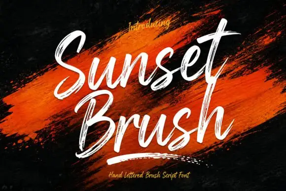
Rough brush script with a dry edge
Sunset Brush is a rough brush script in white over an orange paint smear: heavy strokes with dry, split ends, tall narrow loops and a forward slant that keeps a twelve-letter phrase moving.
Ideas for this font
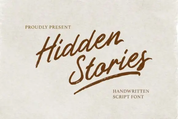
Angled brush script with dry-brushed edges and an underline swash
Hidden Stories is a dry brush script that leans hard to the right, its strokes ragged at the edges and broken where the brush lifted, with a single long underline swash finishing the second word.
Ideas for this font
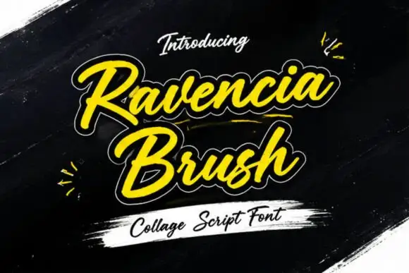
Display
Ravencia Brush is a heavy brush script with a thick monoline, a white contour cut around every stroke and a yellow fill, presented on a dark painterly ground with torn paper and paint smears.
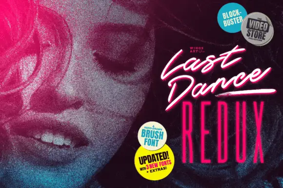
Slanted cinematic brush script
Last Dance Redux is a slanted brush script in white with a pink glow: fast narrow strokes with a dry edge, tight loops and underline swashes, presented as a video-store cover with neon type beneath.
Ideas for this font
Allow optional Google Analytics to measure visits and catalogue actions. Your search words and notes are not included. Privacy & storage