Neutral Sans Workhorse

Happy Halloween + Monure
Lets Happy Halloween own the focal silhouette while handling secondary copy, sizing and subheads cleanly.
Inspect Monure specimenDisclosure: MakerFileHub may earn a commission from qualifying purchases via paid links on this page. How our links work.
Soft horror capitals with short dripping edges and heavy rounded forms
Happy Halloween is a horror display face built from heavy rounded capitals whose lower edges drip in short rounded runs, so each word looks like wet paint or melted wax rather than a drawn letter.
Paid link
Get this fontProject & layout blueprintsAt-a-glance maker compatibility
Sturdy stroke walls and open counters weed cleanly on adhesive vinyl, HTV apparel film, and cut cardstock.
Visual anatomy & craft review
Every letterform is a slab of solid ink: the H is two thick verticals joined by a bar of equal weight, the A closes into a mound with a small counter, and the P and Y repeat the same round-topped volume so the two words sit as matching blocks. The character comes from the bottom edge, where the strokes break into short drips of varying length, some running a third of the x-height below the baseline. The counters are small and rounded, which keeps the word dense, and the tops are smooth, so the melting effect reads only at the base. There is no contrast and no serif anywhere. The orange ground, the wreaths, bats and pumpkins around the words are presentation; the typeface is the two words.
Heavy · Dripping · Horror
Two-font hierarchy recipes
Tested contrast partners — pairing Happy Halloween with grounded secondary typography.
Happy Halloween + Monure
Lets Happy Halloween own the focal silhouette while handling secondary copy, sizing and subheads cleanly.
Inspect Monure specimen
Happy Halloween + Papillon Serif – Elegant Modern Luxury
Grounds bold display lettering with classic typographic authority on posters, badges and apparel.
Inspect Papillon Serif – Elegant Modern Luxury specimenPractical applications
Concrete hierarchy, scale and production guidance tailored to Happy Halloween’s stroke geometry.
The dripping base edge does the work of an illustration at poster size, so a single line of type fills a sheet without extra artwork, and the heavy forms stay legible from the pavement.
Hierarchy & layout recipe
Set the title at 96 pt on an A3 poster, keep the address and times in a bold 14 pt grotesque, and hold 25 mm below the drips so the longest run does not touch the detail block.
Pre-production check
Screen printing a heavy face with thin drip tails can tear the squeegee edge; check a pull at final size and shorten the longest drips if the ink bridges them.
A solid horror face with a dripping base cuts cleanly from acrylic at party scale, and the drips give the topper a silhouette that reads against a lit cake without extra decoration.
Hierarchy & layout recipe
Set the greeting at 55 mm tall on a 160 mm topper, keep the age in the same face at 25 mm, and leave 6 mm of material around the longest drip so the acrylic does not snap.
Pre-production check
Laser cut acrylic will burn a thin drip tail; check the vector at full size and thicken any drip under 3 mm before the file goes to the cutter.
A heavy dripping face reads at the size of a printed insert and survives being folded into a paper bag, where a light novelty face would disappear into the creases.
Hierarchy & layout recipe
Set the greeting at 40 pt on a 120 by 80 mm card, keep the house number in a bold 12 pt grotesque, and keep all type 10 mm clear of the fold so the drips are not broken by the crease.
Pre-production check
Insert cards crease across the middle; check the artwork against the fold line and move the greeting up if the longest drip crosses it.
Technical & licence verification
Confirm included OTF/TTF/WOFF formats, full glyph tables and licence coverage on the live store page before batch production.
Closest visual alternatives
Matched across letterform anatomy, stroke behaviour and craft applications.
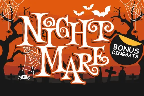
Angular spiral-terminal horror serif
Night Mare is an angular decorative serif in which the letters stay uneven, the feet come to points and the terminals coil inward in tight spirals, so a stacked title reads as gothic horror lettering rather than a clean historical blackletter.
Ideas for this font
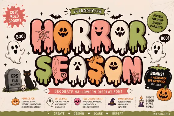
Bubble horror letters with faces and webs
Horror Season mixes puffy capitals with melting lower edges and face-shaped counters, where webs, cracks and small creature details appear inside selected letter bodies and the title is multicoloured with a heavy outline.
Ideas for this font
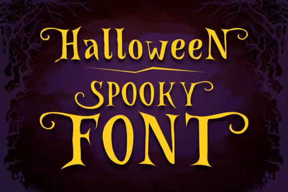
Narrow spooky serifs with curled ends
Halloween Spooky shows tall high-contrast letters with pointed serif tips and long curling terminals, and the enlarged F and T extend horizontally across the lowest word of the composition.
Ideas for this font
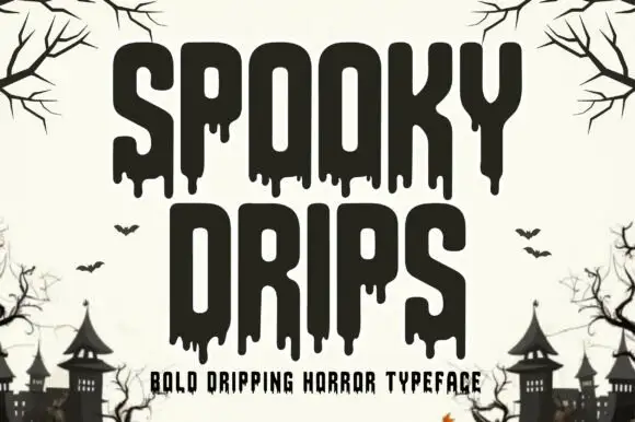
Bold dripping horror display
Spooky Drips is a bold dripping display in near-black on a bone ground: very heavy condensed letters with long viscous drips running from the baseline and the counters, flat terminals and a squared top, framed by bare branches and a row of haunted houses along the foot.
Ideas for this font
Allow optional Google Analytics to measure visits and catalogue actions. Your search words and notes are not included. Privacy & storage