Editorial Serif Anchor

Ghisella + Things
Anchors Ghisella's fluid strokes with crisp Roman proportions on wedding suites, headers and packaging.
Inspect Things specimenDisclosure: MakerFileHub may earn a commission from qualifying purchases via paid links on this page. How our links work.
Large looping connected calligraphy with a duo companion
Ghisella is a lush connected calligraphy with oversized entry loops, tall ascenders and a script companion, presented as a duo on a coral ground.
Paid link
Get this fontProject & layout blueprintsAt-a-glance maker compatibility
Weld or Unite overlapping script joins into one continuous vector path before sending to the blade.
Visual anatomy & craft review
The capital G opens with a loop that travels almost the width of the letter before it turns, and the final a drops a wide tail that curves back under the word, so the lockup occupies far more horizontal space than the letters alone. Ascenders in l and h rise to nearly double the x-height, joins sit at mid-height, and the weight shifts between a solid downstroke and a hair, which is what gives the sample its celebratory motion. The companion line under the script is a thinner version of the same hand, and the scissors, hearts and small marks around the card are cover illustration. The FONT DUO badge is a listing label, not part of the alphabet.
Lush · Looped · Celebratory
Two-font hierarchy recipes
Tested contrast partners — pairing Ghisella with grounded secondary typography.
Ghisella + Things
Anchors Ghisella's fluid strokes with crisp Roman proportions on wedding suites, headers and packaging.
Inspect Things specimen
Ghisella + Borsen
Keeps small-scale dates, URLs, nutrition facts and care instructions crisp and legible below script titles.
Inspect Borsen specimenPractical applications
Concrete hierarchy, scale and production guidance tailored to Ghisella’s stroke geometry.
Oversized loops give a short name the presence of a full header, so a small card can carry one name alone without any second decorative element.
Hierarchy & layout recipe
Set the name at 40 pt on a 5 by 7 inch card, allow the entry loop to reach within 8 mm of the left margin, and keep the date block clear of the closing tail at the bottom.
Pre-production check
The closing tail is the widest point of the lockup; measure the card width against the tail before you centre the name.
A lush looped script cuts into a decorative topper well, and the heavy downstrokes keep the whole shape readable once it has been welded into one path.
Hierarchy & layout recipe
Scale the name to 5-inch width on a 6-inch topper, weld the loop where it crosses the stem, and keep the thinnest part of the entry loop at least 1.2 mm wide.
Pre-production check
Cut a test piece first: the loop crossing is the most common place for vinyl to tear during weeding.
A looping script on a narrow band gives a small producer a decorative signature that a plain sans-serif label simply cannot match across a band that narrow.
Hierarchy & layout recipe
Keep the script at 14 pt on a 60 mm band, use the thinner companion for the flavour line at 9 pt beneath it, and leave 5 mm clear at each end so the loops are never trimmed.
Pre-production check
Two faces from the same duo share proportions, but check their x-heights side by side before locking the two lines together.
Technical & licence verification
Confirm included OTF/TTF/WOFF formats, full glyph tables and licence coverage on the live store page before batch production.
Closest visual alternatives
Matched across letterform anatomy, stroke behaviour and craft applications.

Very slanted calligraphy with broad lower sweeps and fine hairlines
Silken Luxe is a formal calligraphy script with a steep slant, broad lower sweeps and hairlines that thin almost to nothing, drawn so two words build an ornamental diagonal across the plate.
Ideas for this font

Fine slanted calligraphy with a wide open S and long low descenders
Stylish is a fine slanted calligraphy in which the S opens very wide, the l and h lift tall loops, the connectors run thin and the y drops a long low stroke, so a short phrase reads as modern pointed-pen writing.
Ideas for this font
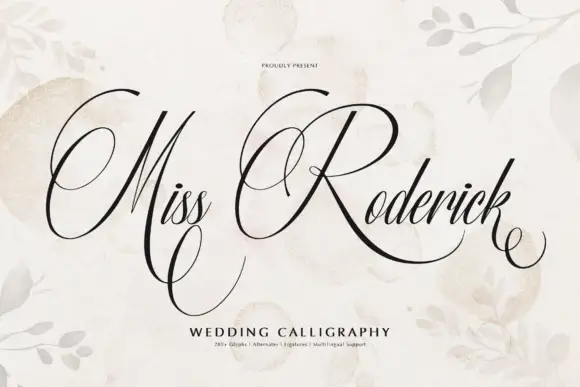
Formal calligraphy with large flourished loops
Miss Roderick is wedding calligraphy in black on cream: high-contrast copperplate-style strokes, hairlines between heavy shades, and enormous loops that leave the capitals and travel across the line, with a caption in tracked capitals beneath.
Ideas for this font
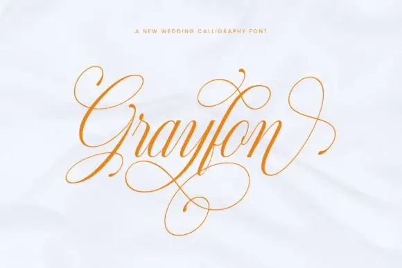
Fine highly flourished calligraphy with cascading loops below the baseline
Grayfon is fine calligraphy in which the flourishes outnumber the letters, with loops that cascade below the baseline and crossings that run across the whole word.
Ideas for this font
Allow optional Google Analytics to measure visits and catalogue actions. Your search words and notes are not included. Privacy & storage